Do you ever try to make CSS rotate animation that rotates an image on click? you may have tried, but it might be not perfect as you were wanted.
In this tutorial, you’ll come to know how to rotate an image on click event using pure CSS. Although, it will be easy if we did it with JavaScript. But in regards to pure CSS projects, it is a little bit complex concept. But, don’t worry about complexity, I’ll explain step-by-step to clear your concept.
The concept of image rotation is that we’ll use HTML radio input to detect click (by CSS: checked selector) and apply CSS transform rotate property to it. Besides this, we’ll use CSS transitions for smoothness and other styles for a basic interface. So, let’s start with the HTML structure.
HTML Structure for Image Rotate Animation on Click
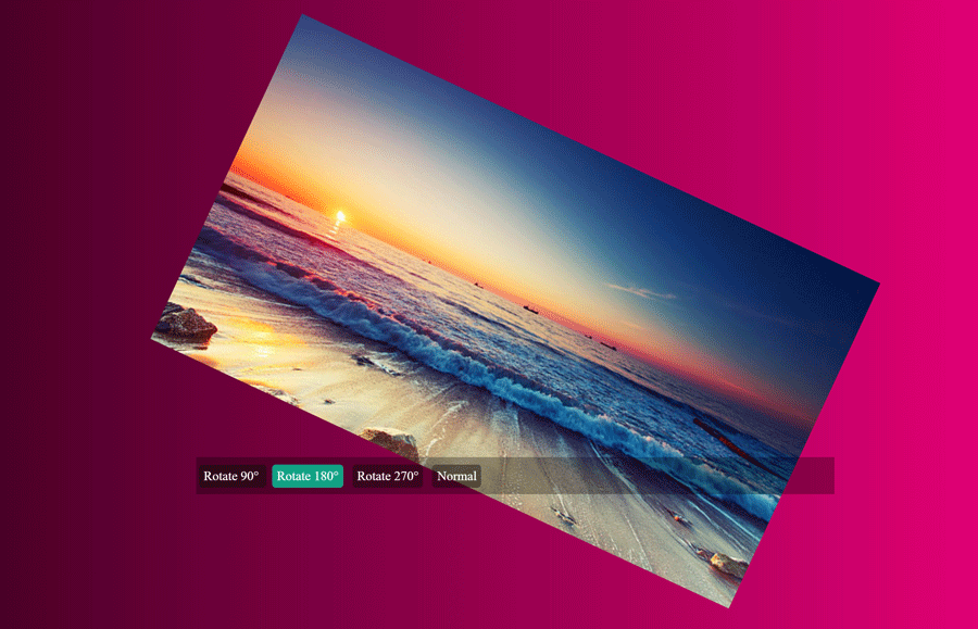
In HTML, we’ll create four radio inputs that will label with “Rotate 90°”, “Rotate 180°”, “Rotate 270°” and “Normal” respectively. These labels will be used as rotation buttons. Similarly, we’ll insert an image and wrap all these elements in a parent div element.
<div class="img-container">

  <input id="rt90" type="radio" name="rotate" />
  <input id="rt180" type="radio" name="rotate" />
  <input id="rt270" type="radio" name="rotate" />
  <input id="nrml" type="radio" name="rotate" />

  <div class="btn-board">
    <label class="rt-btn" for="rt90">
Rotate 90° </label>
    <label class="rt-btn" for="rt180">
Rotate 180°</label>
    <label class="rt-btn" for="rt270">
Rotate 270°</label>
    <label class="rt-btn" for="nrml">
Normal </label>

  </div> <!--//btn-board-->

<img class="target" src="image/street.jpg" />
</div> <!--//img-container-->
As you can look at the above HTML code, each input has a unique ID. This ID attribute will be used in CSS to assign specific rotation values to the image. On the other hand, all labels are wrapped in a div that has the class name “btn-board”. It will help us to style buttons in CSS.
You are not limited to use this HTML structure as is, you can also modify (add some extra elements) or keep only necessary elements. However, these are some additional changes that you can do according to your needs. Now, look forward to style these HTML elements with CSS.
CSS Styles
Before transforming the image, we’ll set some basic CSS styles related to layout and interface.
Actually, the image rotation interface is really simple. First of all, we’ll style the main outer wrapper that has a class name “img-container”. The main thing to do with it is that it must have a relative position. So, the basic style of this container is as follows:
.img-container{
   display: block;
   margin: 15px;
   text-align: center;
   position: relative;
   box-shadow: 2px 1px 6px rgba(0, 0, 0, 0.5);
   overflow: hidden;
   background: -webkit-linear-gradient(to right, #33001b, #ff0084);
	background: linear-gradient(to right, #33001b, #ff0084);
   box-sizing: border-box;
}
Another considerable thing is that we set its overflow property to hidden. It means that the image will not overlap when rotated to 90 degrees or 270 degrees. However, there is an issue that the top and bottom areas of an image will not show. To solve this, you can set the overflow property to “auto” or “visible”.
Now, we’ll set some CSS attributes for the image to make it responsive.
.img-container img{
    width: 100%;
    height: auto;
   transition: .4s;
   -webkit-transition: .4s;
-moz-transition: .4s;
}
We defined CSS width and height property for the image to make it responsive. While the transition property for smoothness. You can define custom duration (in seconds) for the transition to make rotate animation slow or faster.
After that, rotate buttons are the next part of our CSS styling. So, the following code snippet defines the basic design of rotation buttons.
.btn-board{
   background: rgba(0, 0, 0, 0.3);
   width: 100%;
   height: 40px;
   line-height: 40px;
   position: absolute;
   bottom: 0;
   display: block;
   box-sizing: border-box;
   padding: 0;
   text-align: left;
   z-index: 11;
}

.rt-btn{
   padding: 5px;
   background: rgba(0, 0, 0, 0.4);
   font-size: 11px;
   border: 0;
   outline: 0;
   color: #fff;
   width: 32px;
   height: 32px;
   border-radius: 4px;
   margin: 0 3px;
}
.rt-btn:hover{
   background: #16a085;
}
There is no need to style HTML radio buttons here, we’ll simply hide them.
input[name="rotate"]{
   display: none;
   opacity: 0;
}
Now, it’s time to set CSS transform property to enable rotate image animation on click.
#rt90:checked ~ div + img {
     transform: rotate(90deg);
   -webkit-transform: rotate(90deg);
   -moz-transform: rotate(90deg);
   -ms-transform: rotate(90deg);
    filter: progid:DXImageTransform.Microsoft.BasicImage(rotation=1);
}

#rt180:checked ~ div + img {
    transform: rotate(180deg);
   -webkit-transform: rotate(180deg);
   -moz-transform: rotate(180deg);
   -ms-transform: rotate(180deg);
    filter: progid:DXImageTransform.Microsoft.BasicImage(rotation=2);
}

#rt270:checked ~ div + img {
    transform: rotate(270deg);
   -webkit-transform: rotate(270deg);
   -moz-transform: rotate(270deg);
   -ms-transform: rotate(270deg);
   filter: progid:DXImageTransform.Microsoft.BasicImage(rotation=3);
}
Normally, we can use only CSS transform property to rotate an image. But, for cross browser’s support, we used -Webkit-, -Moz- and -ms-transform. Similarly, the CSS filter attributes defined for older browsers.
That’s all. I hope you get it helpful and now you’re able to rotate an image using CSS. If you have any questions, or suggestions regarding CSS animation, kindly let us know by comments.