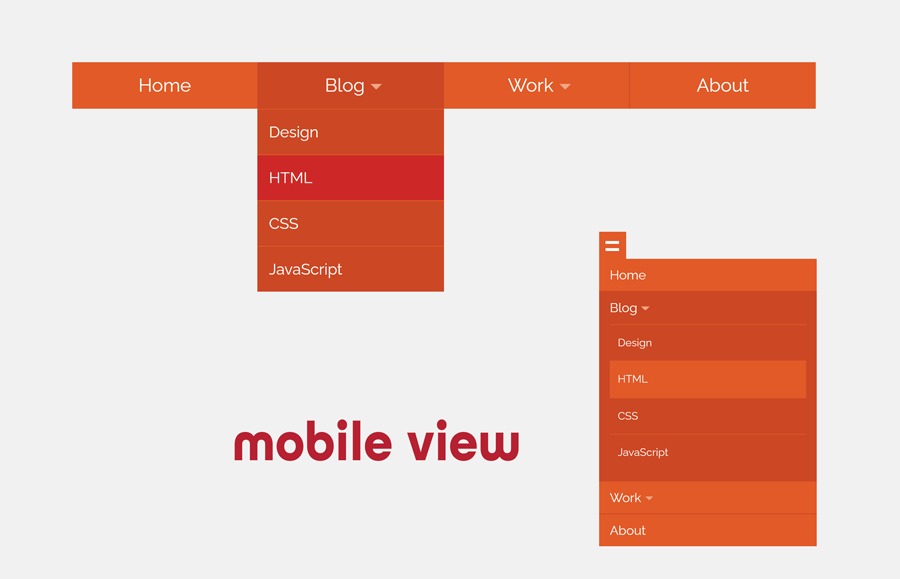
Drop-down navigation is the most common element of a website to navigate the site content. In such navigation, the basic links appear in a bar and if a link has more list then it is shown in the dropdown. In this tutorial, we are going to create a basic responsive drop down menu using HTML and CSS only.
We’ll use the HTML nav element to arrange the unordered list of links in the horizontal bar. In order to make a drop-down, we’ll place sub-links in nested lists. Then we’ll style these link lists using CSS in the form of a horizontal drop down menu. In the final step, we will use the CSS media queries to convert this horizontal menu bar into a hamburger menu for mobile/small screen.
You can implement this lightweight navigation to any mobile-friendly website templates. Or you can learn the way to convert a nested list into drop down menu. So, let’s get started with HTML coding to create a basic drop-down menu.
The HTML Code for Menu
In HTML, create a nav element with a unique ID (#nav) and place your list of links inside it. Similarly, create the nested list for a dropdown. A basic HTML structure for the drop-down menu is as follows:
<nav id="nav" role="navigation"> <a href="#nav" title="Show navigation">Show navigation</a> <a href="#" title="Hide navigation">Hide navigation</a>
      <ul class="clearfix">
    <li><a href="">Home</a></li>
    <li> <a href=""><span>Blog</span></a>
          <ul>
        <li><a href="">Design</a></li>
        <li><a href="">HTML</a></li>
        <li><a href="">CSS</a></li>
        <li><a href="">JavaScript</a></li>
      </ul>
        </li>
    <li> <a href=""><span>Work</span></a>
          <ul>
        <li><a href="">Web Design</a></li>
        <li><a href="">Typography</a></li>
        <li><a href="">Front-End</a></li>
      </ul>
        </li>
    <li><a href="">About</a></li>
  </ul>
</nav>
In the above HTML code, you just need to update anchor links. You can place multiple dropdown items in the menu, just place an unordered list (ul) inside the li tag.
Styling Drop Down Menu with CSS
After creating the HTML structure, now it’s time to style the menu using CSS. So, target the nav element (with its ID) and define its width and position property. If you want to make the navbar sticky, use the CSS position fixed with the top value 0.
#nav {
	width: 60em; /* 1000 */
	font-family: 'Open Sans', sans-serif;
	font-weight: 400;
	position: absolute;
	top: 25%;
	left: 50%;
	margin-left: -30em; /* 30 480 */
}
After that, define the CSS styles for the navigation links as follows:
#nav > a {
	display: none;
}
#nav li {
	position: relative;
}
#nav li a {
	color: #fff;
	display: block;
}
#nav li a:active {
	background-color: #c00 !important;
}
In order to make a drop down symbol with the parent list item, we’ll use the after pseudo selector and border property to make a chevron down icon.
#nav span:after {
	width: 0;
	height: 0;
	border: 0.313em solid transparent; /* 5 */
	border-bottom: none;
	border-top-color: #efa585;
	content: '';
	vertical-align: middle;
	display: inline-block;
	position: relative;
	right: -0.313em; /* 5 */
}
The ul that direct child of nav is the first level navigational links. Set its height (60px by default) and background according to your needs. Likewise, target list items and define their CSS styles as described below:
#nav > ul {
	height: 3.75em; /* 60 */
	background-color: #e15a1f;
}
#nav > ul > li {
	width: 25%;
	height: 100%;
	float: left;
}
#nav > ul > li > a {
	height: 100%;
	font-size: 1.5em; /* 24 */
	line-height: 2.5em; /* 60 (24) */
	text-align: center;
}
#nav > ul > li:not( :last-child ) > a {
	border-right: 1px solid #cc470d;
}
#nav > ul > li:hover > a, #nav > ul:not( :hover ) > li.active > a {
	background-color: #cc470d;
}
The ul inside the li is the second level nav links that we will display as a dropdown on hover event. Keep its absolute position with 100% top value. Similarly, specify a background color for drop down list. Hide these lists using display none property and display block on :hover pseudo-selector to show on hover.
#nav li ul {
	background-color: #cc470d;
	display: none;
	position: absolute;
	top: 100%;
}
#nav li:hover ul {
	display: block;
	left: 0;
	right: 0;
}
#nav li:not( :first-child ):hover ul {
	left: -1px;
}
#nav li ul a {
	font-size: 1.25em; /* 20 */
	border-top: 1px solid #e15a1f;
	padding: 0.75em; /* 15 (20) */
}
#nav li ul li a:hover, #nav li ul:not( :hover ) li.active a {
	background-color: #e15a1f;
}
Finally, use the CSS media queries to make the drop down menu mobile-friendly/responsive.
 @media only screen and ( max-width: 62.5em ) /* 1000 */ {
#nav {
	width: 100%;
	position: static;
	margin: 0;
}
}
 @media only screen and ( max-width: 40em ) /* 640 */ {
html {
	font-size: 75%; /* 12 */
}
#nav {
	position: relative;
	top: auto;
	left: auto;
}
#nav > a {
	width: 3.125em; /* 50 */
	height: 3.125em; /* 50 */
	text-align: left;
	text-indent: -9999px;
	background-color: #e15a1f;
	position: relative;
}
#nav > a:before, #nav > a:after {
	position: absolute;
	border: 2px solid #fff;
	top: 35%;
	left: 25%;
	right: 25%;
	content: '';
}
#nav > a:after {
	top: 60%;
}
#nav:not( :target ) > a:first-of-type, #nav:target > a:last-of-type {
	display: block;
}
/* first level */

#nav > ul {
	height: auto;
	display: none;
	position: absolute;
	left: 0;
	right: 0;
}
#nav:target > ul {
	display: block;
}
#nav > ul > li {
	width: 100%;
	float: none;
}
#nav > ul > li > a {
	height: auto;
	text-align: left;
	padding: 0 0.833em; /* 20 (24) */
}
#nav > ul > li:not( :last-child ) > a {
	border-right: none;
	border-bottom: 1px solid #cc470d;
}
/* second level */

				#nav li ul {
	position: static;
	padding: 1.25em; /* 20 */
	padding-top: 0;
}
}
That’s all! Hopefully, you have successfully created a responsive drop down menu. If you have any questions or suggestions, use the comment form to let me know.
Hi,
unfortunately the drop down menu does not work nicely (using Web-Kit) when being in the mobile phone mode (hamburger is showing). When trying to go down to the “Work” menu item, the whole menu collapses.
Hi Hardly!
The drop-down opens on hover event. This functionality has been created with CSS only using hover pseudo-selector. So, it will not show nicely on mobile devices.