Today we have created sets of CSS Image Hover Transition Effects that you don’t miss out. We build out some more unique and easy to implement effects.
You just need to do copy & past source code and you are done. These sets of transition effects allow you to add content, icons, and links, etc. over an image.
We have created three unique style image hover effects using HTML & CSS. All the effects come with different color variations. We try to keep the HTML markup as simple as possible.
Each effect use figure the element that holds the image, fig caption, H3, and all other HTML elements.
How to Build CSS Image Hover Transition Effects
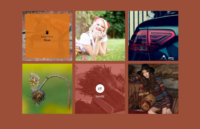
You can see the code of the first image hover effect example here. We have figure an element with the class name HoverSnip_1.
We have different separate classes for colors that you just need to add along with HoverSnip_1. Here we have a class name orange.
<figure class="HoverSnip_1 orange">
<img src="img/hover1.jpg" alt=""/>
  <figcaption>
  <i class="ion-ios-rose"></i>
    <h4>Beautiful</h4>
    <h3>Rose</h3>
  </figcaption>
  <a href="#"></a>
</figure>
Inside figure we place the image tag and then figcaption. The fig caption holds the icon, heading, and content, etc.
Make sure you should place an anchor link outside the fig caption that allows creating a hover effect.
The Styling Of Transition Effects
Before we get started with styling, You need to make sure to add box-sizing for each effect or you can define it globally for all hover effects. So here is code in.
figure.HoverSnip_1 * {
  -webkit-box-sizing: padding-box;
  box-sizing: padding-box;
  -webkit-transition: all 0.2s ease-out;
  transition: all 0.2s ease-out;
}
i) Styling Figure
We do some basic styling for the main container or wrapper. Here we have defined figure HTML5 element as the wrapper. We need to set the position relative and set some width as per our needs. To make it responsive, we will use min and max-width.
figure.HoverSnip_1 {
  font-family: 'Raleway', Arial, sans-serif;
  position: relative;
  float: left;
  overflow: hidden;
  margin: 10px 1%;
  min-width: 230px;
  max-width: 366px;
  width: 100%;
  color: #000000;
  text-align: center;
  -webkit-perspective: 50em;
  perspective: 50em;
}
ii) figcaption
The fig caption will be hidden part of the hover effect and it will show when you hover an image. To hide, we used opacity zero and to keep it on the image with the exact size, we will use position absolute. One thing more, we set the max-width 100% for an image for getting a responsive result.
figure.HoverSnip_1 figcaption {
  top: 50%;
  left: 20px;
  right: 20px;
  position: absolute;
  opacity: 0;
  z-index: 1;
}
figure.HoverSnip_1 img {
  max-width: 100%;
  vertical-align: top;
}
iii) Figure After
Now we will paly with the figure by using :after the property. Using this, we will do use the transition and transform.
figure.HoverSnip_1:after {
  background-color: #ffffff;
  position: absolute;
  content: "";
  display: block;
  top: 20px;
  left: 20px;
  right: 20px;
  bottom: 20px;
  -webkit-transition: all 0.4s ease-in-out;
  transition: all 0.4s ease-in-out;
  -webkit-transform: rotateX(-90deg);
  transform: rotateX(-90deg);
  -webkit-transform-origin: 50% 50%;
  -ms-transform-origin: 50% 50%;
  transform-origin: 50% 50%;
  opacity: 0;
}
iv) Figcaption & Figure Hover
To show the fig caption and get the animation of the figure, we will use translateY for fig caption and translateX for the figure.
figure.HoverSnip_1:hover figcaption {
  -webkit-trasform: translateY(-50%);
  transform: translateY(-50%);
  opacity: 1;
  -webkit-transition-delay: 0.2s;
  transition-delay: 0.2s;
}
figure.HoverSnip_1:hover:after {
  -webkit-transform: rotateX(0);
  transform: rotateX(0);
  opacity: 0.9;
}
v) General Styles
Here is the code of general styles of CSS Hover Effects. These styles for h3, h4, and icon, etc.
figure.HoverSnip_1 h3,
figure.HoverSnip_1 h4 {
  margin: 0;
}
figure.HoverSnip_1 h3 {
  font-weight: 600;
}
figure.HoverSnip_1 h4 {
  font-weight: 400;
  text-transform: uppercase;
}
figure.HoverSnip_1 i {
  font-size: 32px;
}
figure.HoverSnip_1.green:after  {
  background-color: #229955;
}
figure.HoverSnip_1.orange:after  {
  background-color: #d67118;
}
figure.HoverSnip_1 a {
  left: 0;
  right: 0;
  top: 0;
  bottom: 0;
  position: absolute;
  z-index: 1;
}
We have explained to you the process of building transition Effects for the first effect only. You can find all other hover effects in the demo and download source. I hope you enjoy this CSS3 tutorial and find it useful.
Thanks for the post.
Just one note: the code in your example correctly sets
html {box-sizing: border-box;}
*, *:before, *:after {box-sizing: inherit;}
but in this post the box sizing is set to “padding-box”, a non supported value.