It’s time to create another set of HTML & CSS Image Hover Effects that show text on hover. These photo effects have some great animation and new designs. We included 14 modern and Subtle effect which stand out your site.
These modern effects will surely brighten up your website. We will create some creative animation using advanced CSS3 techniques.
The hover effects can also be created using Jquery, but it will affect your website speed. I will share pure CSS solution.
These effects developed using CSS3 transition and are easy to apply effects on any kind of website. You simply need to copy HTML code for specific effects and add style.css file. That’s It.
After CSS3 come into the market, Designing the website and its element gets easier for designers. You can build a beautiful and awesome looking effect quickly.
Nowadays, The web design trend a lot changed. The designers love to play with animations and CSS3 allows bringing something new in every website layout.
Due to this trend, We think to create and share some creative modern items using CSS3.
How to Create HTML & CSS Image Hover Effects
I will guide you about creating the first image hover effect here. The process of creating another effect almost similar but of course the animation and little HTML changes require.
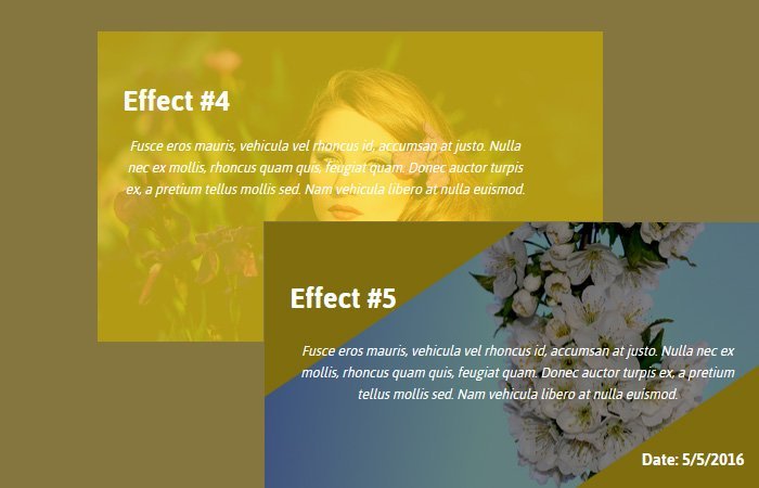
You can find all the rest of the effects in the demo and source code file.
Let’s get started by making the effect.
We have a main wrapper class name bg-items that wraps with a few of the child’s divs. These child divs include items div with a background image and a div which will show content when hovering an image.
Be aware that we are going to use an image as a background and add the class items for each background image. The markup will appear like this:
<div class="bg-items">
    <div class="items" style="background-image : url('img/baby-1399332_960_720.jpg');">
      <div class="one"></div>
      <div class="details">
        <h3>Effect #1</h3>
        <p>Fusce eros mauris, vehicula vel rhoncus id, accumsan at justo.
               Nulla nec ex mollis, rhoncus quam quis, feugiat quam. Donec auctor turpis ex,
              a pretium tellus mollis sed. Nam vehicula libero at nulla euismod.
         </p>
        <h6>Date: 5/5/2016</h6>
      </div>
    </div>
</div>
We also want to mention here, We should also add the primary container and all the image sources will be inside. This container class named Hvcontainer
The Styling
For our CSS, We first need to add some common CSS that should use for each set of effects. We need to set a width of 48% to make 2 column design. Here you can change it and make it 3 columns quickly.
The div class name items should have relative positioning with the inline display.
I’ve also put some basic styles for H2 and P tags. In addition to the image tag, We can use a CSS3 transition to create a smooth impact.
.bg-items {
    cursor: pointer;
    display: inline-block;
    float: left;
    margin: 1%;
    width: 48%;
}
.items {
    background-color: #C97131;
    background-size: cover;
    height: 286px;
    overflow: hidden;
    position: relative;
    width: 100%;
}
.details {
    color: #fff;
    font-family: "Jaldi",sans-serif;
    font-size:25px;
    height: 286px;
    left: 0;
    opacity: 0;
    padding: 5%;
    top: 0;
    transition: opacity 0.8s ease 0s;
    width: 90%;
}
.opticy{
   background-color : rgba(0,0,0,0.5);
}
.details h3 {
  margin-bottom : 20px;
}
.details h6 {
  text-align : right;
  margin-top : 40px;
}
.details p {
  font-size : 14px;
  font-style: italic;
  text-align: center;
  line-height : 20px;
}
.items:hover .details {
  opacity : 1;
  -webkit-transition: opacity .2s .3s;
  transition : opacity .2s .3s;
}
.items div {
  position : absolute;
}
To create an effect on hover, We will play with few design elements which include setting the values for position element and add some background color and also a transition that can change according to need.
On hover, We set left and bottom to be 0 to create this effect.
.one {
  left   : 100%;
  bottom : 100%;
  width : inherit;
  height: inherit;
  background-color : rgba(254, 219, 29, 0.7);
  -webkit-transition: all .3s;
  transition   : all .3s;
}
.items:hover .one {
  -webkit-transition: all .3s;
  transition   : all .3s;
  left   : 0;
  bottom : 0;
}
If you want to implement the second effect from the demo than here is code sample. This effect work similar to the first one but the left should be zero in the normal position but the bottom will be 100%. On-hover, both will be 0.
.two {
  width : inherit;
  height: inherit;
  background-color : rgba(254, 219, 29, 0.7);
  -webkit-transition: all .3s;
  transition   : all .3s;
  left   : 0;
  bottom : 100%;
}
.items:hover .two {
  -webkit-transform : rotate(180deg);
          transform : rotate(180deg);
  left   : 0;
  bottom : 0;
  -webkit-transition: all .3s;
  transition   : all .3s;
}
Please let us know how you find these useful resources and share with your friends.