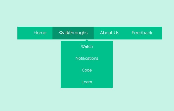
Today, I’m going to show you easy way to create CSS based navigation bar with dropdown. Mostly, such navigation bar display on the top of webpage to handle basic site links.
This menu bar including dropdown list works well on all kind of browsers with awesome simple effect. To implement this navigation on any type of website is pretty easy.
Having easy to use navigation is important for any website. By using CSS3, You can transform boring old HTML means into the good-looking animated menu bar. We used a unique eye-catching color scheme. Such menus are very useful when you are making the flat web design.
It also supports drop-down menus which also developed using only HTML and CSS. Many menus have created the usage of an aggregate of HTML, CSS, and JavaScript.
This simple CSS only approach will exhibit that JavaScript isn’t always essential!
We will include handiest the most relevant CSS required for the structure and simple styling. It a great deal less difficult to observe and recognize the motive of every line of code.
It additionally manner that gives up product is primed and prepared for your particular customization.
As for as animation concern, we created the ease-in effect with slow down its timer but you can add your own effect.
Create HTML for Navigation Bar
Each object of the main menu is a toddler of the topmost unordered listing. Internal it’s far a hyperlink and every other unordered list, in order to be displayed as a drop-down on hover.
<nav class="animatedNav">
    <ul>
        <li>
            <a href="#">Home</a>
            <ul>
                <li><a href="#">Dropdown Menu One</a></li>
                <li><a href="#">Dropdown Menu Two</a></li>
                <li><a href="#">Dropdown Menu Three</a></li>
            </ul>
        </li>
    </ul>
</nav>
The CSS Style for Dropdown Navigation
Now, its time to style navigation bar and its dropdown with CSS. As you spot within the HTML fragment above, we have unordered lists nested within the fundamental ul. So, we must write our CSS with caution.
The class .animatedNav is only used to set the background color so it should be a full-width color bar. As for as .animatedNav > ul we need to limit the width and margin declarations to simplest a primary unordered listing.
.animatedNav {
   /* Add background only if you want full-width navigation color bar */
    background: #00c08b none repeat scroll 0 0;
    height: 52px;
}
.animatedNav > ul{
	margin:0 auto;
	width:710px;
}
We’re placing a float: left; show value in order that the list items are proven in a single line, and we’re assigning a relative role in order that we are able to offset the dropdowns efficaciously.
We also added CSS3 transition element-webkit-transition: all 0.3s ease-in; but you can also add any other effect if you like. The anchor elements will have only basic stuff like font-family and color etc.
.animatedNav > ul > li{
	background-color:#00c08b;
	float: left;
	cursor: pointer;
	list-style-type: none;
	padding: 15px 25px;

	-webkit-transition: all 0.3s ease-in;
	-moz-transition: all 0.3s ease-in;
	-o-transition: all 0.3s ease-in;
	position:relative;
}
.animatedNav > ul > li > a{
	font-family: 'Raleway', sans-serif;
	color:inherit;
	text-decoration:none;
	font-size:18px;
	color:#fff;
}
Now let’s move on with dropdowns menus. Here we can be defining a CSS3 transition animation. We can be setting a maximum peak of zero px, as a way to hide the drop-down.
On hover, we will animate the maximum top to a larger price, so as to reason the list to be regularly discovered:
.animatedNav li ul{
	position:absolute;
	list-style:none;
	text-align:center;
	width:250px;
	left:50%;
	margin-left:-90px;
	top:32px;

	/* This is important for the show/hide CSS animation */
	max-height:0px;
	overflow:hidden;

	-webkit-transition:max-height 0.4s linear;
	-moz-transition:max-height 0.4s linear;
	transition:max-height 0.4s linear;
}
The max-height:300px; value is unfair and you’ll have to increase it if your drop-down list incorporates a whole lot of values which do no longer fit.
Sadly there may be no css-only way to detect the peak, so we must difficult code it.
.animatedNav li:hover ul{
	max-height:300px; /* Increase when adding more dropdown items */
}
The next and last step is to style the actual dropdown items:
.animatedNav li ul li{
	background-color:#00c08b;
}
.animatedNav li ul li a{
	padding:12px;
	color:#fff;
	text-decoration:none;
	display:block;
}
.animatedNav li ul li:hover{
	background-color:#05936c;
}
.animatedNav li ul li:first-child{
	border-radius:3px 3px 0 0;
	margin-top:25px;
	position:relative;
}
.animatedNav li ul li:first-child:before{ /* the pointer tip */
	content:'';
	position:absolute;
	width:1px;
	height:1px;
	border:5px solid transparent;
	border-bottom-color:#00c08b;
	left:50%;
	top:-10px;
	margin-left:-5px;
}
.animatedNav li ul li:last-child{
	border-bottom-left-radius:3px;
	border-bottom-right-radius:3px;
}
And you are done! If you like our this tutorial, please leave a comment and lets us know about it. You can also leave your comments if you need any help. We will try our best to provide you the best solution.