Do you want to apply custom styling on checkboxes? In this tutorial, I will create few of toggle switch examples which developed with pure CSS.
It’s ON/OFF toggle switches and when user check/uncheck a chekcbox to signify a Yes/No solution to some question or assertion.
We set up a label, a checkbox input type, and fetch the boolean value after form submission to see if the user has left the field checked or unchecked.
We’re all aware the default checkbox styling seems like there is no style. But with the help of CSS hacks, We can turn into toggle ON/OFF button
A little CSS trickery can resolve that for us and with the aid of combining the :checked, :before and :after pseudo element to our checkbox. We can reap a few beautiful toggle-kind switches with clean transitioning effects.
No black magic, just pure CSS splendor and we will do toggle Switch. Let’s have a look.
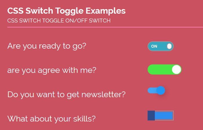
How to Create Toggle Switch Examples with CSS
The HTML is nothing we haven’t seen earlier than. It’s a public checkbox input with a corresponding label. Every of these label/enter combos is wrapped interior a div. I gave a class of onoffswitch. I’m going to demonstrate four extraordinary patterns:
- Custom CSS Toggle Switch
- iOS9 Toggle Switch
- Material Style Switch
- Window 8 Flat Finish
The way of a category will center each style this is attached to the input element. Labels also have their class name. You can also see that label is along, it also has two spans. The one called internal and second one switch. Let’s study the HTML:
<div class="onoffswitch">
    <input type="checkbox" name="onoffswitch" class="onoffswitch-checkbox" id="myonoffswitch" checked>
    <label class="onoffswitch-label" for="myonoffswitch">
        <span class="onoffswitch-inner"></span>
        <span class="onoffswitch-switch"></span>
    </label>
</div>
Nothing anything fundamental there. For the CSS, we need to set width and position to be about the main div container (onoffswitch).
We need the actual checkbox to be hidden way off the display and out of sight. The label is in which we’ll honestly do all of the styling convenient, due to the fact clicking on the label will actually “test” or “uncheck” the checkbox. Here’s the CSS that we’ll be enforcing for all toggle switches:
.onoffswitch {
    position: relative;
    width: 115px;
    -webkit-user-select:none;
     -moz-user-select:none;
     -ms-user-select: none;
}
.onoffswitch-checkbox {
    display: none;
}
.onoffswitch-label {
    display: block;
    overflow: hidden;
    cursor: pointer;
    border: 2px solid #999999;
     border-radius: 50px;
}
Example #1: Custom CSS On/Off Switch
The :before element will simulate the inner light-grey area of the switch and will transition into green. The :after element will be the actual round switch that sits on top of everything and slides from left to right on click.
It’ll have a box-shadow also to make it stand up above everything else. We’ll change the background color of the :before element and the position of the :after element when the input takes on the pseudo class :checked, and everything will transition smoothly.
.onoffswitch-inner {
    display: block;
    width: 200%;
    margin-left: -100%;
    transition: margin 0.3s ease-in 0s;
}
.onoffswitch-inner:before,
.onoffswitch-inner:after {
    display: block;
    float: left;
    width: 50%;
    height: 35px;
    padding: 0;
    line-height: 35px;
    font-size: 15px;
    color: white;
    font-family: Trebuchet, Arial, sans-serif;
    font-weight: bold;
    box-sizing: border-box;
}
.onoffswitch-inner:before {
    content: "ON";
    padding-left: 12px;
    background-color: #34A7C1; color: #FFFFFF;
}
.onoffswitch-inner:after {
    content: "OFF";
    padding-right: 12px;
    background-color: ; color: #999999;
    text-align: right;
}
Now let’s have a look at the .onoffswitch-switch which allow checking/uncheck the box. The span with class name .onoffswitch-switchis main handled to change the states.
.onoffswitch-switch {
    display: block;
    width: 14px;
     margin: 10.5px;
    background: #FFFFFF;
    position: absolute;
    top: 0; bottom: 0;
    right: 76px;
    border: 2px solid #999999; border-radius: 50px;
    transition: all 0.3s ease-in 0s;
}
.onoffswitch-checkbox:checked + .onoffswitch-label .onoffswitch-inner {
    margin-left: 0;
}
.onoffswitch-checkbox:checked + .onoffswitch-label .onoffswitch-switch {
    right: 0px;
}
Example #2: iOS9 CSS Toggle Switch
This case is relatively simple more than the example one, The principle distinction being the beautiful presentation of it. It fits right consistent with the slick flat developments of modern websites but functions the same as example 1. The CSS will only represent an alternate in aesthetic; the relaxation is the same. Right here’s the CSS:
This case is relatively simple more than example 1. We simply keep the main container div class name .onoffswitch The input type checkbox also be there, but the label should not need two spans because we don’t need to show the ON/OFF text. Here is HTML:
<div class="onoffswitch">
    <input type="checkbox" name="onoffswitch" class="onoffswitch-checkbox" id="myonoffswitch" checked>
    <label class="onoffswitch-label" for="myonoffswitch"></label>
</div>
The CSS also look like the example 1 but more minimize. We just need to handle label and use :before for label. Here is the complete CSS code.
.onoffswitch {
    position: relative; width: 100px;
    -webkit-user-select:none; -moz-user-select:none; -ms-user-select: none;
}
.onoffswitch-checkbox {
    display: none;
}
.onoffswitch-label {
    display: block; overflow: hidden; cursor: pointer;
    height: 30px; padding: 0; line-height: 30px;
    border: 2px solid #CCCCCC; border-radius: 30px;
    background-color: #FFFFFF;
    transition: background-color 0.3s ease-in;
}
.onoffswitch-label:before {
    content: "";
    display: block; width: 30px; margin: 0px;
    background: #FFFFFF;
    position: absolute; top: 0; bottom: 0;
    right: 68px;
    border: 2px solid #CCCCCC; border-radius: 30px;
    transition: all 0.3s ease-in 0s;
}
.onoffswitch-checkbox:checked + .onoffswitch-label {
    background-color: #49E845;
}
.onoffswitch-checkbox:checked + .onoffswitch-label, .onoffswitch-checkbox:checked + .onoffswitch-label:before {
   border-color: #49E845;
}
.onoffswitch-checkbox:checked + .onoffswitch-label:before {
    right: 0px;
}
Conclusion
That’s all here, but you can find all four examples in the demo and download source. Now you can easily create CSS Toggle Switch and can implement your next app development.
This approach maintains the whole lot completely semantic, doesn’t upload any crazy markup, and is achieved with original CSS goodness.
Of course, bear in mind of browser support, however, it’s no huge deal to cater to older browsers with limited styles. Feel free to download of pure css toggle switch on off examples and depart any comments, questions, or feedback.