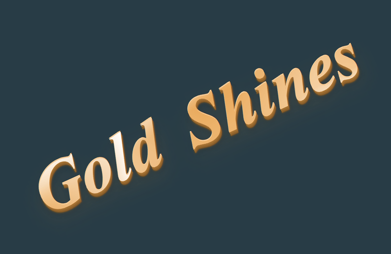
You’ve seen it everywhere: on websites, in magazines, even on product packaging. Gold text is a popular effect that can add a touch of elegance to any design.
In this tutorial, we’ll show you how to create an animated gold CSS text that gives you a gradient gold look. We’ll also share some tips on how to make the effect work with different fonts and backgrounds.
Well, The idea comes from our previous tutorial where we created HTML & CSS 3D Text Effect and now we will implement the same idea but with an additionally amazing shine effect over the Gold text.
Moreover, to make it attractive we will continue with using the 3D text so the text stands out and give an amazing feeling.
So let’s get started with converting your old simple text into something eye-catching typography.
Build HTML Stracture
First, we need our HTML markup which will consist of a container that says “gold-container” and a heading that has “gold-text” class.
To handle the shine animation effect we will use the data-attribute called “data-text” This will create another layer over the main text that will continue moving the shine effect.
Inside the heading, we will add a span tag that will actually hold the text that will display and you can change it with your own text.
To handle span functionality we will use “gold-text__highlight” and data-text for the shining effect.
Finally, we will have a paragraph where you can add text if needed.
<div class="gold-container">
    <span class="gold-text__highlight" data-text="Gold Shines">Gold Shines</span>
    <p class="decoration-text">You can add some simple text here as well.</p>
</div>
Animated Gold CSS Styling
The magic part starts now when we will change simple text into something amazing. We will just start with the container so we can make the fit the text according to our defined size
.gold-container {
  position: relative;
  display: block;
  margin: 0 auto;
  max-width: 36rem;
}
Our next part is to design and style the heading where we will apply some nice font-family, font-size, line-height etc.
But the important part is the gradient that gives the text a unique golden look. For this, the CSS radial-gradient powerful CSS function going to help us a lot and allow us to achieve the golden color look.
.gold-text {
  font-family: "Alegreya", serif;
  font-style: italic;
  font-size: 4rem;
  word-spacing: 0.2em;
  display: inline-block;
  padding: 0;
  line-height: 1;
  white-space: nowrap;
  color: transparent;
  background-color: #E8A95B;
  background-image: radial-gradient(ellipse farthest-corner at right bottom, white 0%, #F0BB7A 20%, #E8A95B 60%, transparent 80%), radial-gradient(ellipse farthest-corner at left top, white 0%, #F0BB7A 50%, #DE9945 75%, #E8A95B 100%);
  background-size: 100% 100%;
  background-clip: text;
  -webkit-background-clip: text;
  margin: 0 0 0.5rem 0;
}
Just gradient didn’t help us with what we wanted to do. We will also need to add some 3D effects with the help of CSS box-shadow. So now giving it a 3D look.
.gold-text:before {
  content: attr(data-text);
  position: absolute;
  top: 0;
  left: 0;
  color: #E8A95B;
  z-index: -1;
  text-shadow: 0 -1px 0 #f4cc9b, 0 1px 0 #a77334, 0 2px 0 #9b6b30, 0 3px 0 #90632d, 0 4px 0 #7a5426, 0 4px 2px #7a5426, 0 0.075em 0.1em rgba(26, 35, 39, 0.3), 0 0.15em 0.3em rgba(222, 153, 69, 0.2);
}
ProTip: Want to see some magic to text? Just remove the display: inline-block; and see the little dance with the text.
.gold-text__highlight {
  display: inline-block;
  position: relative;
  z-index: 1;
}
Now we will apply styling to the actual text that we have within the span tag. We use :after and :before property so we can hide the second layer of the text and control the flash animations.
For :after we will have the following CSS.
.gold-text__highlight:after {
  content: attr(data-text);
  position: absolute;
  left: 0;
  top: 0;
  width: 100%;
  height: 100%;
  z-index: 5;
  background-image: linear-gradient(100deg, transparent 0%, transparent 6rem, white 11rem, transparent 11.15rem, transparent 15rem, rgba(255, 255, 255, 0.3) 20rem, transparent 25rem, transparent 27rem, rgba(255, 255, 255, 0.6) 32rem, white 33rem, rgba(255, 255, 255, 0.3) 33.15rem, transparent 38rem, transparent 40rem, rgba(255, 255, 255, 0.3) 45rem, transparent 50rem, transparent 100%);
  background-clip: text;
  background-size: 60rem 100%;
  background-repeat: no-repeat;
  -webkit-background-clip: text;
  -webkit-animation-name: shine;
          animation-name: shine;
  -webkit-animation-direction: alternate;
          animation-direction: alternate;
  -webkit-animation-iteration-count: infinite;
          animation-iteration-count: infinite;
  -webkit-animation-duration: 4s;
          animation-duration: 4s;
  -webkit-animation-fill-mode: both;
          animation-fill-mode: both;
  -webkit-animation-timing-function: linear;
          animation-timing-function: linear;
}
Similarly, we will create the following CSS for :before element.
.gold-text__highlight:before {
  content: attr(data-text);
  position: absolute;
  left: 0;
  top: 0;
  width: 100%;
  height: 100%;
  z-index: 10;
  color: transparent;
  background-image: linear-gradient(to bottom, rgba(255, 255, 255, 0.5) 0%, transparent 35%, transparent 75%, #DE9945 100%);
  background-clip: text;
  -webkit-background-clip: text;
  -webkit-animation-name: flash;
          animation-name: flash;
  -webkit-animation-direction: alternate;
          animation-direction: alternate;
  -webkit-animation-iteration-count: infinite;
          animation-iteration-count: infinite;
  -webkit-animation-duration: 4s;
          animation-duration: 4s;
  -webkit-animation-fill-mode: both;
          animation-fill-mode: both;
  -webkit-animation-timing-function: linear;
          animation-timing-function: linear;
}
You can change the animation duration from 4s to anything you want. Even you can set the different values for both :after and :before
As you know we also place some paragraphs just below the gold text so we will style it as well to make it look nice.
.decoration-text {
  font-family: "HelveticaNeue-Light", "Helvetica Neue Light", "Helvetica Neue", Helvetica, Arial, "Lucida Grande", sans-serif;
  font-weight: 300;
  font-size: 1.2rem;
  line-height: 1.5;
  color: transparent;
  background-image: radial-gradient(ellipse at top left, #CFD8DC 0%, rgba(69, 90, 100, 0.75) 75%, transparent 100%);
  background-clip: text;
  -webkit-background-clip: text;
}
Finally, we will create the shine animation that we use within the CSS classes. We use the keyframe and developed shine and flash animation so the text provides both effects.
@-webkit-keyframes shine {
  0% {
    background-position: -50rem 0;
  }
  25% {
    background-position: -50rem 0;
  }
  100% {
    background-position: 30rem 0;
  }
}
@keyframes shine {
  0% {
    background-position: -50rem 0;
  }
  25% {
    background-position: -50rem 0;
  }
  100% {
    background-position: 30rem 0;
  }
}
@-webkit-keyframes flash {
  0% {
    opacity: 1;
  }
  10% {
    opacity: 0;
  }
  30% {
    opacity: 0;
  }
  40% {
    opacity: 1;
  }
  50% {
    opacity: 0;
  }
  90% {
    opacity: 0;
  }
  100% {
    opacity: 1;
  }
}
@keyframes flash {
  0% {
    opacity: 1;
  }
  10% {
    opacity: 0;
  }
  30% {
    opacity: 0;
  }
  40% {
    opacity: 1;
  }
  50% {
    opacity: 0;
  }
  90% {
    opacity: 0;
  }
  100% {
    opacity: 1;
  }
}
Conclusion
In this post, we just created an animated gold text with a gradient look using pure CSS. You can use this effect on your website or project to make it look more attractive and elegant.
Do you like this effect and want to use it in your web projects? If yes, then please share your feedback with us.