The text effects and animation leave a solid impact on your web design. One of the HTM / CSS 3D text effects is a fun way to enhance your website. This is a simple and powerful text animation effect with a new twist.
By using such effects you can make your website more attractive. The best place to implement 3D animation on the main heading is where you want to give your visitors an idea about the main content of your website.
Certainly, the 3D text effect is a great way to grab the attention of your visitors. To create the CSS text animation effects we will use the CSS shadow property. We will add multiple borders of different sizes to make the text look like a shadow.
Let’s start with building the effect.
Create 3D Text Effect using HTML/CSS
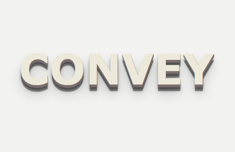
As this tutorial is very simple so we don’t have much HTML. The only thing we need is to place the text inside the HTML element. In our case, we place the text “Convey” within the span tag. It’s your choice and you can place it under div or heading tags such as h1 or h2.
We added the class name “deffect1” so it should conflict with the other effects or with any other effect that you might have on your webpage.
<span class="deffect1">convey</span>
CSS Text Effect Styling
Just like HTML, the CSS is also very simple and we don’t need to write long code here. We will just define the class and start with the basic styling. I am just setting the text-transform, font family and font-size, etc according to my choice. You can change all of these values according to your project.
Even you can change the color to match it according to your webpage layout. The only important thing is text-shadow property that you need to be a little careful while changing.
There is no problem with changing the text-shadow border value from 1px into 2px and 2px into 3px at all. You can do the experiment and see how the text look comes up.
.deffect1 {
	text-transform: uppercase;
	font-family: verdana;
	font-size: 10em;
	font-weight: 700;
	color: #ece8da;
	text-shadow: 1px 1px 1px #7b6d6d,
		1px 2px 1px #7b6d6d,
		1px 3px 1px #7b6d6d,
		1px 4px 1px #7b6d6d,
		1px 5px 1px #7b6d6d,
		1px 6px 1px #7b6d6d,
		1px 7px 1px #7b6d6d,
		1px 8px 1px #7b6d6d,
		1px 9px 1px #7b6d6d,
		1px 10px 1px #7b6d6d,
	1px 18px 6px rgba(16,16,16,0.4),
	1px 25px 15px rgba(16,16,16,0.2),
	1px 35px 45px rgba(16,16,16,0.2),
	1px 25px 45px rgba(16,16,16,0.4);
}
Even you can change the color but make sure you keep the one color for all the borders so that the shadow should be in one color.
We also added a few more 3D text effect examples on the demo page and you can choose which you like. Actually, the process of building effect is almost similar to what we explained above so you can use any effect from the demo.
Conclusion
In conclusion, the 3D text effect can be created using CSS3 transforms. We’ll show you how to create the effect with simple CSS3 code. You can use this technique to create other cool effects such as the 3D rotating text effect.
I hope you enjoyed this article and found it helpful. Feel free to share this post on your social media channels. I would love to see your comments and feedback below.