Our today small quick tip is about creating CSS button shine effect on hover using transition and transform CSS property.
I will create a simple CSS button and apply the shine effect by using CSS3 on it when a user hovers over it. This effect can be applied to both the input type button or anchor link so let’s have a look at the markup.
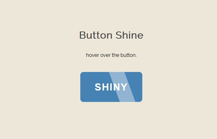
HTML Structure for Button Shine Effect
The markup is simple and all you need to create HTML for a button. We place an HTML element button with class name hello. Next, we need to add a div with class name shine. This call allows us to create a shine effect on hover.
<div class="container">
  <button class="hello">SHINY</button>
  <div class="shine"></div>
</div>
The container class is just used to align the page. If you are using any CSS framework, then you don’t need to add a container. You can just place the HTML button code and a shine div.
CSS Styles
Let’s first of all design the button itself and we need to add some color, font, and background color. To remove the default border, we need to set the border to 0 and add some padding to make it look good in size.
We also added some border-radius, but if you need to keep the flat button design, then you don’t need to add that.
.hello {
  border: 0;
  padding: 30px 15px;
  width: 200px;
  background: steelblue;
  color: white;
  font-size: 2em;
  font-weight: bold;
  transition: background .3s linear;
  letter-spacing: 2px;
  border-radius: 10px;
}
To create the shine effect of the button, we need to set the position to absolute with top 0 but the left will be -70px; The height and width are depending on how much size you want for the shiny effect. Next, we need some color to shine effect and we will use the RGBA color system so it gives the look of shine.
The transition allows us to control the speed of effect while hovering the button and by using transform, we able to set the position of the effect comes from.
.shine {
  position: absolute;
  top: 0;
  left: -70px;
  height: 98px;
  width: 50px;
  background: rgba(255, 255, 255, 0.4);
  transition: all .3s linear;
  transform: skewX(20deg) translateX(0);
}
On hover, we will keep transform skewX value to 20degree but we need to change the translateX to 300px. This is actually the speed of effect that how come it fast and go away.
.container:hover .shine {
  transform: skewX(20deg) translateX(300px);
}
Below we added CodePen embed and you can see the button effect. Hover the button to see the shine effect in action. You can play with its style to generator your own style button. You can change the color, background or transform value, etc.
See the Pen Button Shine Effect CSS by Mark Howard (@iheartkode) on CodePen.
I hope you easily implemented this CSS based shine hover effect on a button in your project. If you have any questions or suggestions let me know by comment below.