Are you looking for an accordion with open / close arrows created in CSS? well! here is a step by step guide to creating accordion with arrow icons. In this accordion tutorial, we’ll use only HTML and CSS to develop a very basic collapsible content panel. Even, we’ll create the arrows icon using CSS border property in order to keep the lightweight size.
This accordion helps you to format your longer content into easy to read like FAQs or detailed content. Similarly, you can also use this accordion to toggle the content with the arrow up/down effect.
The coding concept is that we’ll use the HTML input (checkbox & radio) to toggle the content on the checked/unchecked event. Moreover, you can highly customize this accordion by changing a few CSS values. So, let’s start developing it with HTML.
HTML Code for Accordion with Open / Close Arrows
The HTML for the accordion consists of main three items. The main container, label tag for the title, and content wrapper. The most important element is the input tag that controls the toggle functionality. So, the basic HTML code for the collapsible content is as follows:
<div class="container">
  <div class="accordion_container">
    <input type="checkbox"
           id="accordion-1"
           class="accordion-control">
    <label for="accordion-1"
           class="accordion-label"
           data-label-closed="show"
           data-label-open="hide">Click to</label>
    <div class="accordion-content">
      This is collapsible content
    </div>
  </div>
</div>
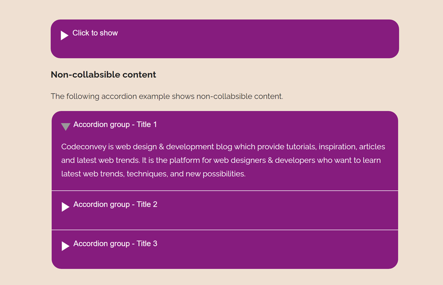
If you want to create non-collapsible content (open one at a time), then use the input type="radio" and keep the other structure as mentioned above. The following HTML structure group the multiple accordions with non-collapsible functionality.
<fieldset class="accordion-group-container">

  <div class="accordion_container">
    <input type="radio"
           name="accordiongroup"
           id="accordiongroup-1"
           class="accordion-control">
    <label for="accordiongroup-1"
           class="accordion-label">
      Accordion group - Title 1
    </label>
    <div class="accordion-content content-1">
      Content goes here...
  </div>
  </div>

  <div class="accordion_container">
    <input type="radio"
           name="accordiongroup"
           id="accordiongroup-2"
           class="accordion-control">
    <label for="accordiongroup-2"
           class="accordion-label">
      Accordion group - Title 2
    </label>
    <div class="accordion-content content-2">
      This is collapsible content
      <br><br><br><br><br><br><br><br>
    </div>
  </div>

  <div class="accordion_container">
    <input type="radio"
           name="accordiongroup"
           id="accordiongroup-3"
           class="accordion-control">
    <label for="accordiongroup-3"
           class="accordion-label">
      Accordion group - Title 3
    </label>
    <div class="accordion-content content-3">
      This is collapsible content
      <br><br><br><br><br><br><br><br>
    </div>
  </div>

</fieldset>
You can use the "checkbox" type for the input if you wanted to make it collapsible.
The CSS Styles
After creating the HTML structure for the accordion, now it’s time to style it using CSS. So, target the very first element "accordion_container" and define its CSS styles as follows. If you want to customize it, you can set the custom background color, max-width, and border, etc.
.accordion_container {
  background: #861c7e;
  padding: 20px;
  border-bottom: 1px solid #fff;
  max-width: 720px;
  margin: 0 auto;
}
.accordion_container:first-of-type {
  border-top-left-radius: 20px;
  border-top-right-radius: 20px;
}
.accordion_container:last-of-type {
  border-bottom-left-radius: 20px;
  border-bottom-right-radius: 20px;
  border-bottom: none;
}
The label tag specifies the title of the accordion. Display it as a block element, set its color, and cursor property. Use the CSS user-select property to avoid text selection while clicking for open/close accordion content.
.accordion-label {
  cursor: pointer;
  display: block;
    user-select: none;
    color: #fff;
}
Now, target the "accordion-content" class that is the wrapper for the content. Set 0 value for the max-height property and keep the overflow hidden in order to hide the content by default. Similarly, define the transition, background, and color as described below:
.accordion-content {
  max-height: 0;
  overflow: hidden;
  transition: max-height 0.2s;
  background-size: 260px;
  background-repeat: no-repeat;
  background-position: center;
  color: #fff;
}
Use the CSS display none property to hide inputs that control accordion working.
.accordion-control {
  display: none;
}
After that, target the label element that comes just after the input using plus selector (+), and define the CSS values for the arrow icon as follows:
.accordion-control + label:before {
  left: -19px;
  top: 3px;
  width: 0;
  height: 0;
  border-style: solid;
  border-width: 10px 0 10px 16px;
  border-color: transparent transparent transparent #fff;
  transition: all 0.2s ease-in;
}
You can change the title text when the checkbox checked/unchecked. So, use the CSS after pseudo selector with label tag and define content.
.accordion-control:checked + label:after {
  content: attr(data-label-open);
}
.accordion-control + label:after {
  content: attr(data-label-closed);
  padding-left: 4px;
}
Use the CSS transform property to rotate the arrow icon when the accordion opened.
.accordion-control:checked + label:before {
  transform: rotate(90deg);
}
Define the max-height value by targeting the checked pseudo selector to display accordion content. If you have longer content, then increase the max-height that is 350px by default.
.accordion-control:checked + label + .accordion-content {
  max-height: 350px;
}
.accordion-control[type=radio] + label:before, .accordion-control[type=radio] + label:after {
  content: "";
}
.accordion-control[type=radio]:checked + label {
  cursor: default;
}
.accordion-control[type=radio]:checked + label:before {
  border-left-color: #999;
}
Finally, hide the fieldset border and done.
fieldset {
  border: none;
  padding: 0;
}
That’s all! I hope you have successfully created an accordion with open / close arrows using this CSS technique. If you have any questions or suggestions, let me know by comment below.
Is it possible to start accordion being open instead of closed by default? If so how would that be done? Thanks!
Yes, it’s possible, you need to define the checked attribute for the input element and it will open the accordion as default.
<input type="checkbox"
           id="accordion-1"
           class="accordion-control" checked>