A toggle button is a visual element of the user interface that is used to switch between two (true/false) state. In web development, an HTML radio (or checkbox) input is used to get true and false value on checked and unchecked events respectively. This input can be converted to a toggle button. So, in this tutorial, you will come to know the method of creating a toggle switch button with on/off text using HTML checkbox input.
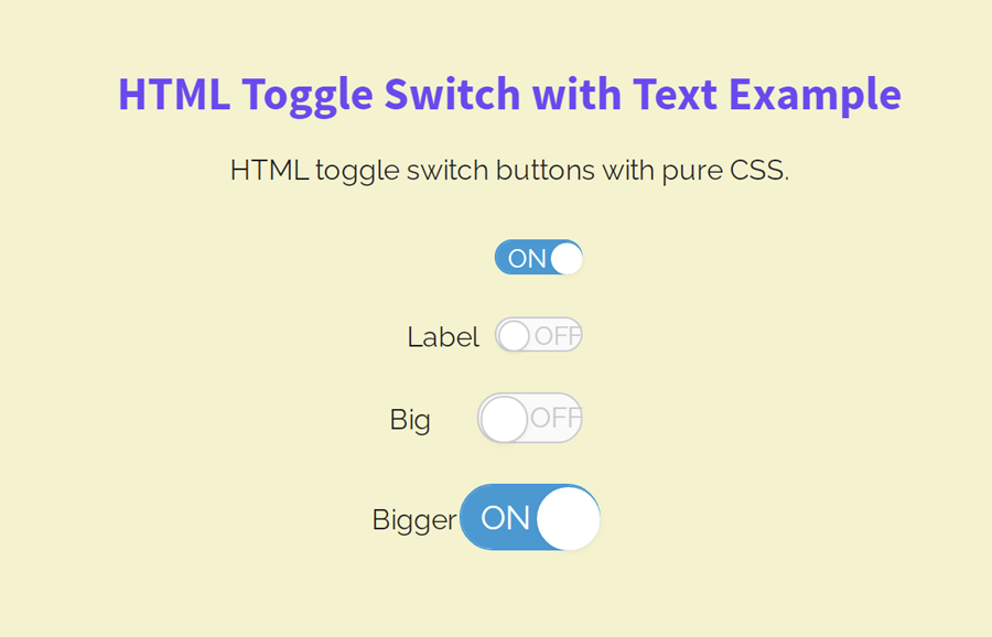
As you have seen in the above image, there are three toggle buttons of different sizes. You can easily make your toggle switch large in order to fit your needs by adding a class name. Similarly, you can easily customize the color scheme for the active/inactive toggle button by changing a few CSS values.
A few months back, I described in the tutorial, you can easily convert radio input into a toggle switch using CSS. Similarly, you can also add switchable text inside your toggle button with the help of this tutorial. You can view its example on the demo page before starting with coding.
HTML Structure for Toggle Switch
In order to build a toggle switch, you need to create a label tag with two classes “toggleSwitch nolabel”. Inside this label, place checkbox input and with “ON” and “OFF” text wrapped with HTML span element. After that, create an empty a tag that we’ll style as toggle’s ball. So, the complete HTML structure for a toggle button looks like the below code:
<label class="toggleSwitch nolabel" onclick="">
   <input type="checkbox" checked />
     <span>
        <span>OFF</span>
        <span>ON</span>
     </span>
<a></a>
</label>
You can place your custom text (like true/false) inside the span elements. If you want to make your toggle button large, simply add a class name "large" to the label tag or "xlarge" for extra-large. Similarly, you can add multiple toggle buttons with the same HTML structure.
The CSS Styles
The "toggleSwitch" class is the container of the toggle switch button. You need to specify its height and width as 18px and 40px respectively. Display it as an inline-block element and keep its overflow visible. Likewise, specify padding and margin values as described below.
  .toggleSwitch {
    display: inline-block;
    height: 18px;
    position: relative;
    overflow: visible;
    padding: 0;
    margin-left: 50px;
    cursor: pointer;
    width: 40px;
      user-select: none;
  }
After styling the basic styles for the switch container, define the styles for the label element. Keep its relative position, display it as a block element, and define 100% width.
  .toggleSwitch label,
  .toggleSwitch > span {
    line-height: 20px;
    height: 20px;
    vertical-align: middle;
  }
  .toggleSwitch label {
    position: relative;
    z-index: 3;
    display: block;
    width: 100%;
  }
We don’t need an outline when the checkbox input and label get focused. So, target the a and label element and define the “none” value for the outline property.
  .toggleSwitch input:focus ~ a,
  .toggleSwitch input:focus + label {
    outline: none;
  }
Similarly, we don’t need to display the default styles of the checkbox input. Therefore, keep the absolute position and 0 opacity for the input. Likewise, hide the span element by defining CSS display “none” property.
  .toggleSwitch input {
    position: absolute;
    opacity: 0;
    z-index: 5;
  }
.toggleSwitch span span {
  display: none;
}
Now, specify the CSS styles for the span element (that contains the ON/OFF text) as described in the below snippet.
  .toggleSwitch > span {
    position: absolute;
    left: -50px;
    width: 100%;
    margin: 0;
    padding-right: 50px;
    text-align: left;
    white-space: nowrap;
  }
  .toggleSwitch > span span {
    position: absolute;
    top: 0;
    left: 0;
    z-index: 5;
    display: block;
    width: 50%;
    margin-left: 50px;
    text-align: left;
    font-size: 0.9em;
    width: 100%;
    left: 15%;
    top: -1px;
    opacity: 0;
  }
The empty <a></a> tag that we placed in the toggle button’s HTML, used as a circular element to indicate active/inactive switch. So, define its width, height, border-radius, and other CSS properties as follows:
  .toggleSwitch a {
    position: absolute;
    right: 50%;
    z-index: 4;
    display: block;
    height: 100%;
    padding: 0;
    left: 2px;
    width: 18px;
    background-color: #fff;
    border: 1px solid #CCC;
    border-radius: 100%;
    -webkit-transition: all 0.2s ease-out;
    -moz-transition: all 0.2s ease-out;
    transition: all 0.2s ease-out;
    box-shadow: 0 1px 2px rgba(0, 0, 0, 0.05);
  }
After that, make the background of the toggle switch by targeting the before pseudo-class for span element. If you want to customize it, you can set the custom values for the background color, border, and border-radius, etc.
  .toggleSwitch > span span:first-of-type {
    color: #ccc;
    opacity: 1;
    left: 45%;
  }
  .toggleSwitch > span:before {
    content: '';
    display: block;
    width: 100%;
    height: 100%;
    position: absolute;
    left: 50px;
    top: -2px;
    background-color: #fafafa;
    border: 1px solid #ccc;
    border-radius: 30px;
    -webkit-transition: all 0.2s ease-out;
    -moz-transition: all 0.2s ease-out;
    transition: all 0.2s ease-out;
  }
In order to switch the toggle button, target the input element with a checked pseudo selector, and define the following CSS styles.
  .toggleSwitch input:checked ~ a {
    border-color: #fff;
    left: 100%;
    margin-left: -8px;
  }
  .toggleSwitch input:checked ~ span:before {
    border-color: #0097D1;
    box-shadow: inset 0 0 0 30px #0097D1;
  }
  .toggleSwitch input:checked ~ span span:first-of-type {
    opacity: 0;
  }
  .toggleSwitch input:checked ~ span span:last-of-type {
    opacity: 1;
    color: #fff;
  }
Finally, add the following CSS snippet into your project for different sizes for the toggle switch.
  /* Switch Sizes */
  .toggleSwitch.large {
    width: 60px;
    height: 27px;
  }
  .toggleSwitch.large a {
    width: 27px;
  }
  .toggleSwitch.large > span {
    height: 29px;
    line-height: 28px;
  }
  .toggleSwitch.large input:checked ~ a {
    left: 41px;
  }
  .toggleSwitch.large > span span {
    font-size: 1.1em;
  }
  .toggleSwitch.large > span span:first-of-type {
    left: 50%;
  }
  .toggleSwitch.xlarge {
    width: 80px;
    height: 36px;
  }
  .toggleSwitch.xlarge a {
    width: 36px;
  }
  .toggleSwitch.xlarge > span {
    height: 38px;
    line-height: 37px;
  }
  .toggleSwitch.xlarge input:checked ~ a {
    left: 52px;
  }
  .toggleSwitch.xlarge > span span {
    font-size: 1.4em;
  }
  .toggleSwitch.xlarge > span span:first-of-type {
    left: 50%;
  }
You have done it! hopefully, now you are able to create the HTML toggle switch button with text. If you have any questions or suggestions, let me know by comment below.