Creating animated weather icons using CSS is a fun and visually engaging way to enhance any website or application that deals with weather information. This guide will walk you through the process step-by-step, allowing you to add a dynamic element to your project.
Step1: HTML Structure for Animated Weather Icons
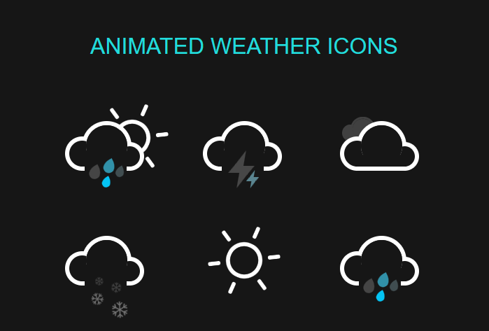
This HTML code defines a series of weather icons, each represented by different classes like sun-shower, thunder-storm, cloudy, flurries, sunny, and rainy. Each class includes nested div elements that symbolize various weather elements like clouds, sun rays, raindrops, snowflakes, and lightning bolts, which are intended to be animated with CSS to visually depict different weather conditions.
<h1>Animated Weather Icons</h1>
<div class="icon sun-shower">
<div class="cloud"></div>
<div class="sun">
<div class="rays"></div>
</div>
<div class="rain"></div>
</div>

<div class="icon thunder-storm">
<div class="cloud"></div>
<div class="lightning">
<div class="bolt"></div>
<div class="bolt"></div>
</div>
</div>

<div class="icon cloudy">
<div class="cloud"></div>
<div class="cloud"></div>
</div>

<div class="icon flurries">
<div class="cloud"></div>
<div class="snow">
<div class="flake"></div>
<div class="flake"></div>
</div>
</div>

<div class="icon sunny">
<div class="sun">
<div class="rays"></div>
</div>
</div>

<div class="icon rainy">
<div class="cloud"></div>
<div class="rain"></div>
</div>
Step2: Styling Animated Weather Icons with CSS
This CSS code defines styles for various weather icons (sun, clouds, rain, etc.) built with HTML elements, creating animations like spinning suns, falling rain, and flickering lightning.
html { box-sizing: border-box; }
html *,
html *:before,
html *:after { box-sizing: inherit; }

body {
max-width: 42em;
padding: 2em;
margin: 0 auto;
color: #161616;
font-family: 'Roboto', sans-serif;
text-align: center;
background-color: currentColor;
}

h1 {
margin-bottom: 1.375em;
color: #22dbdb;
font-weight: 100;
font-size: 2em;
text-transform: uppercase;
}
p,
a {
color: rgba(255,255,255,0.3);
font-size: small;
}
p { margin: 1.375rem 0; }

.icon {
position: relative;
display: inline-block;
width: 12em;
height: 10em;
font-size: 1em; /* control icon size here */
}

.cloud {
position: absolute;
z-index: 1;
top: 50%;
left: 50%;
width: 3.6875em;
height: 3.6875em;
margin: -1.84375em;
background: currentColor;
border-radius: 50%;
box-shadow:
-2.1875em 0.6875em 0 -0.6875em,
2.0625em 0.9375em 0 -0.9375em,
0 0 0 0.375em #fff,
-2.1875em 0.6875em 0 -0.3125em #fff,
2.0625em 0.9375em 0 -0.5625em #fff;
}
.cloud:after {
content: '';
position: absolute;
bottom: 0;
left: -0.5em;
display: block;
width: 4.5625em;
height: 1em;
background: currentColor;
box-shadow: 0 0.4375em 0 -0.0625em #fff;
}
.cloud:nth-child(2) {
z-index: 0;
background: #fff;
box-shadow:
-2.1875em 0.6875em 0 -0.6875em #fff,
2.0625em 0.9375em 0 -0.9375em #fff,
0 0 0 0.375em #fff,
-2.1875em 0.6875em 0 -0.3125em #fff,
2.0625em 0.9375em 0 -0.5625em #fff;
opacity: 0.3;
transform: scale(0.5) translate(6em, -3em);
animation: cloud 4s linear infinite;
}
.cloud:nth-child(2):after { background: #fff; }

.sun {
position: absolute;
top: 50%;
left: 50%;
width: 2.5em;
height: 2.5em;
margin: -1.25em;
background: currentColor;
border-radius: 50%;
box-shadow: 0 0 0 0.375em #fff;
animation: spin 12s infinite linear;
}
.rays {
position: absolute;
top: -2em;
left: 50%;
display: block;
width: 0.375em;
height: 1.125em;
margin-left: -0.1875em;
background: #fff;
border-radius: 0.25em;
box-shadow: 0 5.375em #fff;
}
.rays:before,
.rays:after {
content: '';
position: absolute;
top: 0em;
left: 0em;
display: block;
width: 0.375em;
height: 1.125em;
transform: rotate(60deg);
transform-origin: 50% 3.25em;
background: #fff;
border-radius: 0.25em;
box-shadow: 0 5.375em #fff;
}
.rays:before {
transform: rotate(120deg);
}
.cloud + .sun {
margin: -2em 1em;
}

.rain,
.lightning,
.snow {
position: absolute;
z-index: 2;
top: 50%;
left: 50%;
width: 3.75em;
height: 3.75em;
margin: 0.375em 0 0 -2em;
background: currentColor;
}

.rain:after {
content: '';
position: absolute;
z-index: 2;
top: 50%;
left: 50%;
width: 1.125em;
height: 1.125em;
margin: -1em 0 0 -0.25em;
background: #0cf;
border-radius: 100% 0 60% 50% / 60% 0 100% 50%;
box-shadow:
0.625em 0.875em 0 -0.125em rgba(255,255,255,0.2),
-0.875em 1.125em 0 -0.125em rgba(255,255,255,0.2),
-1.375em -0.125em 0 rgba(255,255,255,0.2);
transform: rotate(-28deg);
animation: rain 3s linear infinite;
}

.bolt {
position: absolute;
top: 50%;
left: 50%;
margin: -0.25em 0 0 -0.125em;
color: #fff;
opacity: 0.3;
animation: lightning 2s linear infinite;
}
.bolt:nth-child(2) {
width: 0.5em;
height: 0.25em;
margin: -1.75em 0 0 -1.875em;
transform: translate(2.5em, 2.25em);
opacity: 0.2;
animation: lightning 1.5s linear infinite;
}
.bolt:before,
.bolt:after {
content: '';
position: absolute;
z-index: 2;
top: 50%;
left: 50%;
margin: -1.625em 0 0 -1.0125em;
border-top: 1.25em solid transparent;
border-right: 0.75em solid;
border-bottom: 0.75em solid;
border-left: 0.5em solid transparent;
transform: skewX(-10deg);
}
.bolt:after {
margin: -0.25em 0 0 -0.25em;
border-top: 0.75em solid;
border-right: 0.5em solid transparent;
border-bottom: 1.25em solid transparent;
border-left: 0.75em solid;
transform: skewX(-10deg);
}
.bolt:nth-child(2):before {
margin: -0.75em 0 0 -0.5em;
border-top: 0.625em solid transparent;
border-right: 0.375em solid;
border-bottom: 0.375em solid;
border-left: 0.25em solid transparent;
}
.bolt:nth-child(2):after {
margin: -0.125em 0 0 -0.125em;
border-top: 0.375em solid;
border-right: 0.25em solid transparent;
border-bottom: 0.625em solid transparent;
border-left: 0.375em solid;
}

.flake:before,
.flake:after {
content: '\2744';
position: absolute;
top: 50%;
left: 50%;
margin: -1.025em 0 0 -1.0125em;
color: #fff;
list-height: 1em;
opacity: 0.2;
animation: spin 8s linear infinite reverse;
}
.flake:after {
margin: 0.125em 0 0 -1em;
font-size: 1.5em;
opacity: 0.4;
animation: spin 14s linear infinite;
}
.flake:nth-child(2):before {
margin: -0.5em 0 0 0.25em;
font-size: 1.25em;
opacity: 0.2;
animation: spin 10s linear infinite;
}
.flake:nth-child(2):after {
margin: 0.375em 0 0 0.125em;
font-size: 2em;
opacity: 0.4;
animation: spin 16s linear infinite reverse;
}

/* Animations */

@keyframes spin {
100% { transform: rotate(360deg); }
}

@keyframes cloud {
0% { opacity: 0; }
50% { opacity: 0.3; }
100% {
opacity: 0;
transform: scale(0.5) translate(-200%, -3em);
}
}

@keyframes rain {
0% {
background: #0cf;
box-shadow:
0.625em 0.875em 0 -0.125em rgba(255,255,255,0.2),
-0.875em 1.125em 0 -0.125em rgba(255,255,255,0.2),
-1.375em -0.125em 0 #0cf;
}
25% {
box-shadow:
0.625em 0.875em 0 -0.125em rgba(255,255,255,0.2),
-0.875em 1.125em 0 -0.125em #0cf,
-1.375em -0.125em 0 rgba(255,255,255,0.2);
}
50% {
background: rgba(255,255,255,0.3);
box-shadow:
0.625em 0.875em 0 -0.125em #0cf,
-0.875em 1.125em 0 -0.125em rgba(255,255,255,0.2),
-1.375em -0.125em 0 rgba(255,255,255,0.2);
}
100% {
box-shadow:
0.625em 0.875em 0 -0.125em rgba(255,255,255,0.2),
-0.875em 1.125em 0 -0.125em rgba(255,255,255,0.2),
-1.375em -0.125em 0 #0cf;
}
}

@keyframes lightning {
45% {
color: #fff;
background: #fff;
opacity: 0.2;
}
50% {
color: #0cf;
background: #0cf;
opacity: 1;
}
55% {
color: #fff;
background: #fff;
opacity: 0.2;
}
}
Weather Icons in Motion: A CSS Animation Tutorial Demo
You Might Be Interested In:
Ashfaq Ahmed
Ashfaq Ahmed is a freelance WordPress developer and owner of codeconvey.com. I developed modern and highly interactive websites. I always focus on improving my development and design skills.