If you want to add a nice touch to your web pages then tick icon animation CSS is a very good way. Such animation is perfect to use when you want the user to perform some task. Like when a user adds to a cart, log in, or completes the registration, this tick animation shows the user the process is completed.
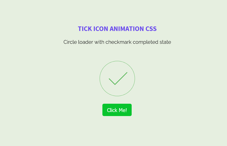
Our tutorial shows a circle loader with a button and when the user clicks on that button, it shows an animated checkmark completed state. To make such an animation, we used the CSS style property, which is very simple. We will use the CSS keyframes animation properties and a small Jquery function for the click button.
Build HTML Structure
To create the Tick animation, we need to create the circle loader along with a checkmark. For this, we created a parent div “circle-loader” and add a child div "checkmark draw" so it shows a circle and checkmark.
To handle the checkmark functionality through jQuery, later on, we created a button with ID "toggle". As for the button class "btn-success" will help us to style the button through CSS.
<div class="circle-loader">
    <div class="checkmark draw"></div>
</div>
<p><button id="toggle" type="button" class="btn-success">Click Me!</button></p>
Styling Tick Icon Animation
We will start with styling the .circle-loader where we will apply some general styles like adding margin, border, width, and height and apply some animation so the circle border looks cool. The loader-spin function of the circle will be handled through the keyframe. It will work like loading animation in a circle.
.circle-loader {
  margin-bottom: 3.5em;
  border: 1px solid rgba(0, 0, 0, 0.2);
  border-left-color: #5cb85c;
  animation: loader-spin 1.2s infinite linear;
  position: relative;
  display: inline-block;
  vertical-align: top;
  border-radius: 50%;
  width: 7em;
  height: 7em;
}
Next, we will style the .load-complete class that will be activated once the user clicks on the “Click Me!” button and the following style will be applied to the .circle-loader div.
.load-complete {
  -webkit-animation: none;
  animation: none;
  border-color: #5cb85c;
  transition: border 500ms ease-out;
}
The checkmark child div will stay display none and only be activated when you click on the button.
.checkmark {
  display: none;
}
But we will style and animate the checkmark div using the :after element.
.checkmark.draw:after {
  animation-duration: 800ms;
  animation-timing-function: ease;
  animation-name: checkmark;
  transform: scaleX(-1) rotate(135deg);
}
.checkmark:after {
  opacity: 1;
  height: 3.5em;
  width: 1.75em;
  transform-origin: left top;
  border-right: 3px solid #5cb85c;
  border-top: 3px solid #5cb85c;
  content: "";
  left: 1.75em;
  top: 3.5em;
  position: absolute;
}
For loader spin, we will rotate it using keyframes. And, To implement the checkmark animation, we will take the help of CSS keyframes again where we will define the checkmark div values for the height and width to show the checkmark in the circle.
@keyframes loader-spin {
  0% {
    transform: rotate(0deg);
  }
  100% {
    transform: rotate(360deg);
  }
}
@keyframes checkmark {
  0% {
    height: 0;
    width: 0;
    opacity: 1;
  }
  20% {
    height: 0;
    width: 1.75em;
    opacity: 1;
  }
  40% {
    height: 3.5em;
    width: 1.75em;
    opacity: 1;
  }
  100% {
    height: 3.5em;
    width: 1.75em;
    opacity: 1;
  }
}
Don’t forget to style the button as you want. We simply added a green background button and apply border-radius but you can customize it as you want.
.btn-success {
  background: #08c42e;
  border: none;
  color: #fff;
  font-size: 16px;
  padding: 10px 15px;
  border-radius: 5px;
	cursor: pointer;
}
Handle Button Through Js
In the end, you need to add the main jQuery file along with the following simple jQuery click function to handle the clicking functionality so the checkmark shows when the user toggles the button.
<script src="https://cdnjs.cloudflare.com/ajax/libs/jquery/2.1.3/jquery.min.js"></script>
<script>
$('#toggle').click(function() {
$('.circle-loader').toggleClass('load-complete');
$('.checkmark').toggle();
});
</script>
Conclusion
This is a simple tutorial for adding the Tick icon animation using CSS, HTML, and a little JS code to show the Checkmark inside the circle. You can customize the design and layout of the checkmark and circle by editing the CSS. Apply your own design and style that fit into your site design.