An animated button is an interactive way to quickly inform the users about the next process. It attracts the users as well as aware them about the next process is still loading. In this tutorial, you will come to know how to create an onclick button loading animation using HTML, CSS, and JS.
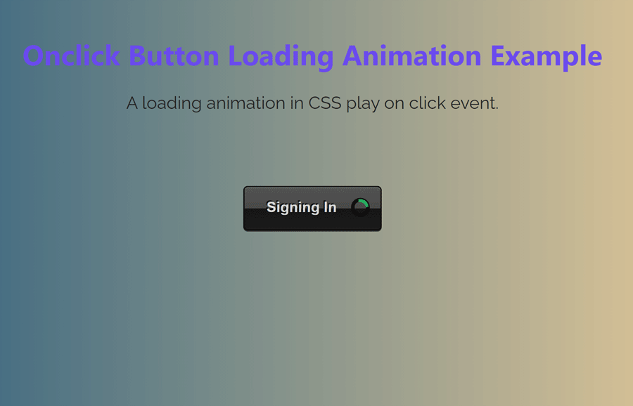
As you have seen in the above preview, there is a black button with a green spinner loader inside it. The spinner animates on the click event and after a certain time, the button comes back to its previous state. You can view the button animation in the following video:
Video Preview
The idea of button loading animation is very simple. We will create a button and spinner icon with CSS. We will keep the spinner in a separate class and add it to the button on the click event to display the loading animation. Similarly, we’ll change the button text and after a certain time period, we’ll remove the spinning class and set the previous button text.
The button and spinner color can be customized according to your needs. You can also check these CSS button styles to set the custom style for button animation.
The HTML Code
First of all, create the HTML button element with a class name "twoToneButton", wrap it into a div element and define its class name "twoToneCenter". Basically, the wrapper element is optional to align the button to the center.
<div class="twoToneCenter">

    <button class="twoToneButton">Sign In</button>

</div>
Place the above HTML code where you want to display the button. You can also create a hyperlink or virtual button by adding the class name "twoToneButton" to the anchor tag. Similarly, you can add this class name to your existing buttons in which you want to integrate loading animation.
CSS Styles for Button Loading Animation
In CSS, select the container class and define the text-align property with "center" value to align the button to the center of the page (or parent element). Similarly, define the margin property with the “1em 0” value to leave some space for the top and bottom of the button’s container
.twoToneCenter {
  text-align: center;
  margin: 1em 0;
}
After that, select the "twoToneButton" class and display it as an inline-block element. Use the CSS outline property with "none" value in order to remove the default button’s outline. Define the padding, line height, background, and color property with the mentioned values. Likewise, specify values for text-shadow, position, transition, and box-shadow as follows:
.twoToneButton {
  display: inline-block;
  outline: none;
  padding: 10px 20px;
  line-height: 1.4;
  background: #212121;
  background: linear-gradient(to bottom, #545454 0%, #474747 50%, #141414 51%, #1b1b1b 100%);
  border-radius: 4px;
  border: 1px solid #000000;
  color: #dadada;
  text-shadow: #000000 -1px -1px 0px;
  position: relative;
  transition: padding-right 0.3s ease;
  font-weight: 700;
  box-shadow: 0 1px 0 #6e6e6e inset, 0px 1px 0 #3b3b3b;
}
Now, target the button class with the hover pseudo-selector and define the box-shadow with inset values as follows:
.twoToneButton:hover {
  box-shadow: 0 0 10px #080808 inset, 0px 1px 0 #3b3b3b;
  color: #f3f3f3;
}
In the same way, select the button class with an active pseudo selector and define the box-shadow, color, and background as follows:
.twoToneButton:active {
  box-shadow: 0 0 10px #080808 inset, 0px 1px 0 #3b3b3b;
  color: #ffffff;
  background: #080808;
  background: linear-gradient(to bottom, #3b3b3b 0%, #2e2e2e 50%, #141414 51%, #080808 100%);
}
After defining the basic styles for the button, now it’s time to style the spinner loader inside the button. So, target the “spinning” class and define the background color. This class will be added to the button element onclick event and a loading spinner will be displayed inside the button.
.twoToneButton.spinning {
  background-color: #212121;
  padding-right: 40px;
}
Likewise, target the :after and :before pseudo-selector and define the content property with a blank value. Specify the right and top properties with 6px and 50% values respectively. Keep the 0 value for both width and height properties, define the box shadow, and set the absolute position. Use the CSS border radius with 50% value in order to make the circular spinner. Define the animation-name "rotate360" and exist with infinite linear forwards ease values.
.twoToneButton.spinning:after {
  content: '';
  right: 6px;
  top: 50%;
  width: 0;
  height: 0;
  box-shadow: 0px 0px 0 1px #080808;
  position: absolute;
  border-radius: 50%;
  -webkit-animation: rotate360 0.5s infinite linear, exist 0.1s forwards ease;
          animation: rotate360 0.5s infinite linear, exist 0.1s forwards ease;
}
.twoToneButton.spinning:before {
  content: "";
  width: 0px;
  height: 0px;
  border-radius: 50%;
  right: 6px;
  top: 50%;
  position: absolute;
  border: 2px solid #000000;
  border-right: 3px solid #27ae60;
  -webkit-animation: rotate360 0.5s infinite linear, exist 0.1s forwards ease;
          animation: rotate360 0.5s infinite linear, exist 0.1s forwards ease;
}
Finally, define the animation keyframes for the "rotate360" and "exist" animation as follows:
@-webkit-keyframes rotate360 {
  100% {
    transform: rotate(360deg);
  }
}
@keyframes rotate360 {
  100% {
    transform: rotate(360deg);
  }
}
@-webkit-keyframes exist {
  100% {
    width: 15px;
    height: 15px;
    margin: -8px 5px 0 0;
  }
}
@keyframes exist {
  100% {
    width: 15px;
    height: 15px;
    margin: -8px 5px 0 0;
  }
}
Button Loading Animation JS Function
After creating the HTML and CSS for the animated button, now it’s time to apply the spinner loading animation on the click event. To do so, we’ll use JavaScript click event and change the button inner HTML and a class name “spinning” to display a loader inside the button. On the other hand, we’ll use the JavaScript setTimeout function to remove the spinning class and inner HTML to take the button to its previous state. So, the following is the complete JS function to animate the button.
$(function(){

    var twoToneButton = document.querySelector('.twoToneButton');

    twoToneButton.addEventListener("click", function() {
        twoToneButton.innerHTML = "Signing In";
        twoToneButton.classList.add('spinning');

      setTimeout(
            function  (){
                twoToneButton.classList.remove('spinning');
                twoToneButton.innerHTML = "Sign In";

            }, 6000);
    }, false);

});
That’s all! I hope, you have successfully created a CSS onclick button loading animation. If you have any suggestions or questions, feel free to comment below. Happy coding 🙂