In the ever-evolving world of web design, the pursuit of eye-catching and dynamic effects is an ongoing endeavor. One such intriguing visual phenomenon is the Stack Glitch Effect, a captivating display that adds a touch of avant-garde flair to your website. Achieving this glitchy magic is a breeze, thanks to the simplicity of using only CSS.
Step1: HTML Structure Stacking Glitch In a Container
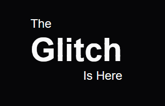
The HTML code represents a container with a glitch effect applied to the word “Glitch” within a stacked layout. The glitch intensity is controlled by the CSS variable (–stacks), and the phrase “Is Here” is positioned to the right of the glitched text.
<div class="container">
The
<div class="stack" style="--stacks: 3;">
<span style="--index: 0;">Glitch</span>
<span style="--index: 1;">Glitch</span>
<span style="--index: 2;">Glitch</span>
</div>
<span class="right">Is Here</span>
</div>
Step2: Styling With CSS
This CSS code defines a stylized glitch effect applied to a text stack within a container, utilizing advanced clip-path and keyframe animations. The dynamic glitch animation alternates between a visually impactful stack formation and a glitchy distortion, enhancing the visual appeal of the content.
* {
margin: 0;
padding: 0;
box-sizing: border-box;
}

:root {
--background: #060608;
--color: #FAFAFA;
}

html, body {
width: 100%;
height: 100%;
font-family: Arial;
}

body {
display: flex;
justify-content: center;
align-items: center;
background: var(--background);
}

.container {
color: var(--color);
font-size: 1.5rem;
display: flex;
flex-direction: column;
}

.right {
text-align: right;
width: 100%;
}

.stack {
display: grid;
grid-template-columns: 1fr;
}

.stack span {
font-weight: bold;
grid-row-start: 1;
grid-column-start: 1;
font-size: 4rem;
--stack-height: calc(100% / var(--stacks) - 1px);
--inverse-index: calc(calc(var(--stacks) - 1) - var(--index));
--clip-top: calc(var(--stack-height) * var(--index));
--clip-bottom: calc(var(--stack-height) * var(--inverse-index));
clip-path: inset(var(--clip-top) 0 var(--clip-bottom) 0);
animation: stack 340ms cubic-bezier(.46,.29,0,1.24) 1 backwards calc(var(--index) * 120ms), glitch 2s ease infinite 2s alternate-reverse;
}

.stack span:nth-child(odd) { --glitch-translate: 8px; }
.stack span:nth-child(even) { --glitch-translate: -8px; }

@keyframes stack {
0% {
opacity: 0;
transform: translateX(-50%);
text-shadow: -2px 3px 0 red, 2px -3px 0 blue;
};
60% {
opacity: 0.5;
transform: translateX(50%);
}
80% {
transform: none;
opacity: 1;
text-shadow: 2px -3px 0 red, -2px 3px 0 blue;
}
100% {
text-shadow: none;
}
}

@keyframes glitch {
0% {
text-shadow: -2px 3px 0 red, 2px -3px 0 blue;
transform: translate(var(--glitch-translate));
}
2% {
text-shadow: 2px -3px 0 red, -2px 3px 0 blue;
}
4%, 100% { text-shadow: none; transform: none; }
}
Stack Glitch Effect Using Pure CSS Demo
And there you have it a Stack Glitch Effect crafted solely with the power of CSS. This simple yet effective technique adds a futuristic and visually appealing touch to your web design, making your content stand out in the digital landscape.