Today, I will go through to take a look at how a button hovers animation work, the ones that slide out the text to show another piece of text with CSS. (You can show same or different text).
Building a nice and awesome effect always fun. If you have a website, You surely love to create something unique. CSS plays a very important role in making something unique.
When we talk about CSS, The CSS3 animation comes in our mind. We know that CSS3 allows us to create useful effects without touching JavaScript.
The animation we will use is a CSS transition property to create a slide down & up effect and it will work when mouse over the button.
When mousing over the button, The text ( By default hidden) will come up with a nice slide up animation. But when leaving a mouse, The text will hide with down animation.
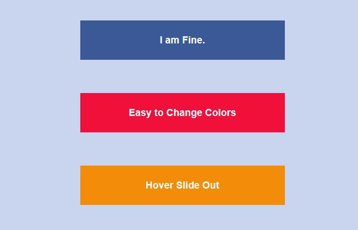
How to Create Hover Slide Out Text Effect with CSS
There are two sides of button, The first one shows always text but when hovering it — It shows another side of button with different text.
Actually, It’s not a regular button (anchor or input type) but it’s a div element which we did style in a way to look like a button.
We have created six different buttons with different color variations. You can pick which you like.
Let’s get started with HTML:
The HTML is simple and only consist of a div and two of Span tags. The div is our container and have a class slideout-anim-wrap and a class blue only use to add a different color.
You can use any of the following class for color
- blue
- yellow
- red
- green
- orange
- pink
<div class="slideout-anim-wrap blue">
  <span class="slide-anim-text">
    How are you?
  </span>
  <span>
    I am Fine.
  </span>
</div>
That’s pretty much it, the rest is all CSS.
Styling Explained
The height & width need to be specified. Make sure to set the overflow ** hidden ** so we are able to hide the ‘Back Side’ button.
The line-height of the font is et 4em but it may change according to height. We also added margin-bottom which you may not want to add it.
.slideout-anim-wrap {
  height: 64px;
  font: normal normal 700 1em/4em Arial,sans-serif;
  overflow: hidden;
  width: 100%;
  display: inline-block;
  margin-bottom: 3em;
}
We will use the CSS3 transitions (notice no need -o- prefix since opera now supports WebKit). Without transition, the button will just pop instead of slide.
.slideout-anim-wrap,
.slide-anim-text {
  -webkit-transition: 0.3s;
  -moz-transition: 0.3s;
  -ms-transition: 0.3s;
  transition: 0.3s;
}
To position the buttons vertically on above other, It is important to add ** Display block **. Added white color for text and make it center.
.slideout-anim-wrap span {
  color: white;
  text-decoration: none;
  text-align: center;
  display: block;
}
This piece of code makes the first text move up when you hover over the button.
.slideout-anim-wrap:hover
.slide-anim-text{
  margin-top: -4em;
}
optional but it will add some nice effect to add background color on hover.
.blue:hover{
  background-color: #5082ec;
}
That’s pretty easy and simple. Nothing special. You can check out a demo and download the final source.