Do you know jQuery slide down and slide up? That’s what I am going to do. By using transition property, we can easily create CSS Transition Slide Down & Slide up effect.
I will use a purely CSS transition to make the slide down/up effect.
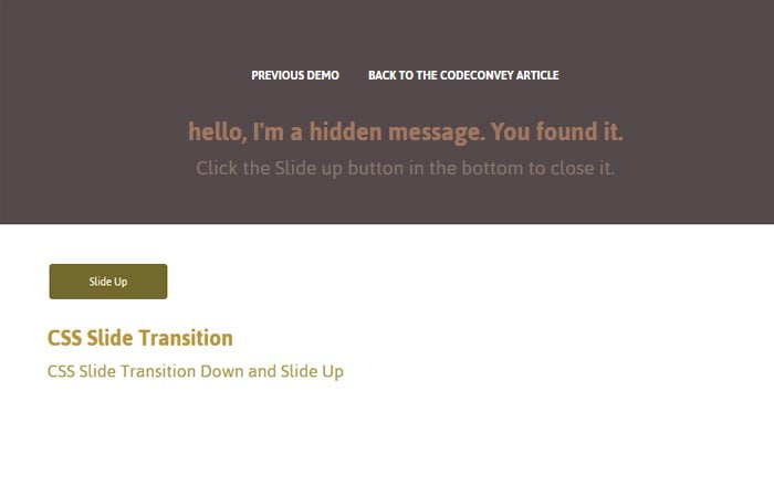
I am going to make sliding transition effects that hide or show the div one clicked. It can be handled with one toggle button.
If I can stay away from JavaScript for animations, I’m amazingly happy and motivated to take action. That’s better, do not require a JavaScript platform to control steps. It works in a pretty nice way and shows the content when to click on down button else it keeps the content hidden.
The very common function of jQuery you may have used for transition Slide Down & Up is .slideDown() and .slideUp() to do this type of things.
But if you will try to run this method, you’ll find that the animation is pretty jerky as it runs without hardware rendering assistance using only the CPU rather than the GPU.
The CSS transitions are a great way to replace with CSS animations that provide smooth animation on page load slower devices and computer systems assuming you’re owning a browser that’s relatively recent. Most CSS transitions are a breeze to generate and use.
How to Create CSS Transition Slide Down & Slide up Effect
First, we need to define checkbox that will function like toggle which means that it will play two functions up and down.
We also define label here but we will not add label text because we want to make it a button.
<input type="checkbox" name="toggle" id="toggle" />
<label for="toggle"></label>
Next, we need to define a div that shows the content so we here define div class name .message. It will animate slide down or up. You can add content in this div and style as you want.
<div class="message"> CONTENT GOES HERE </div>
Sliding Styling
Ok, so let’s first take a look the toggle button and as we know we are using input type checkbox. We make that checkbox hide and handle the clicking functionality through label which we have defined just right below the checkbox.
Our checkbox with ID #toggle is set to absolute position and the value of left and top are -100%. These both values allow us to hide the checkbox from the body of the page.
#toggle {
  position: absolute;
  appearance: none;
  cursor: pointer;
  left: -100%;
  top: -100%;
}
Next, The label will take place of that checkbox and the position will also absolute for it. More, we do a few basic styles to make the button look good.
We added the nice background color, hide the default border and add some padding. We also did a few more, you can see such basic style in below CSS code.
#toggle + label {
  position: absolute;
  cursor: pointer;
  padding: 10px;
  background: #000;
  width: 100px;
  border-radius: 3px;
  padding: 8px 10px;
  color: #FFF;
  line-height: 20px;
  font-size: 12px;
  text-align: center;
  -webkit-font-smoothing: antialiased;
  cursor: pointer;
  margin: 20px 50px;
  transition: all 500ms ease;
}
To add text to a button, we find an easy way by using :afer selector and add content""; element.
#toggle + label:after {
  content: "Slide Down"
}
When we click on a button, we want the slide container goes down/up with nice animation. Remember this container define just right below the toggle button.
.slidecontainer {
  transition: margin 300ms cubic-bezier(0.17, 0.04, 0.03, 0.94);
  padding: 5em 3em;
}
#toggle:checked ~ .message {
  top: 0;
}
#toggle:checked ~ .slidecontainer {
  margin-top: 250px;
}
#toggle:checked + label {
  background: #54494b;
}
What should happen when a button is checked? It should change the text, right? So we have simply used the same approach as we did above.
#toggle:checked + label:after {
  content: "Slide Up"
}
What is a CSS slide div on click? It’s div class name message which shows/hide when clicking on the toggle button.
We did a few basic styling including background, color, height, and padding. The important thing to add some transition so it will come and goes nicely.
But wait, there is something more important is to add the position absolute. This will help us to hide the message box by default and we use top -250px to hide it. Actually, it will go out of the body page about -250px and when we click it will come back again.
You also make sure the height should be equal to the top or at least roundabout. If the height is auto, it will still open but you will see some white space underneath the message box.
.message {
    background: #54494b none repeat scroll 0 0;
    box-sizing: border-box;
    color: #fff;
    height: 230px;
    left: 0;
    overflow: hidden;
    padding: 2em;
    position: absolute;
    top: -250px;
    transition: top 300ms cubic-bezier(0.17, 0.04, 0.03, 0.94) 0s;
    width: 100%;
}
.message h1 {
  color: #FFF;
}
I finished with making such a nice effect which can be added to the header of a website or you can also add in the footer by just doing customization.
Download complete source code and see the demo for a live version. Let’s start an experiment with it and make it nicer.