Today we have easy to understand tutorial about creating a simple HTML photo gallery with complete source code. I also prepare a demo so you can take a look.
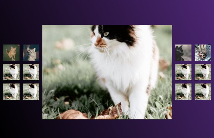
It’s a well-organized gallery with example. It included a great feature which replaces the main photo of the gallery when you click on thumbnails.
We know that it’s normally only possible with Javascript or jQuery but here we will do with CSS only without even touching any script.
To make work the click events, we will take the help of CSS3 :checked. We will create a series of radio buttons which will be by default hidden and control through CSS.
Furthermore, I will create a unique layout which is possible with CSS grid. The gallery will have thumbnails on the left and right side of the container but the main image will be showcased in the center of the page.
You may be thinking about how it will look like on mobile, right? An HTML photo gallery will look really awesome on mobile and smaller devices and its layout will provide you a totally different experience.
I’ll take help of “grid-template-columnsgrid-template-rows" which switch the layout so the main image will be staying in the center but both sides thumbnails will go just right below it.
This makes it look great and offer you extraordinary user experience while viewing on the smaller screen.
I am sure, you will enjoy this Simple CSS Image Gallery and love its design & simplicity of code. Without further talking, Let’s go through to see how we can do HTML & CSS code.
How to Code Simple HTML Photo Gallery
Now the most important part of this tutorial start. We will first see how we can handle the click function and for this, I will use the radio buttons.
All of these radio buttons will be hidden though CSS and will be handle though :checked CSS3 element.
<input class="gallery__select" type="radio" name="gallery-select" id="0" checked="checked"/>
<input class="gallery__select" type="radio" name="gallery-select" id="1"/>
<input class="gallery__select" type="radio" name="gallery-select" id="2"/>
<input class="gallery__select" type="radio" name="gallery-select" id="3"/>
<input class="gallery__select" type="radio" name="gallery-select" id="4"/>
<input class="gallery__select" type="radio" name="gallery-select" id="5"/>
<input class="gallery__select" type="radio" name="gallery-select" id="6"/>
<input class="gallery__select" type="radio" name="gallery-select" id="7"/>
<input class="gallery__select" type="radio" name="gallery-select" id="8"/>
<input class="gallery__select" type="radio" name="gallery-select" id="9"/>
<input class="gallery__select" type="radio" name="gallery-select" id="10"/>
<input class="gallery__select" type="radio" name="gallery-select" id="11"/>
<input class="gallery__select" type="radio" name="gallery-select" id="12"/>
Now our acutally gallery code starts here. We have a main div element with the class gallery. Inside the main div, I have place two additional div which class names are gallery__filler. These are only used for adding extra spaces above the thumbnails.
The last thing we will define the images inside the label. Each label control though the above radio buttons so we will keep the same class name gallery__item for each label.
<div class="gallery"> <div class="gallery__filler"></div> <div class="gallery__filler"></div> <label class="gallery__item" for="0"> <img src="https://source.unsplash.com/random/400x400?bear,cat&v=18" alt="Something random"/> </label> <label class="gallery__item" for="1"><img src="https://source.unsplash.com/random/400x400?bear,cat&v=3" alt="Something random"/></label> <label class="gallery__item" for="2"><img src="https://source.unsplash.com/random/400x400?bear,cat&v=4" alt="Something random"/></label> <label class="gallery__item" for="3"><img src="https://source.unsplash.com/random/400x400?bear,cat&v=20" alt="Something random"/></label> <label class="gallery__item" for="4"><img src="https://source.unsplash.com/random/400x400?bear,cat&v=9" alt="Something random"/></label> <label class="gallery__item" for="5"><img src="https://source.unsplash.com/random/400x400?bear,cat&v=16" alt="Something random"/></label> <label class="gallery__item" for="6"><img src="https://source.unsplash.com/random/400x400?bear,cat&v=15" alt="Something random"/></label> <label class="gallery__item" for="7"><img src="https://source.unsplash.com/random/400x400?bear,cat&v=9" alt="Something random"/></label> <label class="gallery__item" for="8"><img src="https://source.unsplash.com/random/400x400?bear,cat&v=25" alt="Something random"/></label> <label class="gallery__item" for="9"><img src="https://source.unsplash.com/random/400x400?bear,cat&v=12" alt="Something random"/></label> <label class="gallery__item" for="10"><img src="https://source.unsplash.com/random/400x400?bear,cat&v=11" alt="Something random"/></label> <label class="gallery__item" for="11"><img src="https://source.unsplash.com/random/400x400?bear,cat&v=12" alt="Something random"/></label> <label class="gallery__item" for="12"><img src="https://source.unsplash.com/random/400x400?bear,cat&v=23" alt="Something random"/></label> </div>
Apply CSS Styles
Let’s apply styles over the gallery to make it work with CSS only. We will start with a basic style.
* {
  box-sizing: border-box;
  -webkit-animation: fadeIn 0.5s;
          animation: fadeIn 0.5s;
}
body {
  background: linear-gradient(65deg, #000, #000 20%, #639);
  display: grid;
  width: 100vw;
  padding-top: 20px;
  margin: 0;
}
img {
  height: 100%;
  width: 100%;
  min-height: 50px;
  -o-object-fit: cover;
     object-fit: cover;
}
.gallery {
  display: grid;
  justify-content: center;
  grid-gap: 20px;
  grid-template-columns: repeat(2, 100px) minmax(200px, 800px) repeat(2, 100px);
  grid-template-rows: repeat(5, 100px);
}
.gallery__item {
  cursor: pointer;
  border-radius: 5px;
  grid-row: span 1;
  grid-column: span 1;
  transition: -webkit-transform 0.1s ease-in-out;
  transition: transform 0.1s ease-in-out;
  transition: transform 0.1s ease-in-out, -webkit-transform 0.1s ease-in-out;
}
.gallery__item:hover {
  -webkit-transform: scale(1.1) rotate(5deg);
          transform: scale(1.1) rotate(5deg);
}
.gallery__select {
  display: none;
}
.gallery__select:nth-of-type(1):checked ~ .gallery .gallery__item:nth-of-type(1) {
  cursor: default;
  display: grid;
  align-items: center;
  grid-row: 1/-1;
  grid-column: 3;
}
.gallery__select:nth-of-type(1):checked ~ .gallery .gallery__item:nth-of-type(1):hover {
  -webkit-transform: none;
          transform: none;
}
Finally, we have CSS for handling each image using the :checked. Also, media queries help us to make it work on the smaller viewport.
@media (max-width: 768px) {
  .gallery {
    grid-gap: 10px;
    grid-template-columns: repeat(auto-fit, 50px);
    grid-template-rows: 300px repeat(auto-fit, 50px);
  }
}
.gallery__filler {
  grid-column: span 2;
}
@media (max-width: 768px) {
  .gallery__filler {
    display: none;
  }
}
@media (min-width: 768px) {
  body {
    align-content: center;
    padding: 20px;
  }
}

@media (max-width: 768px) {
  .gallery__select:nth-of-type(1):checked ~ .gallery .gallery__item:nth-of-type(1) {
    grid-row: 1/-3;
    grid-column: 1/-1;
  }
}
.gallery__select:nth-of-type(2):checked ~ .gallery .gallery__item:nth-of-type(2) {
  cursor: default;
  display: grid;
  align-items: center;
  grid-row: 1/-1;
  grid-column: 3;
}
.gallery__select:nth-of-type(2):checked ~ .gallery .gallery__item:nth-of-type(2):hover {
  -webkit-transform: none;
          transform: none;
}
@media (max-width: 768px) {
  .gallery__select:nth-of-type(2):checked ~ .gallery .gallery__item:nth-of-type(2) {
    grid-row: 1/-3;
    grid-column: 1/-1;
  }
}
.gallery__select:nth-of-type(3):checked ~ .gallery .gallery__item:nth-of-type(3) {
  cursor: default;
  display: grid;
  align-items: center;
  grid-row: 1/-1;
  grid-column: 3;
}
.gallery__select:nth-of-type(3):checked ~ .gallery .gallery__item:nth-of-type(3):hover {
  -webkit-transform: none;
          transform: none;
}
@media (max-width: 768px) {
  .gallery__select:nth-of-type(3):checked ~ .gallery .gallery__item:nth-of-type(3) {
    grid-row: 1/-3;
    grid-column: 1/-1;
  }
}
.gallery__select:nth-of-type(4):checked ~ .gallery .gallery__item:nth-of-type(4) {
  cursor: default;
  display: grid;
  align-items: center;
  grid-row: 1/-1;
  grid-column: 3;
}
.gallery__select:nth-of-type(4):checked ~ .gallery .gallery__item:nth-of-type(4):hover {
  -webkit-transform: none;
          transform: none;
}
@media (max-width: 768px) {
  .gallery__select:nth-of-type(4):checked ~ .gallery .gallery__item:nth-of-type(4) {
    grid-row: 1/-3;
    grid-column: 1/-1;
  }
}
.gallery__select:nth-of-type(5):checked ~ .gallery .gallery__item:nth-of-type(5) {
  cursor: default;
  display: grid;
  align-items: center;
  grid-row: 1/-1;
  grid-column: 3;
}
.gallery__select:nth-of-type(5):checked ~ .gallery .gallery__item:nth-of-type(5):hover {
  -webkit-transform: none;
          transform: none;
}
@media (max-width: 768px) {
  .gallery__select:nth-of-type(5):checked ~ .gallery .gallery__item:nth-of-type(5) {
    grid-row: 1/-3;
    grid-column: 1/-1;
  }
}
.gallery__select:nth-of-type(6):checked ~ .gallery .gallery__item:nth-of-type(6) {
  cursor: default;
  display: grid;
  align-items: center;
  grid-row: 1/-1;
  grid-column: 3;
}
.gallery__select:nth-of-type(6):checked ~ .gallery .gallery__item:nth-of-type(6):hover {
  -webkit-transform: none;
          transform: none;
}
@media (max-width: 768px) {
  .gallery__select:nth-of-type(6):checked ~ .gallery .gallery__item:nth-of-type(6) {
    grid-row: 1/-3;
    grid-column: 1/-1;
  }
}
.gallery__select:nth-of-type(7):checked ~ .gallery .gallery__item:nth-of-type(7) {
  cursor: default;
  display: grid;
  align-items: center;
  grid-row: 1/-1;
  grid-column: 3;
}
.gallery__select:nth-of-type(7):checked ~ .gallery .gallery__item:nth-of-type(7):hover {
  -webkit-transform: none;
          transform: none;
}
@media (max-width: 768px) {
  .gallery__select:nth-of-type(7):checked ~ .gallery .gallery__item:nth-of-type(7) {
    grid-row: 1/-3;
    grid-column: 1/-1;
  }
}
.gallery__select:nth-of-type(8):checked ~ .gallery .gallery__item:nth-of-type(8) {
  cursor: default;
  display: grid;
  align-items: center;
  grid-row: 1/-1;
  grid-column: 3;
}
.gallery__select:nth-of-type(8):checked ~ .gallery .gallery__item:nth-of-type(8):hover {
  -webkit-transform: none;
          transform: none;
}
@media (max-width: 768px) {
  .gallery__select:nth-of-type(8):checked ~ .gallery .gallery__item:nth-of-type(8) {
    grid-row: 1/-3;
    grid-column: 1/-1;
  }
}
.gallery__select:nth-of-type(9):checked ~ .gallery .gallery__item:nth-of-type(9) {
  cursor: default;
  display: grid;
  align-items: center;
  grid-row: 1/-1;
  grid-column: 3;
}
.gallery__select:nth-of-type(9):checked ~ .gallery .gallery__item:nth-of-type(9):hover {
  -webkit-transform: none;
          transform: none;
}
@media (max-width: 768px) {
  .gallery__select:nth-of-type(9):checked ~ .gallery .gallery__item:nth-of-type(9) {
    grid-row: 1/-3;
    grid-column: 1/-1;
  }
}
.gallery__select:nth-of-type(10):checked ~ .gallery .gallery__item:nth-of-type(10) {
  cursor: default;
  display: grid;
  align-items: center;
  grid-row: 1/-1;
  grid-column: 3;
}
.gallery__select:nth-of-type(10):checked ~ .gallery .gallery__item:nth-of-type(10):hover {
  -webkit-transform: none;
          transform: none;
}
@media (max-width: 768px) {
  .gallery__select:nth-of-type(10):checked ~ .gallery .gallery__item:nth-of-type(10) {
    grid-row: 1/-3;
    grid-column: 1/-1;
  }
}
.gallery__select:nth-of-type(11):checked ~ .gallery .gallery__item:nth-of-type(11) {
  cursor: default;
  display: grid;
  align-items: center;
  grid-row: 1/-1;
  grid-column: 3;
}
.gallery__select:nth-of-type(11):checked ~ .gallery .gallery__item:nth-of-type(11):hover {
  -webkit-transform: none;
          transform: none;
}
@media (max-width: 768px) {
  .gallery__select:nth-of-type(11):checked ~ .gallery .gallery__item:nth-of-type(11) {
    grid-row: 1/-3;
    grid-column: 1/-1;
  }
}
.gallery__select:nth-of-type(12):checked ~ .gallery .gallery__item:nth-of-type(12) {
  cursor: default;
  display: grid;
  align-items: center;
  grid-row: 1/-1;
  grid-column: 3;
}
.gallery__select:nth-of-type(12):checked ~ .gallery .gallery__item:nth-of-type(12):hover {
  -webkit-transform: none;
          transform: none;
}
@media (max-width: 768px) {
  .gallery__select:nth-of-type(12):checked ~ .gallery .gallery__item:nth-of-type(12) {
    grid-row: 1/-3;
    grid-column: 1/-1;
  }
}
.gallery__select:nth-of-type(13):checked ~ .gallery .gallery__item:nth-of-type(13) {
  cursor: default;
  display: grid;
  align-items: center;
  grid-row: 1/-1;
  grid-column: 3;
}
.gallery__select:nth-of-type(13):checked ~ .gallery .gallery__item:nth-of-type(13):hover {
  -webkit-transform: none;
          transform: none;
}
@media (max-width: 768px) {
  .gallery__select:nth-of-type(13):checked ~ .gallery .gallery__item:nth-of-type(13) {
    grid-row: 1/-3;
    grid-column: 1/-1;
  }
}
@-webkit-keyframes fadeIn {
  from {
    opacity: 0;
  }
  to {
    opacity: 1;
  }
}
@keyframes fadeIn {
  from {
    opacity: 0;
  }
  to {
    opacity: 1;
  }
}
That’s It.