A timeline is a presentation of major events arranged in a sequence in which they happened. This is a useful component to display all achievements/goals with a certain time period. A timeline may be in horizontal or vertical format in regards to layout to mention time and description. In this tutorial, you’ll come to know how to create a simple horizontal timeline using HTML and CSS.
Although, it is a pure CSS timeline it can be easily handled in JavaScript as the years and descriptions are written in HTML5 data-attribute. So, you can also set timeline data dynamically. On the other hand, you can highly customize the timeline style by changing CSS values.
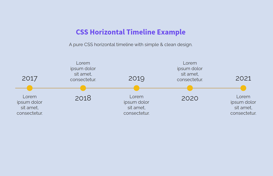
Another idea to show images based timeline is an autoplay slideshow with text that you can also consider if it fulfill your needs. Anyhow, have a look at the demo page to check this timeline in action before starting with coding.
Horizontal Timeline Preview
HTML Structure for Horizontal Timeline
In HTML, create a ul element with a class name “timeline” and place each list item with data-year & data-text attributes. Place the time period inside the "data-year" attribute and write the description inside the "data-text" attribute. Besides that, leave the li element blank.
<ul class="timeline">
	<li data-year="2017" data-text="Lorem ipsum dolor sit amet, consectetur."></li>
	<li data-year="2018" data-text="Lorem ipsum dolor sit amet, consectetur."></li>
	<li data-year="2019" data-text="Lorem ipsum dolor sit amet, consectetur."></li>
	<li data-year="2020" data-text="Lorem ipsum dolor sit amet, consectetur."></li>
	<li data-year="2021" data-text="Lorem ipsum dolor sit amet, consectetur."></li>
</ul>
You can place the above timeline HTML structure anywhere on your webpage. Similarly, you can also wrap it inside a container for further customization.
The CSS Styles
The "timeline" class (for ul element) acts as a container for the timeline. So, define its width and height as 800px and 20px respectively. Likewise, define a background color and justify the text using CSS text-align property. In order to hide the default list bullets use the list-style none property.
.timeline {
	width:800px;
	height: 20px;
	list-style: none;
	text-align: justify;
	margin: 80px auto;
	background: -webkit-gradient(left top, left bottom, color-stop(0%, rgba(255,255,255,0)), color-stop(45%, rgba(255,255,255,0)), color-stop(51%, rgba(191,128,11,1)), color-stop(57%, rgba(255,255,255,0)), color-stop(100%, rgba(255,255,255,0)));
	background: linear-gradient(to bottom, rgba(255,255,255,0) 0%, rgba(255,255,255,0) 45%, rgba(191,128,11,1) 51%, rgba(255,255,255,0) 57%, rgba(255,255,255,0) 100%);
}
Now, target the timeline class with after pseudo selector and define the 100% width along with the display inline-block property to make the horizontal layout.
.timeline:after {
    display: inline-block;
    content: "";
    width: 100%;
}
The li element indicates the circular bullets for time and description. So, define 20px height & width along with 50% border-radius property. Similarly, define its relative position and background color. Place the data-year attribute inside the content property by targeting the li before selector. Keep the absolute position and specify font-size according to your needs.
.timeline li {
	display: inline-block;
	width: 20px;
	height: 20px;
	background: #F2BB13;
	text-align: center;
	line-height: 1.2;
	position: relative;
	border-radius: 50%;
}
.timeline li:before {
	display: inline-block;
	content: attr(data-year);
	font-size: 26px;
	position: absolute;
	left: 50%;
	transform: translateX(-50%);
}
To show the year top and bottom of the line, use the nth-child odd and even selector. Set the -40px value for top and bottom property as follows:
.timeline li:nth-child(odd):before {
	top: -40px;
}
.timeline li:nth-child(even):before {
	bottom: -40px;
}
As we placed the years in the data-year attribute, now it’s time to show the years using the CSS content property.
.timeline li:after {
	display: inline-block;
	content: attr(data-text);
	font-size: 16px;
	position: absolute;
	left: 50%;
	transform: translateX(-50%);
}
Finally, define the following CSS styles for adjusting the description text. You can also define a different colors (or styles) for top and bottom text according to your needs.
.timeline li:nth-child(odd):after {
	bottom: 0;
	margin-bottom: -10px;
	transform: translate(-50%, 100%);
}
.timeline li:nth-child(even):after {
	top: 0;
	margin-top: -10px;
	transform: translate(-50%, -100%);
}
That’s all! I hope you have successfully created a simple horizontal timeline with the help of this CSS snippet. If you have any questions or suggestions, let me know by comment below.
Thank you. How can i make it responsive?
I have the same question. How to make it responsive and show perfectly even in a mobile view?
Hi Mike, you need to use media queries to make it responsive.