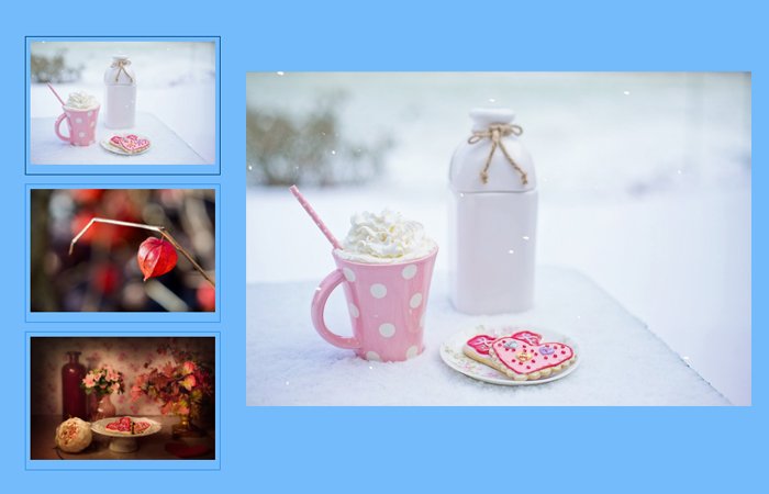
Are you looking for a gallery with CSS only? In this post, I will create a simple responsive CSS image gallery with thumbnails and minimal HTML code.
This gallery work when a user click on thumbnail and all the thumbnail are on the left side vertically added. The main picture of a gallery located on the right side. When a user clicks on a thumbnail, the main picture changes according to the thumbnail.
This picture gallery looks greater in design and works on click event like when the user clicks on a thumbnail, it will change the main image.
You might also Like: Simple CSS Image Gallery with Captions
The click event is something fascinating and can only achievable using Javascript. But here we will achieve the click event using CSS3.
By using the CSS3 :checked and ~ element, we can easily make the on-click event. The CSS3 is powerful and remove the limitation to building whatever you want.
How to Create Simple Responsive CSS Image Gallery with Thumbnails
This simple gallery also has another greater feature is active states. It shows the different border color around the thumbnail for the active thumbnail.
This lets the user know the active state of an image.
It is a lightweight gallery which doesn’t require any javascript. It is easy to customize and allow to add images and thumbnails.
Basic HTML Markup
The gallery consists of two types of blocks. One block contains thumbnails, and the second one has large images. We have the place all the content inside the main container .mage-gallery
Each thumbnail defines within the label HTML5 element and control through the input type radio button.
The radio button has a unique ID to control each image. The large image inset inside the section with the unique ID.
<div class="image-gallery">
  <input id="tab1" type="radio" name="tabs" checked>
  <label for="tab1"><img width="100" height="100" src="https://cdn.pixabay.com/photo/2017/01/02/09/43/chinese-lantern-plant-1946358_960_720.jpg"></label>
  <section id="content1">
    <img src="https://cdn.pixabay.com/photo/2017/01/02/09/43/chinese-lantern-plant-1946358_960_720.jpg">
  </section>
</div>
Let’s Start Styling
To make gallery work, we are going to use two CSS property. The first one is display: flex; and second one flex-flow: column wrap;
.image-gallery {
  	display: flex;
    flex-flow: column wrap;
    height: 600px;
    margin: 0 auto;
    max-width: 800px;
    min-width: 320px;
}
i) By Default Hide Main Image
All the sections of large are by default display: none;
.image-gallery section {
    display: none;
    margin-left: 20px;
    width: 100%;
}
.image-gallery section img{
  height: auto;
    max-width: 100%;
}
ii) Hiding Radio Buttons
We don’t need to show the radio button, and just want to use its functionality, so we make it hide.
.image-gallery input {
  display: none;
}
iii) Styling Lables
You can style the label as you want.
.image-gallery label {
    border: 1px solid #3194ee;
    margin: 0 0 10px;
    padding: 5px;
    text-align: center;
    width: 20%;
}
.image-gallery label:hover {
  cursor: pointer;
}
.image-gallery label img {
    height: auto;
    width: 100%;
}
iv) Active Thumbnail
You can design active thumbnail differently.
.image-gallery input:checked + label {
  border: 1px solid #004481;
  padding: 5px;
}
v) Show Main Image
The display: block; property will work when any thumbnail checked.
.image-gallery #tab1:checked ~ #content1,
.image-gallery #tab2:checked ~ #content2,
.image-gallery #tab3:checked ~ #content3 {
  display: block;
}
Now the gallery is ready to implement on the live site. You can take a look the demo to see how it work and download source code.
