A well-designed website can capture attention and leave a lasting impression. But have you ever thought about adding a little flair to your email forms? An animated send button can be a surprising way to boost engagement and make your emails more interactive.
In this post, we’ll walk you through the steps of creating an eye-catching animated send button using just HTML and CSS.
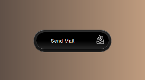
Step1: Send Mail Button
This code snippet creates a styled “Send Mail” button composed of multiple elements, including a backdrop, text label, and an SVG icon depicting an envelope. The button is designed to provide visual feedback and enhance user interaction with a distinct graphical representation.
<button>
<span class="backdrop">
<span class="action"></span>
</span>
<span class="text">
Send Mail
</span>
<span class="icon">
<svg xmlns="http://www.w3.org/2000/svg" fill="none" viewBox="0 0 24 24" stroke-width="1.5" stroke="currentColor">
<!-- Tray -->
<path stroke-linecap="round" stroke-linejoin="round" d="M2.25 13.5h3.86a2.25 2.25 0 012.012 1.244l.256.512a2.25 2.25 0 002.013 1.244h3.218a2.25 2.25 0 002.013-1.244l.256-.512a2.25 2.25 0 012.013-1.244h3.859m-19.5.338V18a2.25 2.25 0 002.25 2.25h15A2.25 2.25 0 0021.75 18v-4.162c0-.224-.034-.447-.1-.661L19.24 5.338a2.25 2.25 0 00-2.15-1.588H6.911a2.25 2.25 0 00-2.15 1.588L2.35 13.177a2.25 2.25 0 00-.1.661z" />
<!-- Envelope -->
<path stroke-linecap="round" stroke-linejoin="round" d="M21.75 6.75v10.5a2.25 2.25 0 01-2.25 2.25h-15a2.25 2.25 0 01-2.25-2.25V6.75m19.5 0A2.25 2.25 0 0019.5 4.5h-15a2.25 2.25 0 00-2.25 2.25m19.5 0v.243a2.25 2.25 0 01-1.07 1.916l-7.5 4.615a2.25 2.25 0 01-2.36 0L3.32 8.91a2.25 2.25 0 01-1.07-1.916V6.75" />
</svg>
</span>
</button>
Step2: Button Design with CS
This CSS code meticulously styles a button with sophisticated visual effects, incorporating an animated SVG icon, dynamic hover and focus states, and a custom font. It leverages gradients, shadows, and transitions to create a visually appealing and interactive user interface component.
@font-face {
font-family: "Geist Sans";
src: url("https://assets.codepen.io/605876/GeistVF.ttf") format("truetype");
}
* {
box-sizing: border-box;
}
:root {
--speed: 0.25s;
}
body {
display: grid;
place-items: center;
min-height: 100vh;
background: hsl(0 0% 4%);
font-family: "Geist Sans", sans-serif;
background: linear-gradient(to right, #312b2b, #eec19a) !important
}
button {
cursor: pointer;
position: relative;
display: flex;
border: 1px solid hsl(0 0% 100% / 0.25);
border-radius: 100px;
overflow: hidden;
display: grid;
grid-template-columns: auto 3.5em;
gap: 1.5em;
font-family: "Geist Sans", sans-serif;
font-weight: 80;
background:
hsl(280 0% 12%);
color: hsl(0 0% 90%);
padding: 0.5em 0.5em 0.5em 1.5em;
place-items: center;
box-shadow:
0 1px inset hsl(0 0% 100% / 0.5),
0 -10px 20px 10px hsl(0 0% 0% / 0.5) inset,
0 10px 20px 10px hsl(0 0% 50% / 0.25) inset,
0 1px hsl(0 0% 2% / 0.75);
letter-spacing: 0.05ch;
}
button:focus-visible {
outline-offset: 0.5em;
outline-color: hsl(280 80% 80% / 0.5);
}
.icon {
width: 100%;
aspect-ratio: 1;
border-radius: 100%;
}
.backdrop {
position: absolute;
inset: 0.5em;
}
.icon {
overflow: hidden;
}
.icon svg {
width: 50%;
overflow: visible !important;
}
svg path:nth-of-type(2) {
transform-box: fill-box;
transform-origin: 50% 50%;
transition:
fill var(--speed),
rotate var(--speed),
scale var(--speed),
translate var(--speed);
}
svg path:nth-of-type(1) {
translate: 5rem 0;
transform-box: fill-box;
transition: translate var(--speed);
opacity: 0.75;
}
button:is(:hover, :focus-visible) svg path:nth-of-type(2) {
translate: 0 -50%;
rotate: 290deg;
scale: 0.65;
fill: hsl(0 0% 20%);
transition-timing-function: ease, ease, cubic-bezier(.2, .7, .9, 1.5);
}
button:is(:hover, :focus-visible) svg path:nth-of-type(1) {
translate: 0 0;
}
.action {
position: absolute;
right: 0;
height: 100%;
background:
linear-gradient(transparent 50%, hsl(0 0% 30% / 0.5)),
hsl(0 0% 0%);
box-shadow: 0 -1px inset hsl(0 0% 100% / 0.35);
width: 3.5em;
aspect-ratio: 1;
transition: width var(--speed);
border-radius: 100px;
}
.icon {
color: hsl(0 0% 90%);
display: grid;
place-items: center;
z-index: 2;
}
.text {
display: inline-block;
z-index: 2;
padding: 0 2rem;
}
button:is(:hover, :focus-visible) .action {
width: 100%;
}
Send Mail with Style: How to Create an Animated Button Using HTML and CSS Demo
And there you have it! With just a few lines of HTML and CSS, you’ve created an animated “Send Mail” button that responds to hover and click events, enhancing the interactive experience of your webpage.