Nowadays, there is a trend of Google Material design in both mobile apps and web designing. This designing framework comes with many animation effects, one of them is a ripple effect. Basically, the Materialize (web version of Material Design) is a JavaScript and CSS based framework. Thus, the ripple effect also requires JavaScript to reveal on click event. But in this tutorial, we are going to create the same ripple effect using pure CSS that will reveal on button click.
Yup! it will work just like the Material Design ripple effect, you may check the final output on the demo page. You may wonder to hear that it’s all done by using CSS animations. So, how is a ripple effect working on click event without using JavaScript? simply using CSS- :active pseudo-selector.
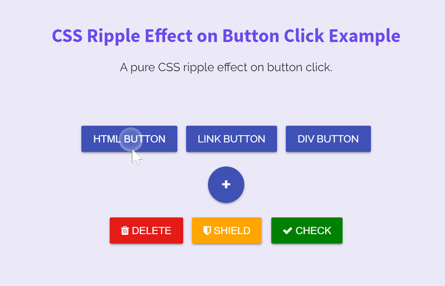
As you have seen on the above image (or on the demo page), there are multiple button types on which you can apply the ripple effect. Whether you are creating an HTML button element or a virtual button (hyperlink, div or span button), you are able to implement a ripple effect on all kinds of HTML elements. So, let’s begin creating the ripple effect.
HTML for Button to use CSS Ripple Effect
In HTML, we just need a button element with two necessary class names (“button” and “ripple”). Inside the button tag, you can put any text according to your needs. Besides this, you can attach any other id or extra class name as your requirements. However, the ripple effect just needs the following HTML structure to work.
<button class="button ripple">HTML Button</button>
Similarly, if you want to convert your hyperlink into a button, simply add above mentioned class names in it.
<a href="#1" class="button ripple"> Link Button</a>
Likewise, you can also create a virtual button by adding the “button ripple” class names to any HTML element. The following are examples of div and span buttons.
<div class="button ripple"> Div Button </div>
<span class="button ripple"> span Button </span>
The CSS styles for ripple
Now, its time to define styles for the button element. Here, the most important thing is the position and overflow values (keep them as it is). Anyhow, the other properties can be modified according to your desired output.
.button {
  position: relative;
  display: inline-block;
  height: 36px;
  padding: 0 16px;
  margin: 10px 4px;
  background-color: #3f51b5;
  color: #fff;
  border: 0;
  border-radius: 2px;
  box-shadow: 0 2px 2px 0 rgba(0, 0, 0, 0.14), 0 3px 1px -2px rgba(0, 0, 0, 0.2), 0 1px 5px 0 rgba(0, 0, 0, 0.12);
  text-decoration: none;
  text-transform: uppercase;
  font-size: 14px;
  font-weight: 500;
  line-height: 36px;
  vertical-align: middle;
  overflow: hidden;
  cursor: pointer;
  outline: 0;
  z-index: 1;
  -webkit-transition: all .15s ease-in;
  transition: all .15s ease-in;
}
.button:hover, .button:focus {
  opacity: .9;
}
If you want to change the button color, update the background color value in the above CSS (background-color: #3f51b5;). You can also customize the size of the button by changing the height value. Keep the same values for the height and line-height properties. Similarly, you can increase/decrease text size by changing the font-size value (that is 14px).
At that time, add the following ripple effect CSS animation into your project.
@-webkit-keyframes ripple {
  0% {
    width: 0;
    height: 0;
    opacity: .5;
  }
  100% {
    width: 150px;
    height: 150px;
    opacity: 0;
  }
}

@keyframes ripple {
  0% {
    width: 0;
    height: 0;
    opacity: .5;
  }
  100% {
    width: 150px;
    height: 150px;
    opacity: 0;
  }
}
Now we’ll reveal the ripple animation when button active (clicked). If you want to change the ripple color, just update the value of the background-color.
.ripple:before {
  content: '';
  position: absolute;
  top: 50%;
  left: 50%;
  width: 0;
  height: 0;
  -webkit-transform: translate(-50%, -50%);
          transform: translate(-50%, -50%);
  border-radius: 50%;
  background-color: currentColor;
  visibility: hidden;
  z-index: 2;
}
.ripple:not(:active):before {
  -webkit-animation: ripple 0.4s cubic-bezier(0, 0, 0.2, 1);
          animation: ripple 0.4s cubic-bezier(0, 0, 0.2, 1);
  -webkit-transition: visibility .4s step-end;
  transition: visibility .4s step-end;
}
.ripple:active:before {
  visibility: visible;
}
That’s all! you have created a ripple effect using pure CSS that will reveal on button click. You can comment below if you have any questions related to this CSS ripple effect.
Nice tutorial. Thank you.
Thanks for the appreciation! Keep visiting us for more CSS tutorials and code snippets.