Responsive Sticky Footer: You know it is common for every website to have a header, a content area, and a footer. If a content area has a lot of content it pushes the footer to the bottom of the browser window.
But the issue comes when pages have little content or sometimes the content does not take up enough vertical space to push the footer to the bottom of the window. Such a situation sits the footer middle of the screen.
You surely tried out many HTML, CSS, and Javascript Sticky Footer tutorials but What about this one which is fully responsive and works well on all mobile devices?
The sticky is the new way of showing footer on your website. It keeps the footer at the bottom of the page. We do require the sticky footer when we have less content on the page.
Not only this but it also depends upon the screens sizes. Like if you view a website on a large screen Tv, you will see a white space at the bottom of the footer even if the site has much content.
The footer that fixed at the bottom area of the web page always requires whether you have more or less content. There are many approaches to fix the position of the footer.
We already have written an article about the flexbox method for sticky Footer in detail and also explain to you a few different possibilities.
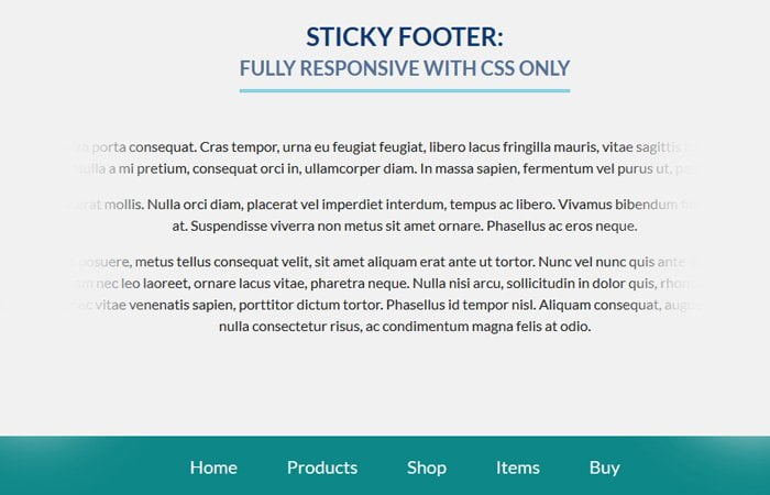
How to Make Responsive Sticky Footer
This footer is fully responsive and works well on all small or large Tv devices. It is flexible-height sticky footers using the CSS. You can easily adjust the height of the footer by editing one line of CSS.
Let’s see the HTML, and we have a wrapper which will be our top area of the website. You can define the header and content area inside the wrapper.
<div id="wrapper">
  <div id="container">
    <p>Clean Sticky Footer SCSS Mixin</p>
  </div>
</div>
Next, we have a footer markup. We keep the footer separate from the wrapper so you can easily edit it and make it full width if you need it.
<div id="footer">
	<ul>
    	<li>Home</li>
        <li>Products</li>
        <li>Shop</li>
        <li>Items</li>
        <li>Buy</li>
    </ul>
</div>
General Styling
Let’s take a look at the CSS. We start the CSS by setting the height: 100%; for both body and HTML.
html, body {
  height: 100%;
   font-family: lato;
}
The technique we are going to set the margin-bottom . It is depended upon the height of the footer we want.
Ok, Here we make the wrapper height to 100%.
#wrapper {
  min-height: 100%;
  height: auto !important;
  height: 100%;
  margin-bottom: -30px;
   background: #f1f1f1;
}
For the footer, We need to set the height and height should be equal to the margin-bottom which we laid down for the wrapper. In our case both are 30px;
#footer {
  background: #0d8788;
  height: 30px;
}
We have prepared the demo, So you know how exactly footer work while sticky it at the bottom of the page.