Making Responsive Sticky Footer Using Javascript: Have you tried out a CSS solution for making sticky footer? What about Javascript?
With the help of a few lines, we can easily fix the footer at the bottom of the page with wide-range of browser support.
I heard many developers having an issue with browsers supports. For this, We have this Javascript fixed footer solution. It also responsive and work well with all mobile phone devices.
By using Javascript doesn’t mean that I will not use the CSS. Of course, I will still need little help of CSS to keep the footer at the bottom of the page.
If you search out in Google, You probably find many methods of making responsive sticky footer that keep the footer at the bottom of the page.
But the issue with these methods they are not fully compatible with different browsers. Especially, These methods create the issue with older browsers, or sometimes they work with window browsers but not work well with mobile browsers.
Today, I am going to show you another method called Javascript sticky footer method. This method works well with the older browser and it’s lightweight, means you don’t need to add a lot of Javascript to make your footer fixed at the bottom of the page.
Sometimes people disagree to used Jquery for something as trivial, and they preferred to use flexbox method. But the flexbox has the issue with supporting older browser such as IE6 to IE9, Opera-Mini 12 and IE11 also have bugs. So using Jquery isn’t a bad thing and also we should have different options and alternatives.
How to Create Responsive Sticky Footer Using JavaScript
Let’ start with HTML which is very simple. We have the primary container that will have content and then HTML5 element called footer.
The footer will stay at the end of a page, no matter how much content you have or regardless of content height. We don’t need to wrap with any container div, We just add container div above the footer where you are allowed to add content.
<html>
<body>
<div class="container">
<p>Your content area ....</p>
</div>
<footer>
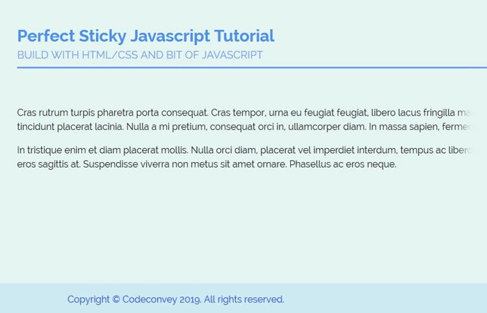
Copyright © Codeconvey 2016. All rights reserved.
</footer>
</body>
</html>
The Styling
The CSS is also straightforward, and We just need to set the position relative and min-height 100% for HTML element tag.
Next, we will make the position: absolute; and set left/bottom to zero. We also ensure that we set the width 100% so that the footer will be full across the browser window.
html {
    position: relative;
    min-height: 100%;
}
footer {
    position: absolute;
    left: 0;
    bottom: 0;
    height: auto;
    width: 100%;
}
The Javascript
Finally, we will add following a bit of javascript to get our job done.
function footerAlign() {
  $('footer').css('height', 'auto');
  var footerHeight = $('footer').outerHeight();
  $('body').css('padding-bottom', footerHeight);
  $('footer').css('height', footerHeight);
}
$(document).ready(function(){
  footerAlign();
});
$( window ).resize(function() {
  footerAlign();
});
That is all about making simple footer that is sticky at the bottom of the page by using a bit of Javascript. I hope you will find it useful. If you have any question, please do let me know in below comment section.