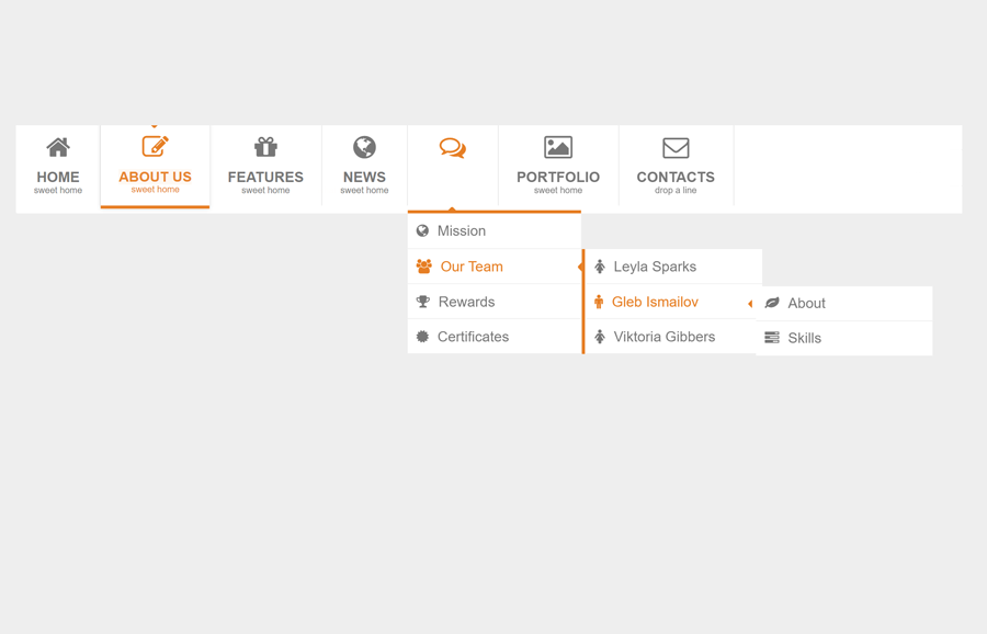
In this tutorial, we are going to share a responsive mega menu that is created with HTML and CSS only. This navigation comes with animated text and Font Awesome icons. It allows you to create a multi-level dropdown menu with nested lists that show on hover.
The menu is quite fit for heavy content web pages to arrange site links in main and submenu structure. The text animation on the hover events provides a cool user experience while browsing the content. Before going further, you can check the mega menu in action on the demo page.
OK! without wasting time, let’s get started with HTML to create this mega menu for your project.
HTML Structure for Mega Menu
First of all, load the Normalize and Font Awesome CSS by adding the following CDN link into the head section of your HTML page.
<!-- Normalize CSS -->
<link rel="stylesheet" href="https://cdnjs.cloudflare.com/ajax/libs/normalize/5.0.0/normalize.min.css">
<!-- Font Awesome CSS -->
<link rel='stylesheet' href='https://netdna.bootstrapcdn.com/font-awesome/4.0.3/css/font-awesome.min.css'>
After that, create a container and place the nav element inside it. Create ul element with a class name "mcd-menu" inside the nav and place your links inside the list item. So, the complete HTML for the mega menu is as follows:
<div class="container">
   <nav>
      <ul class="mcd-menu">
         <li>
            <a href="">
            <i class="fa fa-home"></i>
            <strong>Home</strong>
            <small>sweet home</small>
            </a>
         </li>
         <li>
            <a href="" class="active">
            <i class="fa fa-edit"></i>
            <strong>About us</strong>
            <small>sweet home</small>
            </a>
         </li>
         <li>
            <a href="">
            <i class="fa fa-gift"></i>
            <strong>Features</strong>
            <small>sweet home</small>
            </a>
         </li>
         <li>
            <a href="">
            <i class="fa fa-globe"></i>
            <strong>News</strong>
            <small>sweet home</small>
            </a>
         </li>
         <li>
            <a href="">
            <i class="fa fa-comments-o"></i>
            <strong>Blog</strong>
            <small>what they say</small>
            </a>
            <ul>
               <li><a href="#"><i class="fa fa-globe"></i>Mission</a></li>
               <li>
                  <a href="#"><i class="fa fa-group"></i>Our Team</a>
                  <ul>
                     <li><a href="#"><i class="fa fa-female"></i>Leyla Sparks</a></li>
                     <li>
                        <a href="#"><i class="fa fa-male"></i>Gleb Ismailov</a>
                        <ul>
                           <li><a href="#"><i class="fa fa-leaf"></i>About</a></li>
                           <li><a href="#"><i class="fa fa-tasks"></i>Skills</a></li>
                        </ul>
                     </li>
                     <li><a href="#"><i class="fa fa-female"></i>Viktoria Gibbers</a></li>
                  </ul>
               </li>
               <li><a href="#"><i class="fa fa-trophy"></i>Rewards</a></li>
               <li><a href="#"><i class="fa fa-certificate"></i>Certificates</a></li>
            </ul>
         </li>
         <li>
            <a href="">
            <i class="fa fa-picture-o"></i>
            <strong>Portfolio</strong>
            <small>sweet home</small>
            </a>
         </li>
         <li>
            <a href="">
            <i class="fa fa-envelope-o"></i>
            <strong>Contacts</strong>
            <small>drop a line</small>
            </a>
         </li>
         <li class="float">
            <a class="search">
            <input type="text" value="search ...">
            <button><i class="fa fa-search"></i></button>
            </a>
            <a href="" class="search-mobile">
            <i class="fa fa-search"></i>
            </a>
         </li>
      </ul>
   </nav>
</div>
The CSS Styles
In CSS, define the relative position for the "container" and set auto value for the left & right margin in order to align the navbar in the center of the page. Similarly, define the “both” value for CSS clear property as we are going to float the list items for horizontal layout.
.container {
    position: relative;
    margin: 0px auto;
    padding: 0;
    clear: both;
}
We placed the "mcd-menu" class inside the ul element that is the wrapper element of all lists. So, specify the list-style value “none” in order to hide the default list bullets. Likewise, define the background, height, margin, and padding values as follows:
.mcd-menu {
  list-style: none;
  padding: 0;
  margin: 0;
  background: #FFF;
  height: 100px;
  border-radius: 2px;
  -moz-border-radius: 2px;
  -webkit-border-radius: 2px;
}
Now, target the li element of the "mcd-menu" class and float it to the left and define the relative position. Similarly, target the “a” for hyperlinks and define the CSS styles as described below:
.mcd-menu li {
  float: left;
  position: relative;
    list-style: none;
}
.mcd-menu li a {
  display: block;
  text-decoration: none;
  padding: 12px 20px;
  text-align: center;
  color: #777;
  border-right: 1px solid #E7E7E7;
}
.mcd-menu li a i {
  display: block;
  font-size: 30px;
  margin-bottom: 10px;
}
.mcd-menu li a strong {
  display: block;
  text-transform: uppercase;
}
.mcd-menu li a small {
  display: block;
  font-size: 10px;
}
The "small" and "strong" tag inside the links contains the text that we want to animate. So, target these tags, define transition and animation as follows:
.mcd-menu li a i, .mcd-menu li a strong, .mcd-menu li a small {
  position: relative;

  transition: all 300ms linear;
  -o-transition: all 300ms linear;
  -ms-transition: all 300ms linear;
  -moz-transition: all 300ms linear;
  -webkit-transition: all 300ms linear;
}
.mcd-menu li:hover > a i {
    opacity: 1;
    -webkit-animation: moveFromTop 300ms ease-in-out;
    -moz-animation: moveFromTop 300ms ease-in-out;
    -ms-animation: moveFromTop 300ms ease-in-out;
    -o-animation: moveFromTop 300ms ease-in-out;
    animation: moveFromTop 300ms ease-in-out;
}
.mcd-menu li:hover a strong {
    opacity: 1;
    -webkit-animation: moveFromLeft 300ms ease-in-out;
    -moz-animation: moveFromLeft 300ms ease-in-out;
    -ms-animation: moveFromLeft 300ms ease-in-out;
    -o-animation: moveFromLeft 300ms ease-in-out;
    animation: moveFromLeft 300ms ease-in-out;
}
.mcd-menu li:hover a small {
    opacity: 1;
    -webkit-animation: moveFromRight 300ms ease-in-out;
    -moz-animation: moveFromRight 300ms ease-in-out;
    -ms-animation: moveFromRight 300ms ease-in-out;
    -o-animation: moveFromRight 300ms ease-in-out;
    animation: moveFromRight 300ms ease-in-out;
}
Specify link active and hover style by adding the following snippet. You can set the custom value for color according to your template in which you are going to integrate this mega menu.
.mcd-menu li:hover > a {
  color: #e67e22;
}
.mcd-menu li a.active {
  position: relative;
  color: #e67e22;
  border:0;
  border-top: 4px solid #e67e22;
  border-bottom: 4px solid #e67e22;
  margin-top: -4px;
  box-shadow: 0 0 5px #DDD;
  -moz-box-shadow: 0 0 5px #DDD;
  -webkit-box-shadow: 0 0 5px #DDD;
}
.mcd-menu li a.active:before {
  content: "";
  position: absolute;
  top: 0;
  left: 45%;
  border-top: 5px solid #e67e22;
  border-left: 5px solid transparent;
  border-right: 5px solid transparent;
}
In order to style the submenu, target the nested li and define the absolute position. Similarly, define background color, margin, padding, min-width, and keep its opacity 0 along with visibility hidden.
.mcd-menu li ul,
.mcd-menu li ul li ul {
  position: absolute;
  height: auto;
  min-width: 200px;
  padding: 0;
  margin: 0;
  background: #FFF;
  border-top: 4px solid #e67e22;
  opacity: 0;
  visibility: hidden;
  transition: all 300ms linear;
  -o-transition: all 300ms linear;
  -ms-transition: all 300ms linear;
  -moz-transition: all 300ms linear;
  -webkit-transition: all 300ms linear;
  top: 130px;
  z-index: 1000;
}
.mcd-menu li ul:before {
  content: "";
  position: absolute;
  top: -8px;
  left: 23%;
  border-bottom: 5px solid #e67e22;
  border-left: 5px solid transparent;
  border-right: 5px solid transparent;
}
To show the submenu, target the ul element with the parent li hover, define its visibility "visible" and opacity value 1.
.mcd-menu li:hover > ul,
.mcd-menu li ul li:hover > ul {
  display: block;
  opacity: 1;
  visibility: visible;
  top: 100px;
}
Now, define the link style of the submenu as described below:
.mcd-menu li ul li {
  float: none;
}
.mcd-menu li ul li a {
  padding: 10px;
  text-align: left;
  border: 0;
  border-bottom: 1px solid #EEE;
}
.mcd-menu li ul li a i {
  font-size: 16px;
  display: inline-block;
  margin: 0 10px 0 0;
}
.mcd-menu li ul li ul {
  left: 230px;
  top: 0;
  border: 0;
  border-left: 4px solid #e67e22;
}
.mcd-menu li ul li ul:before {
  content: "";
  position: absolute;
  top: 15px;
  left: -14px;
  border-right: 5px solid #e67e22;
  border-bottom: 5px solid transparent;
  border-top: 5px solid transparent;
}
.mcd-menu li ul li:hover > ul {
  top: 0px;
  left: 200px;
}
.mcd-menu li.float {
  float: right;
}
Likewise, target the "search" class and specify search input and search button styles. If you want to add an expandable search box inside the menu, check this expandable search box tutorial.
.mcd-menu li a.search {
  padding: 29px 20px 30px 10px;
}
.mcd-menu li a.search i {
  margin: 0;
  display: inline-block;
  font-size: 18px;
}
.mcd-menu li a.search input {
  border: 1px solid #EEE;
  padding: 10px;
  background: #FFF;
  outline: none;
  color: #777;
}
.mcd-menu li a.search button {
  border: 1px solid #e67e22;
  padding: 10px;
  background: #e67e22;
  outline: none;
  color: #FFF;
  margin-left: -4px;
}
.mcd-menu li a.search input:focus {
  border: 1px solid #e67e22;
}


.search-mobile {
	display:none !important;
	background:#e67e22;
	border-left:1px solid #e67e22;
	border-radius:0 3px 3px 0;
}
.search-mobile i {
	color:#FFF;
	margin:0 !important;
}
Add the following CSS animation keyframes for the left and right text sliding.
@-webkit-keyframes moveFromTop {
    from {
        opacity: 0;
        -webkit-transform: translateY(200%);
        -moz-transform: translateY(200%);
        -ms-transform: translateY(200%);
        -o-transform: translateY(200%);
        transform: translateY(200%);
    }
    to {
        opacity: 1;
        -webkit-transform: translateY(0%);
        -moz-transform: translateY(0%);
        -ms-transform: translateY(0%);
        -o-transform: translateY(0%);
        transform: translateY(0%);
    }
}
@-webkit-keyframes moveFromLeft {
    from {
        opacity: 0;
        -webkit-transform: translateX(200%);
        -moz-transform: translateX(200%);
        -ms-transform: translateX(200%);
        -o-transform: translateX(200%);
        transform: translateX(200%);
    }
    to {
        opacity: 1;
        -webkit-transform: translateX(0%);
        -moz-transform: translateX(0%);
        -ms-transform: translateX(0%);
        -o-transform: translateX(0%);
        transform: translateX(0%);
    }
}
@-webkit-keyframes moveFromRight {
    from {
        opacity: 0;
        -webkit-transform: translateX(-200%);
        -moz-transform: translateX(-200%);
        -ms-transform: translateX(-200%);
        -o-transform: translateX(-200%);
        transform: translateX(-200%);
    }
    to {
        opacity: 1;
        -webkit-transform: translateX(0%);
        -moz-transform: translateX(0%);
        -ms-transform: translateX(0%);
        -o-transform: translateX(0%);
        transform: translateX(0%);
    }
}
CSS Media Queries to Make Mega Menu Responsive
The following styles described the CSS media queries for the responsive design of the mega menu. You can set custom values for any screen size if you wanted to show the menu with a different looking. The below snippet specifies different container widths for different media screens.
@media only screen and (min-width: 1200px) {
    .container {
        width: 1210px;
    }
}

@media only screen and (min-width: 960px) and (max-width: 1199px) {
    .container {
        width: 1030px;
    }
}

@media only screen and (min-width: 768px) and (max-width: 959px) {
    .container {
        width: 682px;
    }
}

@media only screen and (min-width: 480px) and (max-width: 767px) {
    .container {
        width: 428px;
        margin: 0 auto;
    }
}

@media only screen and (max-width: 479px) {
    .container {
        width: 320px;
        margin: 0 auto;
    }
}
The media screen between 960px and 1199px is quite fit for desktop. So, define the mega menu styles for desktop as follows:
@media only screen and (min-width: 960px) and (max-width: 1199px) {
    .mcd-menu li a.search input {
		width:100px;
	}
}

@media only screen and (min-width: 768px) and (max-width: 959px) {
    .mcd-menu {
		height: 85px;
	}
	.mcd-menu li a {
		padding: 12px;
	}
	.mcd-menu li a i {
		font-size: 22px;
	}
	.mcd-menu li a strong {
		font-size: 12px;
	}
	.mcd-menu li a small {
		font-size: 10px;
	}
	.mcd-menu li a.search {
		display:none;
	}
	.search-mobile {
		display:block !important;
		margin: 20px;
		border-radius:3px;
		-moz-border-radius:3px;
		-webkit-border-radius:3px;
	}
	.mcd-menu li:hover > ul {
		top:85px;
		min-width:180px;
	}
	.mcd-menu li ul li > ul {
		min-width:150px;
		left:200px;
		top:0;
	}
	.mcd-menu li ul li:hover > ul {
		min-width:150px;
		left:180px;
		top:0;
	}
	.mcd-menu li ul li ul li ul {
		min-width:150px;
		left:25px !important;
		top:54px;
		border:0;
		border-top:3px solid #e67e22;
	}
	.mcd-menu li ul li ul li:hover ul {
		top:35px;
	}
	.mcd-menu li ul li ul li ul:before {
		border:0;
		border-bottom:5px solid #e67e22;
		border-left:5px solid transparent;
		border-right:5px solid transparent;
		left:10%;
		top:-8px;
	}
	.mcd-menu li:hover ul a {
		font-size:12px;
	}
	.mcd-menu li:hover ul a i {
		font-size:14px;
	}
}
Similarly, define CSS styles for tab and larger screen than mobile (between the screen width 480px and 767px) as follows:
@media only screen and (min-width: 480px) and (max-width: 767px) {
    .mcd-menu {
      height: 42px;
      position: relative;
    }
	.mcd-menu li a {
		padding: 12px 17.7px;
	}
    .mcd-menu li a strong, .mcd-menu li a small, .mcd-menu li a.search {
      display: none;
    }
    .mcd-menu li a i {
      margin: 0;
      font-size: 18px;
    }
    .mcd-menu li {
      position: static;
    }
    .mcd-menu li ul {
      min-width: 100%;
      left: 0;
      top: 50px;
    }
    .mcd-menu li:hover > ul {
      top: 42px;
    }
    .mcd-menu li > ul:before {
      border:0;
    }
    .mcd-menu li ul > li {
      position: relative;
    }
    .mcd-menu li ul li:hover > ul {
	  left:34px;
    }
	.mcd-menu li a {
		position: relative;
		font-size:12px;
	}
	.mcd-menu li a:hover strong,.mcd-menu li a.active strong {
		display:block;
		font-size:10px;
		padding:3px 0;
		position:absolute;
		top:-20px;
		left:0;
		background:#e67e22;
		color:#FFF;
		min-width:100%;
		text-transform:lowercase;
		font-weight:normal;
	}
	.mcd-menu li a.active:before{
		left: 40%;
	}
	.search-mobile {
		display:block !important;
	}

	.mcd-menu li ul li > ul {
		min-width:200px;
		left:200px;
	}
	.mcd-menu li ul li:hover ul {
		left:180px;
	}
	.mcd-menu li ul li ul:before {
		left:-9px;
	}
	.mcd-menu li ul li ul li ul {
		min-width:200px;
		border:0;
		border-top:3px solid #e67e22;
		left:25px !important;
		top: 45px;
	}
	.mcd-menu li ul li ul li:hover ul {
		top:40px;
	}
	.mcd-menu li ul li ul li ul:before {
		border:0;
		border-bottom:5px solid #e67e22;
		border-left:5px solid transparent;
		border-right:5px solid transparent;
		left:10%;
		top:-8px;
	}
}
The max screen width of 479px defines the styles for the mobile screens. In this resolution, specify mega menu styles as described below:
@media only screen and (max-width: 479px) {
    .mcd-menu {
      height: 42px;
      position: relative;
    }
    .mcd-menu li a strong, .mcd-menu li a small, .mcd-menu li a.search {
      display: none;
    }
    .mcd-menu li a {
      padding: 12px 13.8px;
		font-size:12px;
    }
    .mcd-menu li a i {
      margin: 0;
      font-size: 18px;
    }
    .mcd-menu li {
      position: static;
    }
    .mcd-menu li ul {
      min-width: 100%;
      left: 0;
      top: 50px;
    }
    .mcd-menu li:hover > ul {
      top: 42px;
    }
    .mcd-menu li > ul:before {
      border:0;
    }
    .mcd-menu li ul > li {
      position: relative;
    }
    .mcd-menu li ul li:hover > ul {
	  left:34px;
    }
	.mcd-menu li a {
		position: relative;
	}
	.mcd-menu li a:hover strong,.mcd-menu li a.active strong {
		display:block;
		font-size:10px;
		padding:3px 0;
		position:absolute;
		top:-20px;
		left:0;
		background:#e67e22;
		color:#FFF;
		min-width:100%;
		text-transform:lowercase;
		font-weight:normal;
	}
	.mcd-menu li a.active:before{
		left: 40%;
	}

	.mcd-menu li ul li > ul {
		min-width:150px;
		left:160px;
	}
	.mcd-menu li ul li:hover ul {
		left:120px;
	}
	.mcd-menu li ul li ul:before {
		left:-9px;
	}
	.mcd-menu li ul li ul li ul {
		min-width:160px;
		left:25px !important;
		top:39px;
		border:0;
		border-top:3px solid #e67e22;
	}
	.mcd-menu li ul li ul li:hover ul {
		top:39px;
	}
	.mcd-menu li ul li ul li ul:before {
		border:0;
		border-bottom:5px solid #e67e22;
		border-left:5px solid transparent;
		border-right:5px solid transparent;
		left:10%;
		top:-8px;
	}

}
You have done it! I hope you have successfully integrated this CSS only responsive mega menu. If you have any questions or suggestions, let me know by comment below.