In web design, the animated text is a great way to capture the user’s attention. Such animations not only show the creativity of a web designer but also attracts the users to interact with that text. Mostly, an animated text is used in the hero section of the webpage or in the slideshow. However, it can be used anywhere in order to make your text more attractive. In this CSS animation tutorial, we are going to share seven examples of text animations with code.
These text animations are based on pure CSS that runs once after page loaded. However, you can run them on different JavaScript events according to your needs. Similarly, you can set the custom value for the animation iteration count.
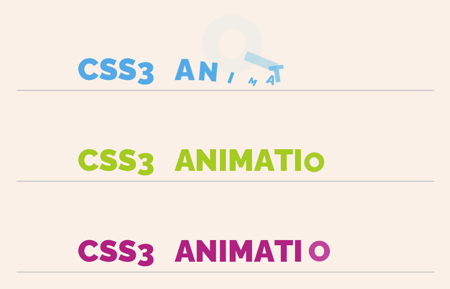
HTML Structure
In HTML, you just need to create a div element with class name “animate” and an animation class (named with one, two, three up to seven) place into a container. After that, wrap each letter to the span element and done.
<div class="container">
   <div class="animate one">
      <span>c</span><span>s</span><span>s</span><span>3</span>
      <span>a</span><span>n</span><span>i</span><span>m</span><span>a</span><span>t</span><span>i</span><span>o</span><span>n</span><span>s</span>
   </div>
</div>
The HTML structure is the same for other animations, just update the animation class name. Besides this, you can also add any static text or any element in this container according to your needs.
Basic CSS Styles
Define some basic styles for the main container of the text. The following CSS code for the container selector has been defined according to the demo page. However, you can set the custom value for each property mentioned below.
.container {
	width: 100%;
	margin: auto;
	font-weight: 900;
	text-transform: uppercase;
	text-align: center;
	padding: 0 0 200px;
}
After that, define styles for the “.animate” selector. Set the font-size, margin, and display the child span element as inline-block.
.animate {
	font-size: 50px;
	margin: 100px 0 0;
	border-bottom: 2px solid #ccc;
}

.animate span {
	display: inline-block;
}
Now, you need to set the animation delay for each letter using the CSS nth-of-type pseudo-selector. To do so, first count the letters containing in your text and set the delay time for each one. You can set the custom gap between the seconds in order to increase/decrease animation speed.
.animate span:nth-of-type(2) {
	animation-delay: .05s;
}
.animate span:nth-of-type(3) {
	animation-delay: .1s;
}
.animate span:nth-of-type(4) {
	animation-delay: .15s;
}
.animate span:nth-of-type(5) {
	animation-delay: .2s;
}
.animate span:nth-of-type(6) {
	animation-delay: .25s;
}
.animate span:nth-of-type(7) {
	animation-delay: .3s;
}
.animate span:nth-of-type(8) {
	animation-delay: .35s;
}
.animate span:nth-of-type(9) {
	animation-delay: .4s;
}
.animate span:nth-of-type(10) {
	animation-delay: .45s;
}
.animate span:nth-of-type(11) {
	animation-delay: .5s;
}
.animate span:nth-of-type(12) {
	animation-delay: .55s;
}
.animate span:nth-of-type(13) {
	animation-delay: .6s;
}
.animate span:nth-of-type(14) {
	animation-delay: .65s;
}
.animate span:nth-of-type(15) {
	animation-delay: .7s;
}
.animate span:nth-of-type(16) {
	animation-delay: .75s;
}
.animate span:nth-of-type(17) {
	animation-delay: .8s;
}
.animate span:nth-of-type(18) {
	animation-delay: .85s;
}
.animate span:nth-of-type(19) {
	animation-delay: .9s;
}
.animate span:nth-of-type(20) {
	animation-delay: .95s;
}
CSS Text Animation keyframes
The following is the CSS text animation keyframes code examples, separated with comment (animation one, two, three up to seven). If you want to execute the animation more than once, you can use the CSS animation-iteration-count property to set the custom number for play.
/* Animation One */

.one span {
	color: #24a8e6;
	opacity: 0;
	transform: translate(-150px, -50px) rotate(-180deg) scale(3);
	animation: revolveScale .4s forwards;
}

@keyframes revolveScale {
	60% {
		transform: translate(20px, 20px) rotate(30deg) scale(.3);
	}

	100% {
		transform: translate(0) rotate(0) scale(1);
		opacity: 1;
	}
}


/* Animation Two */

.two span {
	color: #a5cb21;
	opacity: 0;
	transform: translate(200px, -100px) scale(2);
	animation: ballDrop .3s forwards;
}

@keyframes ballDrop {
	60% {
		transform: translate(0, 20px) rotate(-180deg) scale(.5);
	}

	100% {
		transform: translate(0) rotate(0deg) scale(1);
		opacity: 1;
	}
}


/* Animation Three */


.three span {
	color: #b10e81;
	opacity: 0;
	transform: translate(-300px, 0) scale(0);
	animation: sideSlide .5s forwards;
}

@keyframes sideSlide {
	60% {
		transform: translate(20px, 0) scale(1);
		color: #b10e81;
	}

	80% {
		transform: translate(20px, 0) scale(1);
		color: #b10e81;
	}

	99% {
		transform: translate(0) scale(1.2);
		color: #00f0ff;
	}

	100% {
		transform: translate(0) scale(1);
		opacity: 1;
		color: #b10e81;
	}
}


/* Animation Four */


.four span {
	color: #8d6a00;
	opacity: 0;
	transform: translate(0, -100px) rotate(360deg) scale(0);
	animation: revolveDrop .3s forwards;
}


@keyframes revolveDrop {
	30% {
		transform: translate(0, -50px) rotate(180deg) scale(1);
	}

	60% {
		transform: translate(0, 20px) scale(.8) rotate(0deg);
	}

	100% {
		transform: translate(0) scale(1) rotate(0deg);
		opacity: 1;
	}
}


/* Animation Five */


.five span {
	color: #dd3f0f;
	opacity: 0;
	transform: translate(0, -100px) rotate(360deg) scale(0);
	animation: dropVanish .5s forwards;
}


@keyframes dropVanish {
	30% {
		transform: translate(0, -50px) rotate(180deg) scale(1);
	}

	50% {
		transform: translate(0, 20px) scale(.8) rotate(0deg);
		opacity: 1;
	}

	80% {
		transform: translate(-100px, -100px) scale(1.5) rotate(-180deg);
		opacity: 0;
	}

	100% {
		transform: translate(0) scale(1) rotate(0deg);
		opacity: 1;
	}
}


/* Animation Six */


.six span {
	color: #ddb40f;
	opacity: 0;
	transform: rotate(-180deg) translate(150px, 0);
	animation: twister .5s forwards;
}


@keyframes twister {
	10% {
		opacity: 1;
	}
	100% {
		transform: rotate(0deg) translate(0);
		opacity: 1;
	}
}


/* Animation Seven */


.seven span {
	color: #348c04;
	opacity: 0;
	transform: translate(-150px, 0) scale(.3);
	animation: leftRight .5s forwards;
}


@keyframes leftRight {
	40% {
		transform: translate(50px, 0) scale(.7);
		opacity: 1;
		color: #348c04;
	}

	60% {
		color: #0f40ba;
	}

	80% {
		transform: translate(0) scale(2);
		opacity: 0;
	}

	100% {
		transform: translate(0) scale(1);
		opacity: 1;
	}
}
That’s all! Let me know by comment below if you have successfully implemented a text animation into your project.