A testimonial slider is another important part of a business website. It not only improves the credibility of your website but also maximizes the conversion rate. Whether you are creating a website template for a business or a personal portfolio, a testimonial is essential in it. So, in this tutorial, you will come to know how to create a pure CSS testimonial slider with controls.
Basically, a testimonial contains the user’s feedback statements. It can be a social media comment, feedback email or a directly published customer review. The customer name, review and the picture are necessary parts of a testimonial slider. So, all these items we’ll display in a slider using HTML and pure CSS.
Although, we are not using JavaScript for sliding functionality. But, it’ll work just like a JS slider, yes! you can check on the demo page. But, how is it possible? the answer is simple, using HTML radio inputs and label elements.
HTML Structure for Pure CSS Testimonial Slider
The HTML for this testimonial slider is a bit complicated. However, the technique is quite similar to pure CSS image slider. So, create the div element with class name “carrousel” and place all child elements (input, label, review, image, etc) in it.
<div class="carrousel">
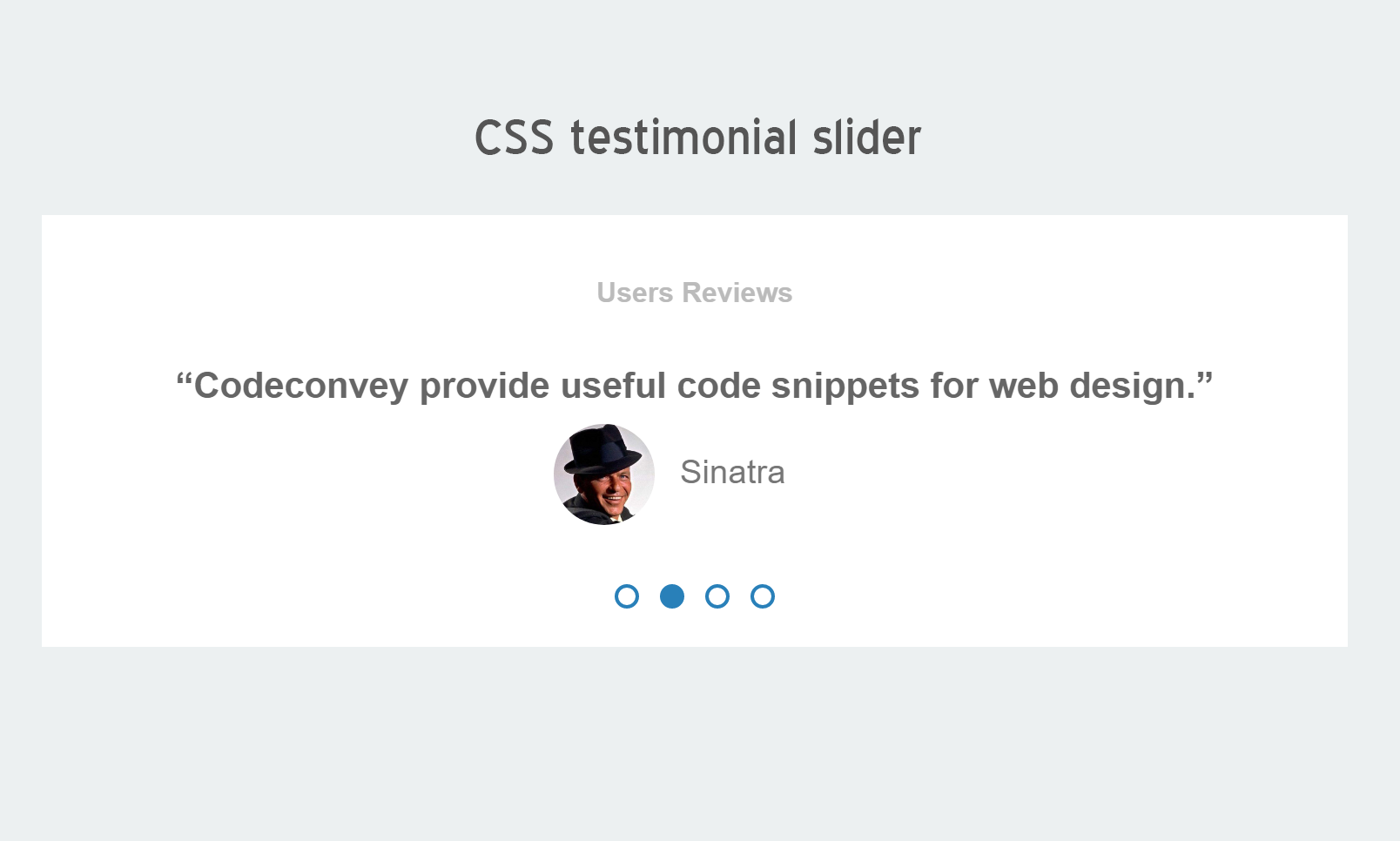
<h2>Users Reviews</h2>
<input type="radio" name="slides" id="radio-1" checked>
<input type="radio" name="slides" id="radio-2">
<input type="radio" name="slides" id="radio-3">
<input type="radio" name="slides" id="radio-4">
<ul class="slides">
<li class="slide">
<p>
<q>Codeconvey is a really useful site.</q>
<span class="author">
<img src="img/dp1.jpg">
JR Tolkien
</span>
</p>
</li>
<li class="slide">
<p>
<q>Codeconvey provide useful code snippets for web design.</q>
<span class="author">
<img src="img/dp2.jpg">
Sinatra
</span>
</p>
</li>
<li class="slide">
<p>
<q>This is pretty cool</q>
<span class="author">
<img src="img/dp3.jpg">
Alf
</span>
</p>
</li>
<li class="slide">
<p>
<q>This is awesome. Only Css you say?</q>
<span class="author">
<img src="img/dp4.jpg">
The octocat
</span>
</p>
</li>
</ul>
<div class="slidesNavigation">
<label for="radio-1" id="dotForRadio-1"></label>
<label for="radio-2" id="dotForRadio-2"></label>
<label for="radio-3" id="dotForRadio-3"></label>
<label for="radio-4" id="dotForRadio-4"></label>
</div>
</div>
If you want to add more than four reviews in the testimonial, increase the number of radio inputs and their labels.
The CSS Styles
Now its time to style the testimonial slider. First of all, we’ll define the basic CSS styles for the main container (div that has a class name “carrousel”). If you want to customize its looks, you can set custom values for max-width (that is 750px), color, font-size, etc.
.carrousel {
  background: #ffffff;
  text-align: center;
  padding: 4em 0;
  height: 7.5em;
  max-width: 750px;
  margin: auto;
  position: relative;
  overflow: hidden;
}
.carrousel h2 {
  margin: 0;
  margin-top: -1.7em;
  padding: 0;
  font-size: 1em;
  text-align: center;
  color: #bbbbbb;
}
.carrousel .slides {
  width: 400%;
  left: 0;
  padding-left: 0;
  padding-top: 1em;
  overflow: hidden;
  list-style: none;
  position: relative;

  -webkit-transition: transform .5s;
  -moz-transition: transform .5s;
  -o-transition: transform .5s;
  transition: transform .5s;
}
.carrousel .slides li {
  width: 25%;
  position: relative;
  float: left;
}
.carrousel li p{
  margin-top: 0;
}
.carrousel li q {
  max-width: 90%;
  margin: auto;
  color: #666666;
  font-size: 1.3em;
  font-weight: bold;
}
As you have seen on the demo page, the profile picture is circular. It’s done using CSS border-radius property having the same value for width and height. If you want to remove the circular shape, just remove the border-radius attribute or set its value to 0.
.carrousel li img {
  width: 3em;
  height: 3em;
  object-fit: cover;
  border-radius: 50%;
  margin-left: -1.5em;
  margin-right: 0.5em;
  vertical-align: middle;
}
Now, we’ll set some styles for the author’s name. You can update the font-size and color values for this. However, margin and display property are quite fit.
.carrousel li span.author {
  margin-top:0.5em;
  font-size: 1.2em;
  color: #777777;
  display: block;
}
Finally, add the following CSS code into your project to enable sliding functionality. The customization guide shown in the code’s comments.
.carrousel .slidesNavigation {
  display: block;
  list-style: none;
  text-align: center;
  bottom: 1em;
  /*--- Centering trick---*/
    /* Absolute positioning*/
    position: absolute;
    /* Abosulte positioning*/
    width: 104px; /*This width  is the addition of the width of all the navigations dots - So in this case is   104 because the navigation dots are 26px (width:10px and 6px marginleft + 6 px marginright) and there are 4 dots so 4x26=104 */
    left: 50%; /*Centering de element*/
    margin-left: -52px; /*adjusting the centering by applying a negative margin of half of the width*/
}
.carrousel input {
  display: none;
}
.carrousel .slidesNavigation label {
  float: left;
  margin: 6px;
  display: block;
  height: 10px;
  width: 10px;
  -webkit-border-radius: 50%;
  border-radius: 50%;
  border: solid 2px #2980b9;
  font-size: 0;
}
/* You have to repeat this with each slide
TODO: make it easier with SCSS
25% movement 100/slides-num
*/
#radio-1:checked ~ .slides {
  transform: translateX(0%);
}
#radio-2:checked ~ .slides {
  transform: translateX(-25%);
}
#radio-3:checked ~ .slides {
  transform: translateX(-50%);
}
#radio-4:checked ~ .slides {
  transform: translateX(-75%);
}


.carrousel .slidesNavigation label:hover {
   cursor: pointer;
}
/* You have to repeat this with each slide/dot */
.carrousel #radio-1:checked ~ .slidesNavigation label#dotForRadio-1,
.carrousel #radio-2:checked ~ .slidesNavigation label#dotForRadio-2,
.carrousel #radio-3:checked ~ .slidesNavigation label#dotForRadio-3,
.carrousel #radio-4:checked ~ .slidesNavigation label#dotForRadio-4 {
  background: #2980b9;
}
At last, also add the following CSS that contain media queries that make testimonial slider responsive.
@media  (max-width: 796px) {
  .carrousel{
    height: 8.5em;
  }
}
@media  (max-width: 480px) {
  .carrousel li p {
    padding-left: 0.5em;
    padding-right: 0.5em;
  }
  .carrousel li q {
      font-size: 1em;
  }
  .carrousel li img {
     width:2em;
     margin-left: -1em;
     margin-right: 0.25em;
  }
}
You have done! if you have any questions or suggestions related to testimonial slider, feel free to comment below.
Thanks sir/ma it was really helpful, I like you to help me out as I just started out in web development. Thanks again
Welcome Osazuwa!
Keep visiting us for more useful web designing code and tutorials.
I found this helpful thanks. But I would like to help with a demo of “add to cart” codes
Hi Sserwanja Gracious!
I’ll publish a tutorial about “add to card” design tomorrow. Keep visiting us! Thanks