In a user interface, a range slider is a useful element to set a range of values. It makes it easy to input number values through its thumb/handle. In HTML, we can define a range slider with input type range (<input type="range"> ). But, it has only one handle to slide the values. Sometimes we need a dual-range slider for both minimum and maximum values adjustment. So, in this tutorial, you will learn how to create a pure CSS range slider with 2 handles that allow users to adjust two values.
Before getting started with coding, please check out the demo page for the live test of the range slider. This double handled range slider created with HTML div elements and placed (hidden) input element to store minimum and maximum values. So, you can get these values in JavaScript programs without any issue.
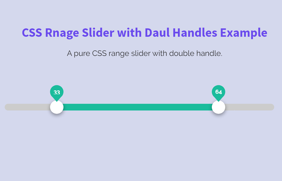
HTML Range Slider Preview
HTML Structure for 2 Handles Range Slider
The HTML for dual range slider is a bit complicated, you just need to copy/paste the following code into your project. In order to customize it, you can define custom default values for both the left and right handle/thumb. To do so, define your value inside the span tag <span id="value">60</span>. Similarly, you can set default min and max values in the input type range shown in line number 24.
                  <div slider id="slider-distance">
  <div>
    <div inverse-left style="width:70%;"></div>
    <div inverse-right style="width:70%;"></div>
    <div range style="left:30%;right:40%;"></div>
    <span thumb style="left:30%;"></span>
    <span thumb style="left:60%;"></span>
    <div sign style="left:30%;">
      <span id="value">30</span>
    </div>
    <div sign style="left:60%;">
      <span id="value">60</span>
    </div>
  </div>
  <input type="range" tabindex="0" value="30" max="100" min="0" step="1" oninput="
  this.value=Math.min(this.value,this.parentNode.childNodes[5].value-1);
  var value=(100/(parseInt(this.max)-parseInt(this.min)))*parseInt(this.value)-(100/(parseInt(this.max)-parseInt(this.min)))*parseInt(this.min);
  var children = this.parentNode.childNodes[1].childNodes;
  children[1].style.width=value+'%';
  children[5].style.left=value+'%';
  children[7].style.left=value+'%';children[11].style.left=value+'%';
  children[11].childNodes[1].innerHTML=this.value;" />

  <input type="range" tabindex="0" value="60" max="100" min="0" step="1" oninput="
  this.value=Math.max(this.value,this.parentNode.childNodes[3].value-(-1));
  var value=(100/(parseInt(this.max)-parseInt(this.min)))*parseInt(this.value)-(100/(parseInt(this.max)-parseInt(this.min)))*parseInt(this.min);
  var children = this.parentNode.childNodes[1].childNodes;
  children[3].style.width=(100-value)+'%';
  children[5].style.right=(100-value)+'%';
  children[9].style.left=value+'%';children[13].style.left=value+'%';
  children[13].childNodes[1].innerHTML=this.value;" />
</div>
The CSS Styles
In CSS, define some basic styles for the main container of range slider. If you want to customize it, you can change its height value, border-radius and margin property.
[slider] {
  position: relative;
  height: 14px;
  border-radius: 10px;
  text-align: left;
  margin: 45px 0 10px 0;
}

[slider] > div {
  position: absolute;
  left: 13px;
  right: 15px;
  height: 14px;
}
Similarly, define the CSS styles for the left and right handles/thumb by adding the following snippet. You can set custom colors, height, and other related properties according to your project’s theme.
[slider] > div > [inverse-left] {
  position: absolute;
  left: 0;
  height: 14px;
  border-radius: 10px;
  background-color: #CCC;
  margin: 0 7px;
}

[slider] > div > [inverse-right] {
  position: absolute;
  right: 0;
  height: 14px;
  border-radius: 10px;
  background-color: #CCC;
  margin: 0 7px;
}

[slider] > div > [range] {
  position: absolute;
  left: 0;
  height: 14px;
  border-radius: 14px;
  background-color: #1ABC9C;
}

[slider] > div > [thumb] {
  position: absolute;
  top: -7px;
  z-index: 2;
  height: 28px;
  width: 28px;
  text-align: left;
  margin-left: -11px;
  cursor: pointer;
  box-shadow: 0 3px 8px rgba(0, 0, 0, 0.4);
  background-color: #FFF;
  border-radius: 50%;
  outline: none;
}
Also, add the following CSS code snippet for cross-browser support for range slider thumbs.
div[slider] > input[type=range]::-ms-thumb {
  pointer-events: all;
  width: 28px;
  height: 28px;
  border-radius: 0px;
  border: 0 none;
  background: red;
}

div[slider] > input[type=range]::-moz-range-thumb {
  pointer-events: all;
  width: 28px;
  height: 28px;
  border-radius: 0px;
  border: 0 none;
  background: red;
}

div[slider] > input[type=range]::-webkit-slider-thumb {
  pointer-events: all;
  width: 28px;
  height: 28px;
  border-radius: 0px;
  border: 0 none;
  background: red;
  -webkit-appearance: none;
}

div[slider] > input[type=range]::-ms-fill-lower {
  background: transparent;
  border: 0 none;
}

div[slider] > input[type=range]::-ms-fill-upper {
  background: transparent;
  border: 0 none;
}
After that, include the styles for the slider track described below.
[slider] > input[type=range] {
  position: absolute;
  pointer-events: none;
  -webkit-appearance: none;
  z-index: 3;
  height: 14px;
  top: -2px;
  width: 100%;
  -ms-filter: "progid:DXImageTransform.Microsoft.Alpha(Opacity=0)";
  filter: alpha(opacity=0);
  -moz-opacity: 0;
  -khtml-opacity: 0;
  opacity: 0;
}

div[slider] > input[type=range]::-ms-track {
  -webkit-appearance: none;
  background: transparent;
  color: transparent;
}

div[slider] > input[type=range]::-moz-range-track {
  -moz-appearance: none;
  background: transparent;
  color: transparent;
}

div[slider] > input[type=range]:focus::-webkit-slider-runnable-track {
  background: transparent;
  border: transparent;
}

div[slider] > input[type=range]:focus {
  outline: none;
}
Finally, define some styles for tooltip sign. If you want to change its size, update the height and width property. Likewise, you can change its text and background color according to your needs.
div[slider] > input[type=range]::-ms-tooltip {
  display: none;
}

[slider] > div > [sign] {
  opacity: 0;
  position: absolute;
  margin-left: -11px;
  top: -39px;
  z-index:3;
  background-color: #1ABC9C;
  color: #fff;
  width: 28px;
  height: 28px;
  border-radius: 28px;
  -webkit-border-radius: 28px;
  align-items: center;
  -webkit-justify-content: center;
  justify-content: center;
  text-align: center;
}

[slider] > div > [sign]:after {
  position: absolute;
  content: '';
  left: 0;
  border-radius: 16px;
  top: 19px;
  border-left: 14px solid transparent;
  border-right: 14px solid transparent;
  border-top-width: 16px;
  border-top-style: solid;
  border-top-color: #1ABC9C;
}

[slider] > div > [sign] > span {
  font-size: 12px;
  font-weight: 700;
  line-height: 28px;
}

[slider]:hover > div > [sign] {
  opacity: 1;
}
That’s all! I hope you like this pure CSS 2 handles range slider. If you have any questions or suggestions related to this range slider, you can comment below.
Hi, thanks for this, I like your implementation better than others I found. I did have one big problem getting it to work with different range and initial values. The problem turned out to be the initial position as set in the slider-distance.children[0] div is not where the actual spot on the screen is. The 70%, 60%, and 40% assigned there need to be chosen based on the range and the initial value.
For me the easiest way to do it was to split out the onchange handler code into js functions and call them on initialization, passing in the desired initial values. This would put the visible thumbs on the screen in the right place and from there it works great.
Hello!
Nice to hear that you added a JavaScript function to get a better working. Keep visiting us for more web design code & scripts!
how did you change into ??
Hello! I implement this with customize values and its working perfect thank you, but could you give me a little explanation of the way i should get the values?
The oninput event is javascript and this is not pure CSS.
It’s a DOM event that is handled in JavaScript.