This is another post to create a radial progress bar by using plain HTML and pure CSS. But before we go ahead, Did you try out a pure CSS percentage circle which build with animation.
Few months backs I was working on a website which had a task to implement a design that incorporated circular progress bars.
The design looks awesome, the implementation worked by using the percircle but it is built with jQuery.
But I have a solution which works with purely CSS and HTML. You don’t need to rely on JS. The result will be same as the jQuery one. Also, you can easily implement and customize as you want.
It works with different classes to get various functions. Like you just need to apply a particular class to call the percentage in the radial.
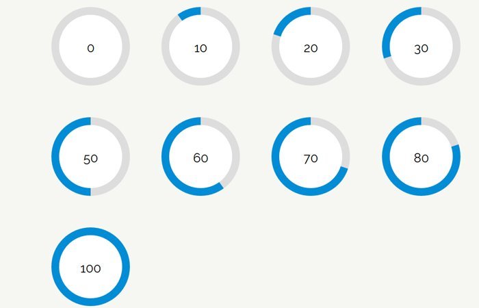
Build a Radial Progress Bar with Plain HTML / CSS
Ok, Let’s have a look at the HTML, and you don’t need to write a lot of HTML lines of code. We do simple used two divs and make the circle with the percentage.
Here we have the main div with two different classes. The first one is required for each ring and the second one progress-0 is all about how much percentage of correct you want to fill. In the example below, we have defined 10.
The HTML
<div class="radialProgressBar progress-10">
  <div class="overlay">10</div>
</div>
The overlay allows us to hide the part of the circle and show only the bar. Also, Make sure that all of the class represents in the CSS section of the demo, and we have created like 10, 20, 30 and so on till 100.
The Styling of Circle Progress Bar
Now let’s see the CSS and to create the circle, we used the border-radius property then we set the width and height as per our need. The background color is light gray in our case, and you can change it as you want.
.radialProgressBar {
  border-radius: 50%;
  -webkit-transform: translate(50%, 50%);
          transform: translate(50%, 50%);
  width: 100px;
  height: 100px;
  display: -webkit-box;
  display: -ms-flexbox;
  display: flex;
  background: #ddd;
  margin: 20px;
}
The overlay also has border-radius, but the width and height will be less as compare to .radialProgressBar because we need to show the circle line instead of a solid circle. To hide the solid one, we also need to set the background color to white.
.radialProgressBar .overlay {
  border-radius: 50%;
  width: 80px;
  height: 80px;
  margin: auto;
  background: #fff;
  text-align: center;
  padding-top: 30%;
}
Finally, we do need to create color full part of a circle and we can simply do this by using Gradient Generator
.progress-10 {
  background-image: -webkit-linear-gradient(36deg, #ddd 50%, transparent 50%), -webkit-linear-gradient(left, #028cd5 50%, #ddd 50%);
  background-image: linear-gradient(54deg, #ddd 50%, transparent 50%), linear-gradient(90deg, #028cd5 50%, #ddd 50%);
}
Hope you like this pure CSS radial progress bar tutorial and find it a good resource. Share and do comment if you like.
Do you have the css for the full 0 to 100 % progress? Like for progress-57?
Do you want a full-width horizontal progress bar? check this tutorial.
You forgot one important thing:
* {
  box-sizing: border-box;
}
otherwise, the overlay will look eggy
… and it’s better to use line-height with rem instead of a guessed percentage so you can easily change font-size without having to adjust the padding. Same for circle and overlay size:
.radialProgressBar { [...] width: 8rem; height: 8rem; [...] } .radialProgressBar .overlay { border-radius: 100%; width: 7rem; height: 7rem; line-height: 7rem; font-size: 3em; [...] }Hi Veeman!
Thanks for the suggestion. Your suggestions will definitely help the other users, keep visiting us for more free HTML & CSS codes.