In a visual user interface, a progress bar is an indicator of a process. It can be used for various purposes including downloading progress, installation, skills overview or visualization of an operation. Basically, the HTML5 provides a default progress bar (with <progress> tag) that not much attractive. So, in this tutorial, we’ll create a pure CSS progress bar with CSS3 animation.
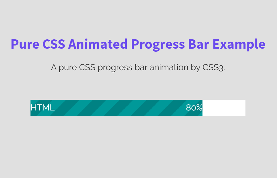
Before going further, I would like to discuss a little bit about this CSS progress bar project. The final output you have seen on the above image, likewise on the demo page. Although this progress bar is not made up of HTML5 <progress> tag, however, its values can be fully controlled in JavaScript/jQuery.
Similarly, you have full control of its values, HTML and CSS design. You are also able to pass values dynamically through a JavaScript function in this progress bar. So, let’s start with the markup structure to create an animated progress bar.
HTML for CSS3 Animated Progress Bar
For the progress bar structure, we will create two div elements. One of them will handle the main/white background of the bar and the other one will contain a CSS gradient background to indicate progression. Inside this div, we’ll place two span elements for the progress label and its value. So, the HTML structure for the progress bar is as follows:
    <div class='bg'>
      <div class='html'>
        <span class='left'>HTML</span>
        <span class='right'>80%</span>
      </div>
    </div>
Besides the above HTML code, you can also add some new elements if you want to create multi values progress bar. Similarly, you can also place some hidden values using the HTML5 data-attr method to use in JavaScript programs. Anyhow, it depends upon your project in which you want to implement this progress bar.
CSS for Progress Bar and Animate with CSS3
According to the HTML of the progress bar, we’ll define some styles for the div element (that has a class “bg”) to make it a white-colored bar. It can be done by using CSS width and height property just like below code:
.bg {
  background-color: #fff;
  width: 400px;
  height: 30px;
  margin: 0 auto;
}
In the above CSS code, the margin property (margin: 0 auto;) is defined to centralize the progress bar. You can remove it if you want to adjust it left or right. Similarly, if you want to customize this bar, you can pass the custom values for width (that is 400px by default) and height. You can also set a custom background color that will show the blank area of the progress bar.
Now, we’ll define two classes for left and right floating. As you have seen on the above HTML, these classes were used to float progress bar label and value.
.left {
  float: left;
}

.right {
  float: right;
}
In HTML, we defined the second div element with a class name "html" to display the filled area of the progress bar. Now, we are going to style it using the CSS gradient background color. If you want to use a custom filled area, you can use this tool to generate a gradient background.
.html {
  background: -webkit-linear-gradient(
    135deg,
    #009999 25%, #008283 25%,
		#008283 50%, #009999 50%,
		#009999 75%, #008283 75%
  );

  background: -moz-linear-gradient(
    135deg,
    #009999 25%, #008283 25%,
		#008283 50%, #009999 50%,
		#009999 75%, #008283 75%
  );

  background: -o-linear-gradient(
    135deg,
    #009999 25%, #008283 25%,
		#008283 50%, #009999 50%,
		#009999 75%, #008283 75%
  );

  width: 80%;
  height: 30px;
  line-height: 30px;
  color: #fff;
  background-size: 50px 50px;
  animation: bar-animation 3s linear infinite;
  -webkit-animation: bar-animation 3s linear infinite;
}
Finally, define the CSS3 animation keyframes to animate the filled area of the pure CSS progress bar. In the above block of code, we have already add this animation (animation: bar-animation 3s linear infinite;). If you want to increase/decrease its speed, you can set a custom value instead of 3s.
@-webkit-keyframes bar-animation {
  0% {
    background-position: 0 0;
  }
  100% {
    background-position: 50px 50px;
  }
}
That’s all! Let me know by comment below if you have successfully implemented this animated progress bar in your project.
This is EXACTLY what I need and really just wanted to find a plugin I could install on my WordPress template! I’m not sure where to put all this code and how to make it work. I have a CSS section of my WordPress template and then I have the page I need this on. Where do I put which code?! I probably have no business trying to implement this, but thought I would reach out!
Hello,
I wrote to you earlier, but I GOT IT!!! I figured it out all by myself. I know… it’s not complicated especially since you literally did all the actual hard work, but I’m pretty excited about it.
Thank you!!
Sara
Hi Sara!
The source code is available with each tutorial, you can download and implement in your projects. Anyhow, thanks for your feedback!
Keep visiting us for more web design code & scripts.
Thank you very much!
Code is wonderful
Hi Abdusamad!
You’re welcome. Keep visiting us for more free HTML and CSS tutorials.