You surely know that the new way of a load more content by click on a button or just by scrolling. Am I right? But how about to do the same thing by using pagination? Yes, that’s the concept I am going to share with you. Actually, I will build a multi items vertical carousel by using pure CSS only and it will work with pagination. You can also check our previous tutorial if you want to create automatic image / content slider.
The concept is somewhat similar to pagination slider. Something like Carousels where the fixed number of items or products are displayed and when the user clicks on the page (Dot or Number) it slides the all fixed number of items to replace a new one.
Pagination isn’t much needed for the site like providing some services, but it’s good to place on product or blog site. This new concept isn’t going to replace the load more type thing, but you can implement where the items or product listed.
Implementing new things on any site design are making your site design unique in the market. It attracts your site visitor and love to stay more time on your site.
To allow the user to navigated the site easily, it’s important to place pagination and how about to give users new user experience by adding this new animated pagination Concept.
How to Create Multi Items Vertical Carousel
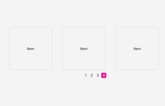
By default, three items get a display which can be can easily by modifying. It has placed the number pagination at the bottom of the items with the first one is active states.
As the user clicks on the second page, it scrolls up and replaces the old items with a new one. It also can show the page name at the top of items.
When user click on next pager (number), it gives the user to slide up the effect by bring new items while clicking on the previous number; it slides bring back the previous items.
Markup
The central concept is base on a radio button which controls the label. Each input type radio has a unique ID which will, later on, control through the label.
<div class="box-paginacao">
  <input type="radio" name="input-paginacao" id="paginacao1" checked>
  <input type="radio" name="input-paginacao" id="paginacao2">
  <input type="radio" name="input-paginacao" id="paginacao3">
  <input type="radio" name="input-paginacao" id="paginacao4">
</div>
We have defined the wrapper box-vitrines which holds the child divs for sets of items. To determine the number of an item, it needs to place inside a div which have a unique class like vitrine1, vitrine2 ... etc. Each item is placed in an unordered list.
<div class="box-paginacao">
    <div class="box-vitrines">
        <ul>
          <div class="vitrine1">
            <h2>First Page</h2>
            <li>Item</li>
            <li>Item</li>
            <li>Item</li>
          </div>
          <div class="vitrine2">
            <h2>Pagina 2</h2>
            <li>Item</li>
            <li>Item</li>
            <li>Item</li>
          </div>
          <div class="vitrine3">
            <h2>Second Page</h2>
            <li>Item</li>
            <li>Item</li>
            <li>Item</li>
          </div>
          <div class="vitrine4">
            <h2>Thrid Page</h2>
            <li>Item</li>
            <li>Item</li>
            <li>Item</li>
          </div>
        </ul>
      </div>
</div>
Finally, we have pagination controller that we can do by using the label.
<div class="box-paginacao">
    <div class="box-vitrines">
        .... Items Goes Here ...
        <div class="btn-paginacao">
          <ul>
            <li><label for="paginacao1">1</label></li>
            <li><label for="paginacao2">2</label></li>
            <li><label for="paginacao3">3</label></li>
            <li><label for="paginacao4">4</label></li>
          </ul>
        </div>
      </div>
</div>
The Style
The following CSS require to make work the item slider.
*, ul{
  margin: 0;
  padding: 0;
  list-style: none;
}
html{
  width: 100%;
  height: 100%;
}
body{
  font-family: 'Roboto', sans-serif;
  background:#f4f4f4;
  font-size: 100%;
  margin: 0;
  padding: 0;
}
.container{
  width: 80%;
  height: auto;
  margin: 0 auto;
  float:none;
}
.row{
  width: 1000px;
  height: auto;
  margin: 0 auto;
  position: relative;
}
h2{
  width: 100%;
  height: auto;
  float: left;
  margin: 2% 0;
  text-align: center;
  font-weight: 400;
  color: #FF1493;
  font-size: 1.5em;
  text-transform:uppercase;
}
h2 small{
	font-size:.55em;
}
input {
  display: none;
}
.box-paginacao {
  width: 100%;
  height: auto;
  float: left;
}
.box-paginacao h2 {
  width: 100%;
  height: auto;
  float: left;
  margin: 0 0 50px;
  text-align: center;
  font-family: 'Roboto', sans-serif;
  font-weight: 400;
  font-size: 1.3em;
  color: #3CA3F2;
}
.box-paginacao .box-vitrines {
  width: 100%;
  height: 371px;
  float: left;
  overflow: hidden;
  position: relative;
}
.box-paginacao ul {
  width: 100%;
  height: auto;
  float: left;
}
.box-paginacao ul li {
  width: 250px;
  height: 250px;
  float: left;
  margin: 0 0 10px 60px;
  border: 1px solid #c0c8c9;
  border-radius: 10px;
  line-height: 250px;
  text-align: center;
  font-family: 'Roboto', sans-serif;
  font-weight: 400;
  font-size: 1.3em;
  color: #2E2929;
}
.box-paginacao .vitrine1,
.box-paginacao .vitrine2,
.box-paginacao .vitrine3,
.box-paginacao .vitrine4 {
  width: 100%;
  height: 336px;
  float: left;
  margin-bottom: 33px;
}
.btn-paginacao {
  width: 100%;
  height: auto;
  float: left;
  margin-top: 10px;
  display: flex;
  align-items: center;
  justify-content: center;
  position: absolute;
  z-index: 10;
  left: 0;
  bottom: 0;
}
.btn-paginacao ul {
  width: auto;
  height: auto;
}
.btn-paginacao ul li {
  width: 30px;
  height: 30px;
  float: left;
  margin: 0 5px 0 0;
  border: 0;
}
.btn-paginacao ul li:last-child {
  margin: 0;
}
.btn-paginacao ul li label {
  width: 100%;
  height: 30px;
  float: left;
  text-align: center;
  line-height: 30px;
  font-family: 'Roboto', sans-serif;
  font-weight: 400;
  font-size: 1em;
  color: #2E2929;
  cursor: pointer;
  border-radius: 3px;
  transition: background-color .25s ease-in-out;
}
.btn-paginacao ul li label:hover {
  background-color: #FF1493;
  color: #FFF;
}
#paginacao1:checked ~ .box-vitrines > ul {
  transition: transform .7s ease-in-out;
  transform: translateY(0px);
}
#paginacao1:checked ~ .box-vitrines label[for="paginacao1"] {
  background-color: #FF1493;
  color: #FFF;
}
#paginacao2:checked ~ .box-vitrines > ul {
  transition: transform .7s ease-in-out;
  transform: translateY(-369px);
}
#paginacao2:checked ~ .box-vitrines label[for="paginacao2"] {
  background-color: #FF1493;
  color: #FFF;
}
#paginacao3:checked ~ .box-vitrines > ul {
  transition: transform .7s ease-in-out;
  transform: translateY(-738px);
}
#paginacao3:checked ~ .box-vitrines label[for="paginacao3"] {
  background-color: #FF1493;
  color: #FFF;
}
#paginacao4:checked ~ .box-vitrines > ul {
  transition: transform .7s ease-in-out;
  transform: translateY(-1107px);
}
#paginacao4:checked ~ .box-vitrines label[for="paginacao4"] {
  background-color: #FF1493;
  color: #FFF;
}
For working demo of pure CSS multi items vertical carousel, you can download the source code and implement on your website.