Masonry is a grid layout to arrange webpage elements in the columns. Unlike a justified grid layout, it doesn’t come with equal rows. However, this style makes it attractive and unique. Nowadays, it became the most popular and trendy layout after being used by Pinterest. In this tutorial, you will come to know how to create a pure CSS Masonry layout using flexbox property.
Basically, Masonry is a grid layout library for JavaScript that works by placing elements in the optimal position. But, it can be also created using CSS flexbox property and media queries to make it responsive across all devices.
The main benefit of the Masonry layout is that it optimizes the use of space on the webpage. This layout reduces the unnecessary gaps between the elements. Similarly, it provides the best user experience to browse the contents more easily.
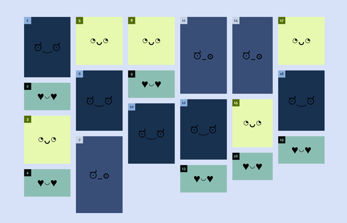
Before going further, I’ll suggest you check out the demo page of this Masonry-like grid layout. OK! as you have seen on the demo, there are three types of elements (small, medium and large) arranged in the columns. To indicate the order of the elements, I mentioned a number of each element. Now, let’s get started with coding to create a masonry layout.
The HTML Structure
In order to create a pure CSS Masonry grid layout with flexbox, we need an HTML structure just like below.
<div class="masonry">
  <div class="item">
    <div class="item__content">
    </div>
  </div>
  <div class="item">
    <div class="item__content item__content--small">
    </div>
  </div>
  <div class="item">
    <div class="item__content item__content--medium">
    </div>
  </div>
  <div class="item">
    <div class="item__content item__content--small">
    </div>
  </div>
  <div class="item">
    <div class="item__content item__content--medium">
    </div>
  </div>
  <div class="item">
    <div class="item__content">
    </div>
  </div>
  <div class="item">
    <div class="item__content item__content--large">
    </div>
  </div>
  <div class="item">
    <div class="item__content item__content--medium">
    </div>
  </div>
  <div class="item">
    <div class="item__content item__content--small">
    </div>
  </div>
  <div class="item">
    <div class="item__content">
    </div>
  </div>
  <div class="item">
    <div class="item__content item__content--large">
    </div>
  </div>
  <div class="item">
    <div class="item__content">
    </div>
  </div>
  <div class="item">
    <div class="item__content item__content--small">
    </div>
  </div>
  <div class="item">
    <div class="item__content item__content--large">
    </div>
  </div>
  <div class="item">
    <div class="item__content item__content--medium">
    </div>
  </div>
  <div class="item">
    <div class="item__content item__content--small">
    </div>
  </div>
  <div class="item">
    <div class="item__content item__content--medium">
    </div>
  </div>
  <div class="item">
    <div class="item__content">
    </div>
  </div>
  <div class="item">
    <div class="item__content item__content--small">
    </div>
  </div>
</div>
After creating HTML structure, place your contents between the <div class="item"> tag. You can remove size classes (item__content–small, item__content–large etc.) if you want to adjust the size according to your contents.
Making Masonry Layout with CSS Flexbox
In CSS, first of all set the basic styles for main masonry wrapper. Display it as flex and set its full width as 100%. Likewise, set the flex flow as column wrap and keep its height to auto. In order to make it responsive, set the different height on various media screens.
.masonry {
  display: -webkit-box;
  display: flex;
  -webkit-box-orient: vertical;
  -webkit-box-direction: normal;
          flex-flow: column wrap;
  width: 100%;
  height: auto;
}
@media screen and (min-width: 400px) {
  .masonry {
    height: 1600px;
  }
}
@media screen and (min-width: 600px) {
  .masonry {
    height: 1300px;
  }
}
@media screen and (min-width: 800px) {
  .masonry {
    height: 1100px;
  }
}
@media screen and (min-width: 1100px) {
  .masonry {
    height: 800px;
  }
}
Set the CSS styles for items, you can customize it by setting the custom values for padding, margin, background color etc.
.item {
  box-sizing: border-box;
  padding: 10px;
}
Now, set the styles for items content (for .item__content selector). Keep its position relative and display it as flex. Similarly, define the flex direction and other basic styles mentioned below.
.item__content {
  position: relative;
  display: -webkit-box;
  display: flex;
  -webkit-box-orient: vertical;
  -webkit-box-direction: normal;
          flex-direction: column;
  -webkit-box-pack: center;
          justify-content: center;
  -webkit-box-align: center;
          align-items: center;
  width: 100%;
  height: 220px;
  font-size: 40px;
  color: #070319;
  background: currentColor;
  box-sizing: border-box;
  color: #18314F;
}
.item__content:hover {
  background: #22446e;
}
If you want to set various size and background color for your elements, you can set CSS height property for the following selectors.
.item__content--small {
  color: #8BBEB2;
  height: 100px;
}
.item__content--small:hover {
  background: #a5cdc3;
}
.item__content--medium {
  color: #E6F9AF;
  height: 175px;
}
.item__content--medium:hover {
  background: #f2fcd5;
}
.item__content--large {
  color: #384E77;
  height: 280px;
}
.item__content--large:hover {
  background: #456093;
}
That’s all! I hope you like this Masonery-like grid layout and find this tutorial helpful. If you have any questions or suggestions, let me know by comment below.