Today we have minimalist pure CSS responsive masonry like grid layout which is simplest and builds with CSS only. It allows implementing the grid Pinterest-like responsive grid layout.
Do you know one of popular content layout style masonry? Don’t know? Think about Pinterest, Window 8 Metro, etc. It’s a layout which provides an almost crazy effect whereby the veritable size of content blocks are pieced together.
The grids play important roles while designing a website. It allow you to arrange the content in well manners. If you want to arrange the content on your website in different way than you can implement adjustable hexagonal CSS grid which provide more becauit to your site.
You don’t need to rely on JavaScript or jQuery to the build grid. It is fully responsive and works well on all type of devices.
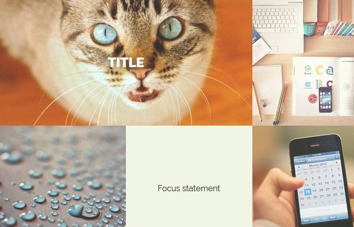
We will add the images and content masonry grids and also apply hover effects on some of the effects. It’s a complete package to show the content and images in a nice way.
You are allowed to add image or video in any size; it will adjust the grid automatically. Let’s have a look at the implementation.
Basic Markup Structure
Let’s begin with the markup and define the style.css to contain all of the styles to create Masonry grids.
<!DOCTYPE html>
<html lang="en">
<head>
    <meta charset="UTF-8" />
    <meta http-equiv="X-UA-Compatible" content="IE=edge,chrome=1">
    <meta name="viewport" content="width=device-width, initial-scale=1.0">
    <title>Masonry Grid Layout</title>
	<link rel="stylesheet" href="style.css">
</head>
<body>
We will define the main container for masonry and a div element for grids. Next, we will have all the grids define with its own wrapper.
Below example shows you how we coded the first grid. This grid is unique because it has a hover effect.
<section class="grid-container">
  <div class="cols grid-area">

    <figure class="col grid-1">
      <img src="https://placeimg.com/640/640/animals" alt="">
      <figcaption>
        <h2>Title</h2>
        <div class="grid-button-wrapper">
          <button class="rww_grid_button">More Info</button>
        </div>
        <p>Filler sentance goes here.</p>
        <a href="#">View More</a>
      </figcaption>
    </figure>

  </div>
</section>
Similar we can define more grids and Let’s see how we can add further grids.
<section class="grid-container">
  <div class="cols grid-area">

    <figure class="col grid-1">
      <img src="https://placeimg.com/640/640/animals" alt="">
      <figcaption>
        <h2>Title</h2>
        <div class="grid-button-wrapper">
          <button class="rww_grid_button">More Info</button>
        </div>
        <p>Filler sentance goes here.</p>
        <a href="#">View More</a>
      </figcaption>
    </figure>


    <div class="col grid-2">
      <img src="https://placeimg.com/640/640/any" alt="">
    </div>

    <figure class="col grid-3">
      <img src="https://placeimg.com/640/640/arch" alt="">
      <figcaption>
        <h2>Title</h2>
        <div class="grid-button-wrapper">
          <button class="rww_grid_button">More Info</button>
        </div>
        <p>Filler sentance goes here. It's longer to demonstrate how the text wrapping works.</p>
        <a href="#">View More</a>
      </figcaption>
    </figure>

    <div class="col grid-4">
      <img src="https://placeimg.com/640/640/nature" alt="">
    </div>

  </div>
</section>
The Core CSS style for Grid Layout
Now we will apply the core styles to grids to make work them. We’ll start with defining the max-width for the main container with the margin auto.
Similar we will with columns but each column by default will take the width of 25%. To make the images responsive and work well on mobile devices, We will set the width and height 100%. Also a little style for h2 tag as well.
.grid-container {
  max-width: 1280px;
  margin: 0 auto;
}
.cols {
  margin: 0 auto;
  max-width: 1000px;
}
.col {
  width: 25%;
  height: 250px;
  float: left;
  margin: 0;
}
.col img {
  display: block;
  position: relative;
  width: 100%;
  height: 100%;
  object-fit: cover;
  object-position: center;
  opacity: 0.8;
}
.col h2 {
  font-weight: 900;
  color: #fff;
  text-shadow: 0 0 20px rgba(0, 0, 0, 0.8);
}
We have different types of layout for each grid so we will define unique classes for each grid. We will apply for different width and position.
.grid-1 {
  width: 50%;
}
.grid-3 {
  float: right;
  height: 500px;
}
.grid-5 {
  display: table;
}
.grid-5 > * {
  display: table-cell;
}
.grid-5 > .text-container {
  text-align: center;
  vertical-align: middle;
  width: 50%;
}
.grid-5 img {
  object-position: right;
}
.grid-7 {
  width: 50%;
}

@supports (display: grid) or (display: -ms-grid) {
  .grid-area {
    display: grid;
    grid-template-columns: repeat(auto-fill, minmax(250px, 1fr));
    grid-auto-rows: 250px;
    justify-content: center;
  }
  .col {
    width: 100%;
    height: 100%;
    float: none;
  }
  .grid-1 {
    grid-column-end: span 2;
  }
  .grid-3 {
    grid-row-end: span 2;
  }
  .grid-5 {
    grid-column-end: span 2;
  }
  .grid-7 {
    grid-column-end: span 2;
  }
}
These media quers help us to make it work with any size of devices.
/* Media queries for other screen widths */
@media screen and (max-width: 450px) {
  .col {
    grid-row-end: unset;
    grid-column-end: unset;
    height: 250px;
  }
  .grid-area {
    display: flex;
    flex-direction: column;
  }
  .grid-3 {
    order: -1;
    height: 500px;
  }
}
@media screen and (max-width: 768px) {
  .grid-2 {
    display: none;
  }
}
As you can see we added hover effect on some of the block grids so here we did the style for them.
figure {
  position: relative;
  overflow: hidden;
  text-align: center;
  cursor: pointer;
}
figure figcaption {
  color: #fff;
  backface-visibility: hidden;
}
figure figcaption::before,
figure figcaption::after {
  pointer-events: none;
}
figure figcaption,
figure figcaption > a {
  position: absolute;
  top: 0;
  left: 0;
  width: 100%;
  height: 100%;
}
Some basic and default CSS need to style the font and text over the grids. If you need only images grids than this CSS may not be need.
figure figcaption > a {
  z-index: 1000;
  text-indent: 200%;
  white-space: nowrap;
  font-size: 0;
  opacity: 0;
}
figure h2 {
  word-spacing: -0.15em;
  font-weight: 300;
}
figure h2 span {
  font-weight: 800;
}
figure h2,
figure p {
  margin: 0;
}
figure button.rww_grid_button {
  background-color: transparent;
  border: 2px solid #fff;
  border-radius: 5px;
  margin: 0 auto;
  padding: 0.5rem;
  font-weight: bold;
  font-size: smaller;
  color: #fff;
  text-transform: uppercase;
  transition: all 0.3s;
}
figure p {
  letter-spacing: 1px;
  font-size: smaller;
}
figure figcaption::before {
  position: absolute;
  top: 0;
  left: 0;
  width: 100%;
  height: 100%;
  background: linear-gradient(
    to bottom,
    rgba(72, 76, 97, 0) 0%,
    rgba(72, 76, 97, 0.8) 75%
  );
  content: "";
  opacity: 0;
  transform: translate3d(0, 50%, 0);
}
figure h2 {
  position: absolute;
  top: 50%;
  left: 0;
  width: 100%;
  color: #484c61;
  transition: all 0.35s;
  transform: translate3d(0, -50%, 0);
}
figure figcaption::before,
figure p,
figure .grid-button-wrapper {
  transition: all 0.35s;
}
figure .grid-button-wrapper {
  position: absolute;
  bottom: 35%;
  left: 0;
  right: 0;
  width: 100%;
  opacity: 0;
  transform: translate3d(0, 20px, 0);
}
figure p {
  position: absolute;
  bottom: 10px;
  left: 0;
  right: 0;
  padding-bottom: 3rem;
  width: 100%;
  opacity: 0;
  transform: translate3d(0, 10px, 0);
}
figure:hover h2 {
  background: none;
  color: #fff;
  transform: translate3d(0, -50%, 0) translate3d(0, -40px, 0);
}
figure:hover figcaption::before,
figure:hover p,
figure:hover .grid-button-wrapper {
  opacity: 1;
  transform: translate3d(0, 0, 0);
}
That’s it. The nice and cool grids are ready to use. Feel free to download source code for pure CSS responsive Masonry grid layout. If you have any question, let me know by comment below.