A few days back, we created a responsive image carousel based on pure CSS and HTML radio input. Similarly, we are going to create another pure CSS image slider with the next and previous control buttons. Here, the main difference is that this slider comes with arrows keys and a more easy CSS technique.
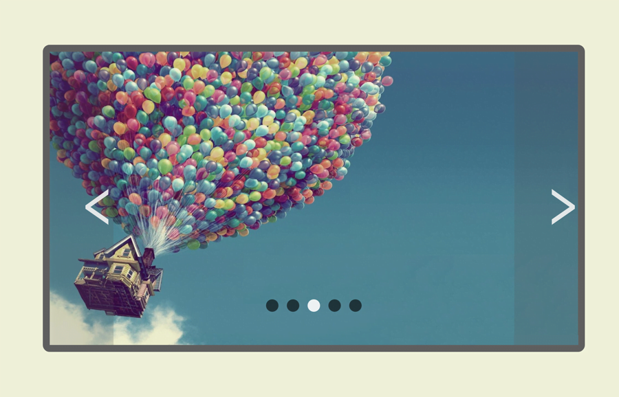
Basically, this pure CSS image slider is quite similar to JavaScript image carousels. It allows users to navigate slider images through dots navigation and next/previous buttons. A user can’t judge either it is built with a jQuery/JavaScript plugin or with CSS only.
Unlike the previous slider, here we’ll use sibling combinator selector (~) in order to slide images with buttons. So, let’s get started with HTML coding.
HTML Structure for Image Slider with Buttons
In HTML, create radio inputs with a unique id and place your images and labels (for next & previous) inside a div element. Likewise, create another div element with class name "nav_slide" and place label tag for dots navigation. Wrap all these elements into a div tag and define its class "container". So, the complete HTML structure looks like below:
<div class="container">
	<input type="radio" id="i1" name="images" checked />
	<input type="radio" id="i2" name="images" />
	<input type="radio" id="i3" name="images" />
	<input type="radio" id="i4" name="images" />
	<input type="radio" id="i5" name="images" />

	<div class="slide_img" id="one">

			<img src="img/image-1.jpg">

				<label class="prev" for="i5"><span>‹</span></label>
				<label class="next" for="i2"><span>›</span></label>

	</div>

	<div class="slide_img" id="two">

			<img src="img/image-2.jpg" >

				<label class="prev" for="i1"><span>‹</span></label>
				<label class="next" for="i3"><span>›</span></label>

	</div>

	<div class="slide_img" id="three">
			<img src="img/image-3.jpg">

				<label class="prev" for="i2"><span>‹</span></label>
				<label class="next" for="i4"><span>›</span></label>
	</div>

	<div class="slide_img" id="four">
			<img src="img/image-4.jpg">

				<label class="prev" for="i3"><span>‹</span></label>
				<label class="next" for="i5"><span>›</span></label>
	</div>

	<div class="slide_img" id="five">
			<img src="img/image-5.jpg">

				<label class="prev" for="i4"><span>‹</span></label>
				<label class="next" for="i1"><span>›</span></label>

	</div>

	<div id="nav_slide">
		<label for="i1" class="dots" id="dot1"></label>
		<label for="i2" class="dots" id="dot2"></label>
		<label for="i3" class="dots" id="dot3"></label>
		<label for="i4" class="dots" id="dot4"></label>
		<label for="i5" class="dots" id="dot5"></label>
	</div>
</div>
You can also add caption text just after the next/prev labels. However, you need to style it with some additional CSS.
The CSS Styles
In CSS, define the CSS styles for the ".container" slider and set its position relative. Similarly, define background-color, border, and margin property. You can set the custom values for these properties in order to customize it.
.container{
		margin: 0 auto;
		margin-top: 20px;
		position: relative;
		width: 70%;
		height: 0;
		padding-bottom: 38%;
	  user-select: none;
		background-color: #1c1c1c;
		border: solid 10px #616161;
		border-radius:10px ;
	}

	.container .slide_img{
		position: absolute;
		width: 100%;;
		height: 100%;
	}
	.container .slide_img img{
		width: inherit;
		height: inherit;
	}
Now, define the styles for the next and previous buttons just like below:
	 .prev, .next{
		width: 12%;
		height: inherit;
		position: absolute;
		top:0;
		background-color: rgba(88, 88, 88,.2);
		color:rgba(244, 244, 244,.9);
		z-index: 99;
		transition: .45s;
		cursor: pointer;
		text-align: center;
	}

	.next{right:0;}
	.prev{left:0;}

	label span{
		position: absolute;
		font-size: 100pt;
		top: 50%;
	 	transform: translateY(-50%);
	}
To make the slider buttons more attractive, define the CSS hover effect using the hover pseudo-selector.
  .prev:hover,
  .next:hover{
		transition: .3s;
		background-color: rgba(88, 88, 89,.8);
		color: #ffffff;
	}
After that, define the styles for slider dots navigation. If you want to change dots size, set the custom values for width and height that are 18px respectively.
.container #nav_slide{
	width: 100%;
	bottom: 12%;
	height: 11px;
	position: absolute;
	text-align: center;
	z-index: 99;
	cursor: default;
}

#nav_slide .dots{
	top: -5px;
	width: 18px;
	height: 18px;
	margin: 0 4px;
	position: relative;
	border-radius: 100%;
	display: inline-block;
	background-color: rgba(0, 0, 0, 0.6);
	transition: .4s;
}

#nav_slide .dots:hover {
	cursor: pointer;
	background-color: rgba(255, 255, 255, 0.9);
	transition: .25s
}

.slide_img{z-index: -1;}
To make the sliding functionality, set the scroll animation to the all defines labels.
	#i1:checked ~ #one  ,
	#i2:checked ~ #two  ,
	#i3:checked ~ #three,
	#i4:checked ~ #four ,
	#i5:checked ~ #five
	{z-index: 9; animation: scroll 1s ease-in-out;}

	#i1:checked  ~  #nav_slide #dot1,
	#i2:checked  ~  #nav_slide #dot2,
	#i3:checked  ~  #nav_slide #dot3,
	#i4:checked  ~  #nav_slide #dot4,
	#i5:checked  ~  #nav_slide #dot5
	{ background-color: rgba(255,255,255,.9);}

@keyframes scroll{
	0%{	opacity:.4;}
	100%{opacity:1;}
}
Finally, set the different width for the container and buttons in order to make them responsive on various media screens.
@media screen and (max-width: 685px){
	.container{
		border: none;
		width: 100%;
		height: 0;
		padding-bottom: 55%;
	}

	label span { font-size: 50pt; }

	.prev, .next{
		width: 15%;
	}
	#nav_slide .dots{
		width: 12px;
		height: 12px;
	}
}
@media screen  and(min-width: 970px){
	.me{ display: none;}
}
That’s all! I hope you found this tutorial helpful to create a pure CSS image slider with buttons. If you need any further help, you can comment below.