Sometimes we need a lightweight image slider while creating a lite website template. No doubt, a number of JavaScript/jQuery plugins are available to build an image slider. But, in order to create an ultra-lightweight carousel what will we do? Of course, we’ll reduce the size of JS functions or use only CSS to functionalize the slider. So, in this tutorial, we’ll create a responsive carousel image slider using pure CSS.
Although, we’ll not use JavaScript to program the sliding feature. But, it works just like the native JS image slider. The carousel items can be slide through next/previous buttons and dots navigation. All these possible with the help of HTML radio input and label element.
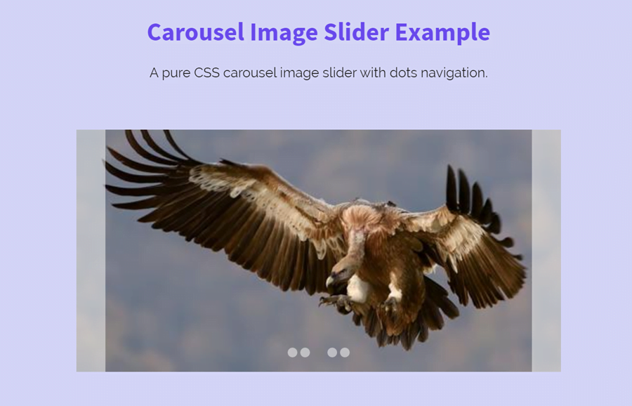
Before getting started with coding, I’ll recommend you check out the carousel demo page if you didn’t check yet. OK! now let’s get started with HTML and CSS to build a carousel image slider.
Responsive Carousel Image Slider Preview
HTML for Carousel Image Slider
First of all, decide how many images do you want to place in your image carousel. After that, create HTML radio inputs according to the number of images and place your images just after it. Wrap your every image in a div element with class name “item” and define its unique id. Similarly, define the labels for dot navigation and attach it with the image using HTML “for” attribute.
Wrap all these elements in a parent div tag and define its class “slider”. So, the complete HTML structure for the carousel image slider is as follows:
<div class="slider">
	<input type="radio" name="radio" id="radio01" class="radio" checked="checked">
	<input type="radio" name="radio" id="radio02" class="radio">
	<input type="radio" name="radio" id="radio03" class="radio">
	<input type="radio" name="radio" id="radio04" class="radio">
	<input type="radio" name="radio" id="radio05" class="radio">
	<div class="item" id="item01"><img src="img/image-1.jpg" alt="slide-image-01"></div>
	<div class="item" id="item02"><img src="img/image-2.jpg" alt="slide-image-02"></div>
	<div class="item" id="item03"><img src="img/image-3.jpg" alt="slide-image-03"></div>
	<div class="item" id="item04"><img src="img/image-4.jpg" alt="slide-image-04"></div>
	<div class="item" id="item05"><img src="img/image-5.jpg" alt="slide-image-05"></div>
	<label class="label" id="label01" for="radio01"></label>
	<label class="label" id="label02" for="radio02"></label>
	<label class="label" id="label03" for="radio03"></label>
	<label class="label" id="label04" for="radio04"></label>
	<label class="label" id="label05" for="radio05"></label>
	<span class="indicator"><label id="indicator01" for="radio01"></label></span>
	<span class="indicator"><label id="indicator02" for="radio02"></label></span>
	<span class="indicator"><label id="indicator03" for="radio03"></label></span>
	<span class="indicator"><label id="indicator04" for="radio04"></label></span>
	<span class="indicator"><label id="indicator05" for="radio05"></label></span>
</div>
If you want to add more images, also increase the number of radio input and labels. Don’t add anything else between the images and radio input. It is because we need the above DOM order to functionalize with CSS.
The CSS Styles
We need a fixed size for slider and hidden overflow. If you want to increase/decrease carousel size, just update the width and height value.
.slider {
	width: 500px;
	height: 250px;
	overflow: hidden;
	position: relative;
	text-align: center;
	line-height: 240px;
    margin: 5px auto;
}
Similarly, define the styles for slider items (images). Keep it absolute and adjust it to the top left with 100% width.
.slider > .item {
	position: absolute;
	top: 0;
	left: 0;
	width: 100%;
	height: 100%;
	z-index: 1;
}
.slider > .radio:checked ~ .item {
	-webkit-transition: all .4s ease 0s;
	transition: all .4s ease 0s;
}
Now add the following CSS snippet for next and previous buttons. If you want to change its size, update the width value (that is 30px). Likewise, you can also customize its background color.
.slider > .label {
	display: none;
	position: absolute;
	z-index: 4;
	top: 0;
	height: 100%;
	width: 30px;
	background-color: rgba( 255, 255, 255, .5 );
	opacity: 0;
	-webkit-transition: opacity .2s ease 0s;
	transition: opacity .2s ease 0s;
}
.slider:hover > .label {
	opacity: 1;
	-webkit-transition: opacity .2s ease 0s;
	transition: opacity .2s ease 0s;
}
After above that, define styles for dots indicators/navigation. If you want to customize them, you can change their size by updating the width and height property that is both 10px.
.slider > .indicator {
	position: relative;
	display: inline-block;
	bottom: 5px;
	z-index: 5;
	width: 10px;
	height: 10px;
	border-radius: 5px;
	background-color: rgba( 255, 255, 255, .5 );
	vertical-align: bottom;
	line-height: 1;
	-webkit-transition: opacity .2s ease 0s;
	transition: opacity .2s ease 0s;
}

.slider > .indicator label {
	display: block;
	width: 100%;
	height: 100%;
}
Finally, functionalize the slider by adding the following CSS code snippet into your carousel project.
/* [ active slide item ] asterisks: slide.length - 1 */
.slider > .radio:checked + * + * + * + * + .item {
	left: 0;
	z-index: 3;
}
/* [ previous slide item ] asterisks: slide.length - 2 */
.slider > .radio:checked + * + * + * + .item,
.slider > .radio:first-of-type:checked ~ .item:last-of-type {
	left: -100%;
	z-index: 2;
}
/* [ next slide item ] asterisks: slide.length */
.slider > .radio:checked + * + * + * + * + * + .item,
.slider > .radio:last-of-type:checked ~ .item:first-of-type {
	left: 100%;
	z-index: 2;
}
/* [ previous button ] asterisks: ( slide.length - 1 ) * 2 */
.slider > .radio:checked + * + * + * + * + * + * + * + * + .label,
.slider > .radio:first-of-type:checked ~ .label:last-of-type {
	left: 0;
	display: block;
}
/* [ next button ] asterisks: slide.length * 2 */
.slider > .radio:checked + * + * + * + * + * + * + * + * + * + * + .label,
.slider > .radio:last-of-type:checked ~ .label:first-of-type {
	right: 0;
	display: block;
}
/* [ active indicator ] asterisks: ( slide.length * 3 ) - 1 */
.slider > .radio:checked + * + * + * + * + * + * + * + * + * + * + * + * + * + * + .indicator {
	background-color: rgba( 127, 127, 127, .5 );
}
That’s all! I hope you like this carousel image slider. If you have any questions related to this carousel slider, feel free to comment below.