It’s new trends in website design to create a CSS fullscreen overlay menu by overlaying the div element. It works with one click and shows the user a fullscreen overlay with navigation links.
The overlay fades-in and menu slightly in perspective. I am going to share you a pure CSS method of getting this done.
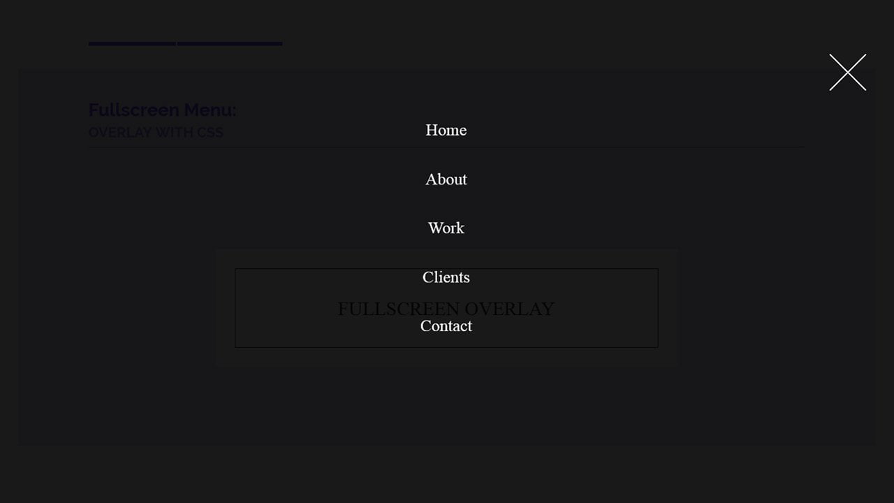
The remarkable thing about this Fullscreen Navigation Overlay, It doesn’t use the fixed size just like the models, but they get the all the screen of a web page.
Let’s have a look at the process of making it. We do control the overlay using a checkbox. First, we need to define a checkbox button which will set to display hidden by using CSS.
How to Create Pure CSS Fullscreen Overlay Menu
We control the checkbox using a label, so we have placed the label under a div lower.
<input type="checkbox" id="op"></input>
<div class="lower">
  <label for="op">Fullscreen Overlay</label>
</div>
Next, we will define a div class name overlay which will be our main div of the overlay. That is a div which will show you when a user clicks on an overlay button.
We also define the navigation menu by using the unordered list.
<div class="overlay overlay-hugeinc">
<label for="op"></label>
<nav>
    <ul>
        <li><a href="#">Home</a></li>
        <li><a href="#">About</a></li>
        <li><a href="#">Work</a></li>
        <li><a href="#">Clients</a></li>
        <li><a href="#">Contact</a></li>
    </ul>
</nav>
</div>
By using the CSS, first, we need to style the lower which is a button. We do add width, background color, font, and few other CSS properties to make it look good.
.lower{
  width:340px;
  margin:10% auto;
  padding:50px;
  background:white;
  opacity:0.8;
  color:black;
  box-shadow:inset 0 0 0 1px black;
  border:30px solid white;
}
.lower:hover{
  background:black;
  color:white;
  box-shadow:inset 0 0 0 1px white;
  border:30px solid black;
}
.lower label {
    display: block;
    font-family: "NotCourierSans";
    font-size: 30px;
    text-align: center;
    text-transform: uppercase;
}
.lower label:hover{
  cursor:pointer;
}
To create the overlay, we will use the position fixed and set the width/height to 100%. The value of top and left will be zero and an RGB background color, so it looks like transparent.
.overlay{
	position: fixed;
	width: 100%;
	height: 100%;
	top: 0;
	left: 0;
	background: rgba(0,0,0,0.9);
}
The label inside the overlay allows us to add a close button so when the user clicks on it; it will close the overlay screen.
.overlay label{
	width: 58px;
	height:58px;
	position: absolute;
	right: 20px;
	top: 20px;
	background: url('https://tympanus.net/Development/FullscreenOverlayStyles/img/cross.png');
	z-index: 100;
  cursor:pointer;
}
The overlay also has few nice animations which are defined in the CSS, and you can find in the demo. It also has a menu CSS so let’s have a look at the demo above.