Today, I am going to introduce you a unique overlay style navigation menu which developed with pure CSS3 and work on fullscreen when clicking on the toggle button.
If your website hasn’t much space to list different links but you still want to show them? Then this overlay navigation helps you a lot.
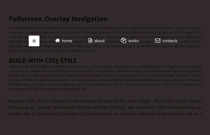
By default, It will show a toggle button and when the user clicks, It will provide full-screen overlay and show all the menu links.
Such type of CSS Fullscreen Overlay Menu works on small devices like when you create the menus list type ul, li and then on the small gadgets it becomes a toggle button but what about making such toggle on a large screen device?
Yep! it will look nice and give a site visitor a quick way to find some useful links.
The great thing about this overlay is that they don’t have fixed size like models because they get all the screen.
Ok, We are going to build this set of menu and guide you step by step to implement on your website. We will use the ease-in-out CSS3 advance property to handle the animation. Moreover, we will also use the transform property to produce the scale effect.
How to Create Fullscreen Overlay Menu
The HTML markup of navigation overlay is pretty simple and standard. We have HTML element nav and then instead we have input type="checkbox" which have defined an ID toggle-nav
Next, we just define the menu links as we normally define but within the div class name box
<nav id="Overlaymenu">
    <input type="checkbox" id="toggle-nav"/>
    <label id="toggle-nav-label" for="toggle-nav"><i class="icon-reorder"></i></label>
    <div class="box">
        <ul>
            <li><a href="#"><i class="icon-home"></i> home</a></li>
            <li><a href="#"><i class="icon-file-alt"></i> about</a></li>
            <li><a href="#"><i class="icon-copy"></i> works</a></li>
            <li><a href="#"><i class="icon-envelope"></i> contacts</a></li>
        </ul>
    </div>
</nav>
The CSS Style for Navigation
First of all, We need to style the div class name .box. we need to set overflow: hidden; and need to make it’s position: fixed;
Here we will add CSS3 Animation so overlay comes with nice effect. This will make the happen the navigation in a fullscreen overlay.
#Overlaymenu .box {
	position: fixed;
	text-align: center;
	overflow: hidden;
	z-index: -1;
	opacity: 0;
	width: 100%;
	height: 100%;
	left: 0px;
	top: 0px;
	background: rgba(0,0,0,0.8);
	-webkit-transition: all 0.3s ease-in-out;
	-moz-transition: all 0.3s ease-in-out;
	-o-transition: all 0.3s ease-in-out;
	transition: all 0.3s ease-in-out;
}
Next thing, you need do basic styling for your menus. According to below code example, you can see that I have added some effect for menus. I have added some kind of border-radius , font-size, and another general style.
#Overlaymenu ul {
	position: relative;
	top: 12%;
	-webkit-transform: scale(2);
	-moz-transform: scale(2);
	-ms-transform: scale(2);
	transform: scale(2);
	-webkit-transition: all 0.3s ease-in-out;
	-moz-transition: all 0.3s ease-in-out;
	-o-transition: all 0.3s ease-in-out;
	transition: all 0.3s ease-in-out;
}
#Overlaymenu li {
	display: inline-block;
	margin: 20px;
}
#Overlaymenu li a {
	border-radius: 3px;
	padding: 15px;
	border: 1px solid transparent;
	text-decoration: none;
	font-size: 18px;
	color: #fff;
	-webkit-transition: all 0.2s ease-in-out;
	-moz-transition: all 0.2s ease-in-out;
	-o-transition: all 0.2s ease-in-out;
	transition: all 0.2s ease-in-out;
}
Now we need to make work the toggle button. You can see we make display: none; of ID #toggle-nav and make some style for this toggle button.
#toggle-nav { display: none; }
#toggle-nav-label {
	color: rgba(0,0,0,0.5);
	background: rgba(0,0,0,0.2);
	text-align: center;
	line-height: 50px;
	font-size: 16px;
	display: block;
	cursor: pointer;
	position: relative;
	z-index: 500;
	width: 50px;
	height: 50px;
	border-radius: 3px;
}
To see all the style and work example please refer to our demo. We try to provide you simple possible solution for fullscreen navigation, hope you will like it and use for your next client project.
If you have any kind of question related to this fullscreen overlay style navigation menu, you can leave the comment. I will try to help you.