When we talk about consistent web design, the very first thing that comes to mind is lightweight and easy-to-navigate pages. So, the menu navigation is the first element to browse the website content. In a consistent design, the navigation system should be responsive, lightweight, and easy to use by the end-users. Therefore, here we have come back with a tutorial about the fullscreen navigation menu using pure CSS.
Why are we going to create this menu with the only CSS? the answer is simple, we just want to toggle the menu with a hamburger icon. For this purpose, we’ll use the HTML checkbox input show/hide menu on the checked/unchecked event in CSS.
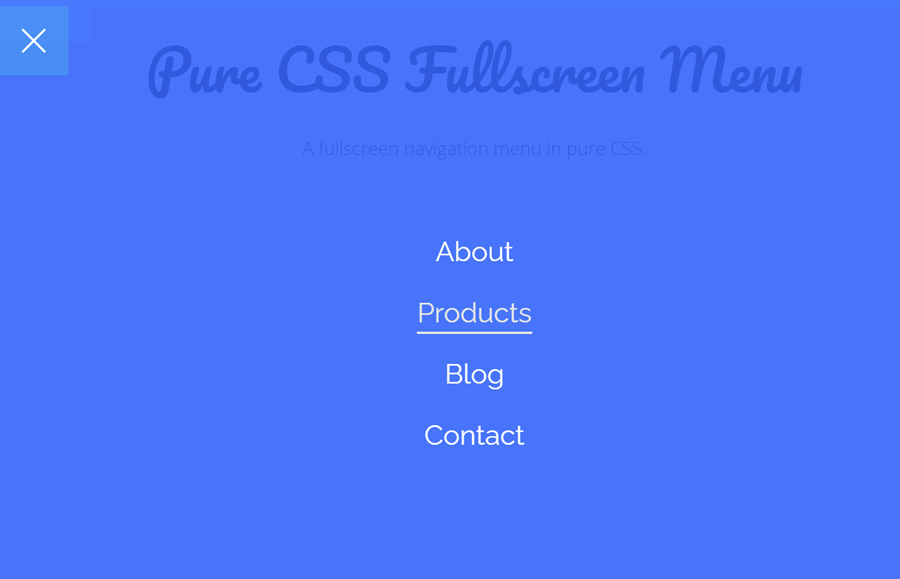
The navigation design is simple yet user-friendly and comes with some cool animations. The hamburger menu button converts into a cross sign when the menu opened. Likewise, the navigation also has an animated hover effect. You can check all these effects on the demo page before starting with coding.
The HTML Structure
The HTML structure for the menu is consists of three parts, an input, hamburger toggle button, and navigation links. So, create a div element with the class name "outer-menu" and place all these menu parts inside it as follows:
<div class="outer-menu">
  <input class="checkbox-toggle" type="checkbox" />
  <div class="hamburger">
    <div></div>
  </div>
  <div class="menu">
    <div>
      <div>
        <ul>
          <li><a href="#">About</a></li>
          <li><a href="#">Products</a></li>
          <li><a href="#">Blog</a></li>
          <li><a href="#">Contact</a></li>
        </ul>
      </div>
    </div>
  </div>
</div>
You are not limited to place only links inside the menu, you can also add some other content inside the div element that has a class name "menu".
CSS Styles for Fullscreen Menu
In the very first step, target the "outer-menu" class that is the main wrapper for the navigation menu. Set its fixes position and set top let value (according to your page template).
.outer-menu {
  position: fixed;
  top: 150px;
  left: 150px;
  z-index: 1;
}
Similarly, define the styles for the "checkbox-toggle" class that is the wrapper for the menu’s toggle button.
.outer-menu .checkbox-toggle {
  position: absolute;
  top: 0;
  left: 0;
  z-index: 2;
  cursor: pointer;
  width: 60px;
  height: 60px;
  opacity: 0;
}
After that, add the following CSS snippet into your project for the animated hamburger button. You can set the custom values for the height and width in order to change its size. Likewise, you can set the custom bars color in background property of hamburger > div selector.
.outer-menu .hamburger {
  position: absolute;
  top: 0;
  left: 0;
  z-index: 1;
  width: 60px;
  height: 60px;
  padding: 0.5em 1em;
  background: rgba(33, 150, 243, 0.75);
  border-radius: 0 0.12em 0.12em 0;
  cursor: pointer;
  transition: box-shadow 0.4s ease;
  -webkit-backface-visibility: hidden;
          backface-visibility: hidden;
  display: flex;
  align-items: center;
  justify-content: center;
}
.outer-menu .hamburger > div {
  position: relative;
  flex: none;
  width: 100%;
  height: 2px;
  background: #FEFEFE;
  transition: all 0.4s ease;
  display: flex;
  align-items: center;
  justify-content: center;
}
.outer-menu .hamburger > div:before,
.outer-menu .hamburger > div:after {
  content: '';
  position: absolute;
  z-index: 1;
  top: -10px;
  left: 0;
  width: 100%;
  height: 2px;
  background: inherit;
  transition: all 0.4s ease;
}
.outer-menu .hamburger > div:after {
  top: 10px;
}
In order to convert the hamburger icon into a cross (for closing menu), we’ll use the CSS transform rotate property. So, target the checkbox with a checked pseudo selector and rotate its child div element as described below:
.outer-menu .checkbox-toggle:checked + .hamburger > div {
  transform: rotate(135deg);
}
.outer-menu .checkbox-toggle:checked + .hamburger > div:before,
.outer-menu .checkbox-toggle:checked + .hamburger > div:after {
  top: 0;
  transform: rotate(90deg);
}
.outer-menu .checkbox-toggle:checked + .hamburger > div:after {
  opacity: 0;
}
The "menu" class is the container of the navigation. Set both width and height as 100% in order to make the fullscreen menu. Similarly, set a background color in RGBA value to make it transparent. Keep the overflow hidden and define all given mentioned properties:
.outer-menu .menu {
  position: fixed;
  top: 0;
  left: 0;
  width: 100%;
  height: 100%;
  pointer-events: none;
  visibility: hidden;
  overflow: hidden;
  -webkit-backface-visibility: hidden;
          backface-visibility: hidden;
  outline: 1px solid transparent;
  display: flex;
  align-items: center;
  justify-content: center;
}
.outer-menu .menu > div {
  width: 200vw;
  height: 200vw;
  color: #FEFEFE;
  background: rgba(41, 98, 255, 0.85);
  border-radius: 50%;
  transition: all 0.4s ease;
  flex: none;
  transform: scale(0);
  -webkit-backface-visibility: hidden;
          backface-visibility: hidden;
  overflow: hidden;
  display: flex;
  align-items: center;
  justify-content: center;
}
.outer-menu .menu > div > div {
  text-align: center;
  max-width: 90vw;
  max-height: 100vh;
  opacity: 0;
  transition: opacity 0.4s ease;
  overflow-y: auto;
  flex: none;
  display: flex;
  align-items: center;
  justify-content: center;
}
Target the ul element of the menu (that contains the list of links) and specify CSS styles as follows:
.outer-menu .menu > div > div > ul {
  list-style: none;
  padding: 0 1em;
  margin: 0;
  display: block;
  max-height: 100vh;
}
.outer-menu .menu > div > div > ul > li {
  padding: 0;
  margin: 1em;
  font-size: 24px;
  display: block;
}
.outer-menu .menu > div > div > ul > li > a {
  position: relative;
  display: inline;
  cursor: pointer;
  transition: color 0.4s ease;
}
Similarly, specify the style for the hover event. You can set the custom color or browse this tutorial to create hover effects.
.outer-menu .menu > div > div > ul > li > a:hover {
  color: #e5e5e5;
}
.outer-menu .menu > div > div > ul > li > a:hover:after {
  width: 100%;
}
.outer-menu .menu > div > div > ul > li > a:after {
  content: '';
  position: absolute;
  z-index: 1;
  bottom: -0.15em;
  left: 0;
  width: 0;
  height: 2px;
  background: #e5e5e5;
  transition: width 0.4s ease;
}
Finally, show the menu on the checkbox checked event by defining visible value for the visibility property.
.outer-menu .checkbox-toggle:checked ~ .menu {
  pointer-events: auto;
  visibility: visible;
}
.outer-menu .checkbox-toggle:checked ~ .menu > div {
  transform: scale(1);
  transition-duration: 0.75s;
}
.outer-menu .checkbox-toggle:checked ~ .menu > div > div {
  opacity: 1;
  transition: opacity 0.4s ease 0.4s;
}
.outer-menu .checkbox-toggle:hover + .hamburger {
  box-shadow: inset 0 0 10px rgba(0, 0, 0, 0.1);
}
.outer-menu .checkbox-toggle:checked:hover + .hamburger > div {
  transform: rotate(225deg);
}
That’s all! I hope you have successfully developed a fullscreen navigation menu using pure CSS. If you have any questions or suggestions, let me know by comment below.