In this short tutorial, we’d like to share how to create cool HTML & CSS Link Hover Effects which can be used for your website navigation.
I will use the pure CSS to create mouseover effects of hyperlinks. The idea to create simple menus bar and then animate them by using modern effect.
In the example, We are using hover transitions, but you could also add these effects on click or as an initial animation.
Previously, we have done a little experiment to create button shine/glow effect on hover and here we will develop some more stunning effects which can be applied on both links and as well as buttons.
With CSS3 we will transform boring HTML menus/links into the good-looking navigation menu.
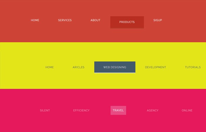
We are going to provide you three different styles and you can choose which you most like. It is easy to implement because it is built with standard hyperlinks links. We also added three different color schemes.
The navigation is the list of links and it needs standard HTML as a base. In our examples, we will build the CSS3 Menu from a standard HTML list. In most cases the HTML is simply a nav with some links:
Let’s Build Link Hover Effect Markup
Lets first define a section which is added just for adding the background color to make the navigation hover effect look more awesome.
Next, We have defined the nav element and then we simply added the hyperlinks.
<section class="color-red">
    <nav class="creativenav_SF">
        <a href="#">Home</a>
        <a href="#">Services</a>
        <a href="#">About</a>
        <a href="#">Products</a>
        <a href="#">Sigup</a>
    </nav>
</section>
But for 3D effects we might use a data-title attribute in a span for repeating the link text in the pseudo-element:
<section class="color-pink">
    <nav class="creativenav_3D">
        <ul>
            <li><a href="#"><span data-title="silent">silent</span></a></li>
            <li><a href="#"><span data-title="Efficiency">Efficiency</span></a></li>
            <li><a href="#"><span data-title="travel">travel</span></a></li>
            <li><a href="#"><span data-title="agency">agency</span></a></li>
            <li><a href="#"><span data-title="online">online</span></a></li>
        </ul>
    </nav>
</section>
The CSS for Cool Hover Effects
An example of the effect of creative navigation is the following style. First of all, we need to style the links by adding font-size, padding, and color, etc and than on-hover, we added the background color.
/* Effect 1: Bottom Line*/
.creativenav_SF a {
	font-size: 18px;
	padding: 20px 50px;
	position: relative;
	display: inline-block;
	outline: none;
	color: #fff;
	text-decoration: none;
	text-transform: uppercase;
	letter-spacing: 1px;
	font-weight: 400;
	text-shadow: 0 0 1px rgba(255,255,255,0.3);
}
.creativenav_SF a:hover,
.creativenav_SF a:focus {
	outline: none;
	background:#b82e20;
}
Next, We will positions a pseudo-element ::after and add it’s position: absolute; plus we added a transition for animations and scaling the element.
.creativenav_SF a::after {
	position: absolute;
	top: 100%;
	left: 0;
	width: 100%;
	height: 4px;
	background: rgba(0,0,0,0.1);
	content: '';
	opacity: 0;
	-webkit-transition: opacity 0.3s, -webkit-transform 0.3s;
	-moz-transition: opacity 0.3s, -moz-transform 0.3s;
	transition: opacity 0.3s, transform 0.3s;
	-webkit-transform: translateY(10px);
	-moz-transform: translateY(10px);
	transform: translateY(10px);
}
.creativenav_SF a:hover::after,
.creativenav_SF a:focus::after {
	opacity: 1;
	-webkit-transform: translateY(0px);
	-moz-transform: translateY(0px);
	transform: translateY(0px);
}
We have mentioned just first demo but there are two more which you can find in the demo file. We hope this collection gives you some more inspiration for creating the menu bar.
If you like these CSS based cool link hover effects, please share it with your friends so they can add them int their next upcoming projects.