Last night, I was thinking about a pure CSS carousel with arrows navigation. I just imagined the coding, but It looked a difficult task. I tried a little bit and I couldn’t finish it. The next morning, I woke up with the new concept to make a fully functional carousel with next/previous arrows.
So, I’m here to explain how I created a pure CSS carousel that works fine like JS slider.
HTML for Pure CSS Carousel
Before getting started with HTML, keep in mind the number of images/items that you want to display in the carousel. Initially, we’ll create the radio input elements according to the number of images. In my case, I placed 4 images. So, I created four radio inputs with value first, second, third, and fourth respectively.
<input type="radio" name="slide-trigger" value="first" id="first" checked />
<input type="radio" name="slide-trigger" value="second" id="second" />
<input type="radio" name="slide-trigger" value="third" id="third" />
<input type="radio" name="slide-trigger" value="fourth" id="fourth" />
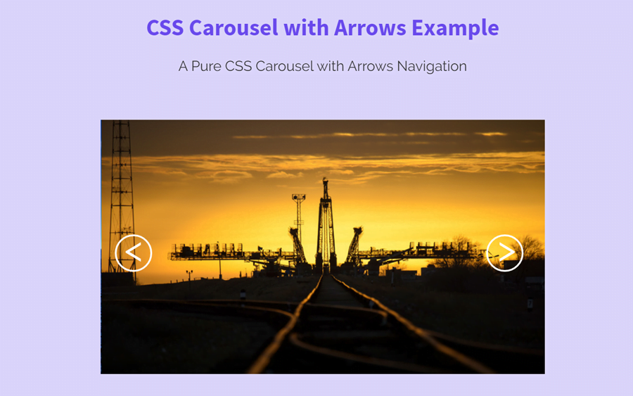
After that, we’ll create a div element with id “slider”. This parent div contains a child div containing two labels for image and arrow icon.
<div id="slider">
  <div id="slider-inner">
    <div id="first-slide" class="slide">
      <label for="fourth"><</label>
        <img src="img/image-1.jpg">
      <label for="second">></label>
    </div>
    <div id="second-slide" class="slide">
      <label for="first"><</label>
       <img src="img/image-2.jpg">
      <label for="third">></label>
    </div>
    <div id="third-slide" class="slide">
      <label for="second"><</label>
       <img src="img/image-3.jpg">
      <label for="fourth">></label>
    </div>
    <div id="fourth-slide" class="slide">
      <label for="third">></label>
       <img src="img/image-4.jpg">
      <label for="first">></label>
    </div>
  </div>
</div>
Try to keep the above HTML structure as it is. Because we’ll add its working functionality with CSS pseudo and preceded selectors.
CSS Styles for Carousel
First of all set the basic style for the slider. Keep its overflow hidden and define other necessary attributes like width, and height, etc.
#slider{
  width:500px;
  awidth:100%;
  height:300px;
  aheight:75%;
  aborder:5px solid;
  overflow:hidden;
  margin:0 auto;
}
Similarly, define some styles for slider inner and its image as follows:
#slider img{
    width: 100%;
    height: auto;
}
#slider-inner{
  position:relative;
  width:2100px;
  awidth:500%;
  height:300px;
  aheight:75%;
  margin-left:-47px;
  -webkit-transition:all .7s cubic-bezier(0.68,-0.55,0.265,1.55);
  transition:all .7s cubic-bezier(0.68,-0.55,0.265,1.55);
}
#slider-inner div{
  position:relative;
  width:500px;
  awidth:100%;
  height:300px;
  aheight:75%;
  display:inline-block;
  margin-left:-5px;
  atext-align:center;
}
Now, its time to design an arrow icon, the following CSS code sets the styles for next & previous arrow buttons. If you want to customize these buttons, you can change the values of font-size, height, width (to increase/decrease size) and color, etc.
#slider-inner div label{
  position:absolute;
  font-size: 40px;
  border:2px solid #fff;
  color: #fff;
  border-radius:50%;
  width: 42px;
  height: 42px;
  opacity:0;
  cursor:pointer;
  -webkit-transition:opacity .7s .4s, background .2s;
  transition:opacity .7s .4s, background .2s;
}
The below CSS functionalities the carousel through pseudo and preceded selectors. So, add the following code into your project to finalize the working of the carousel.
#slider-inner div label:nth-of-type(1){
  left:15px;
  top:50%;
  -webkit-transform:translateY(-50%);
          transform:translateY(-50%);
  padding:0 11px 0 9px;
  z-index:999;
}
#slider-inner div label:nth-of-type(2){
  right:25px;
  top:50%;
  -webkit-transform:translateY(-50%);
          transform:translateY(-50%);
  padding:0 9px 0 11px;
}
#slider-inner div label:hover{background:rgba(255,255,255,.5)}
#first:checked ~ #slider #slider-inner{
  margin-left:-47px;
}
#first:checked ~ #slider #slider-inner #first-slide label{
  opacity:1;
}
#second:checked ~ #slider #slider-inner{
  margin-left:-547px;
}
#second:checked ~ #slider #slider-inner #second-slide label{
  opacity:1;
}
#third:checked ~ #slider #slider-inner{
  margin-left:-1047px;
}
#third:checked ~ #slider #slider-inner #third-slide label{
  opacity:1;
}
#fourth:checked ~ #slider #slider-inner{
  margin-left:-1547px;
}
#fourth:checked ~ #slider #slider-inner #fourth-slide label{
  opacity:1;
}

input {
  display: none;
}
Keep in mind, if you want to add more than 4 items in your carousel, calculate the total width of items (set this width in a first code block), then update the values in the last code block respectively.
Thats all! I hope, you like this pure CSS carousel with arrows buttons. If you have any questions or suggestions related to this carousel, feel free to comment below. Thanks!