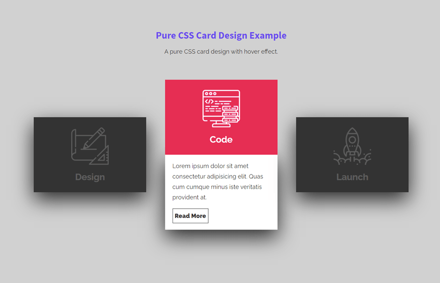
The card element is a useful component to visualize important content on a webpage. It can be used for post feed, products, or summarized content. It is also useful to highlight features of a product or company as well. A standard card design consists of a thumbnail, title, summary, and link to a detailed page. Therefore, in order to make a card element more attractive, we can also add animation and hover effects. That’s we are going to make it here, card design with hover effect using pure CSS.
As you have seen in the above preview, there are three cards arranged side by side. When a user hovers over the card, it expands with a smooth transition and shows the summary of the card. You can check this on the demo page to experience the card expand animation.
You can use these cards to make a showcase of your projects or posts feed. Similarly, you can also use them to make a grid menu or navigation for important pages. Anyhow, it depends on you where you want to integrate these cards. So, let’s get started with HTML to make card design.
The HTML Structure
The HTML for a single card consists of two main parts, face1 before hover and face2 after hover. As I mentioned above, the cards expand on the hover event and show the summary. The summary and read more button wrapped in a div element with a class name "content". Similarly, the thumbnail and title are also wrapped in a div having the same class "content".
So, create a div element with a class name "card", wrap content class and place your thumbnail and title inside the face1 div. Similarly, place summary text and read more inside the face2 div. You can create multiple cards according to your needs. Wrap all your cards inside a div element and define its class name "container".
<div class="container">
   <div class="card">
      <div class="face face1">
         <div class="content">
            <img src="https://github.com/Jhonierpc/WebDevelopment/blob/master/CSS%20Card%20Hover%20Effects/img/design_128.png?raw=true">
            <h3>Design</h3>
         </div>
      </div>
      <div class="face face2">
         <div class="content">
            <p>Lorem ipsum dolor sit amet consectetur adipisicing elit. Quascumque minus iste veritatis provident at.</p>
            <a href="#">Read More</a>
         </div>
      </div>
   </div>
   <div class="card">
      <div class="face face1">
         <div class="content">
            <img src="https://github.com/Jhonierpc/WebDevelopment/blob/master/CSS%20Card%20Hover%20Effects/img/code_128.png?raw=true">
            <h3>Code</h3>
         </div>
      </div>
      <div class="face face2">
         <div class="content">
            <p>Lorem ipsum dolor sit amet consectetur adipisicing elit. Quas cumque minus iste veritatis provident at.</p>
            <a href="#">Read More</a>
         </div>
      </div>
   </div>
   <div class="card">
      <div class="face face1">
         <div class="content">
            <img src="https://github.com/Jhonierpc/WebDevelopment/blob/master/CSS%20Card%20Hover%20Effects/img/launch_128.png?raw=true">
            <h3>Launch</h3>
         </div>
      </div>
      <div class="face face2">
         <div class="content">
            <p>Lorem ipsum dolor sit amet consectetur adipisicing elit. Quas cumque minus iste veritatis provident at.</p>
            <a href="#">Read More</a>
         </div>
      </div>
   </div>
</div>
The CSS for Card Design with Hover
After creating HTML, now it’s time to style these cards using CSS. Therefore, target the "container" class and define its fixed width that covers the total width of your cards. In my case, I used a 1000px wide container for 3 cards, you can specify according to your needs. Likewise, define the relative position and display the container element as flex.
.container{
    width: 1000px;
    position: relative;
    display: flex;
    justify-content: space-between;
    margin: 15px auto;
}
Now, select the "card" class of the container element and define its relative position. Also, use the CSS cursor property and set its value pointer in order to convert arrow to hand while hovering on it.
.container .card{
    position: relative;
    cursor: pointer;
}
Similarly, select the "face" class that specifies the visible area of the card. Define the width and height as 300px and 200px respectively. Likewise, select "face1" and "face2" classes and define their CSS styles as described below:
.container .card .face{
    width: 300px;
    height: 200px;
    transition: 0.5s;
}

.container .card .face.face1{
    position: relative;
    background: #333;
    display: flex;
    justify-content: center;
    align-items: center;
    z-index: 1;
    transform: translateY(100px);
}
.container .card:hover .face.face1{
    background: #ff0057;
    transform: translateY(0);
}
.container .card .face.face2{
    position: relative;
    background: #fff;
    display: flex;
    justify-content: center;
    align-items: center;
    padding: 20px;
    box-sizing: border-box;
    box-shadow: 0 20px 50px rgba(0, 0, 0, 0.8);
    transform: translateY(-100px);
}
.container .card:hover .face.face2{
    transform: translateY(0);
}

.container .card .face.face2 .content p{
    margin: 0;
    padding: 0;
}
Target the "content" class and define its opacity value as 0.2 and transition 0.5s. In the same way, target the content class with the card hover pseudo class and define opacity value as 1. After that, target the img element of the content and define its max-width as 100px in order to fit it inside the card. The h3 tag inside the content class specifies title of the card, define its style as follows:
.container .card .face.face1 .content{
    opacity: 0.2;
    transition: 0.5s;
}

.container .card:hover .face.face1 .content{
    opacity: 1;
}

.container .card .face.face1 .content img{
    max-width: 100px;
}

.container .card .face.face1 .content h3{
    margin: 10px 0 0;
    padding: 0;
    color: #fff;
    text-align: center;
    font-size: 1.5em;
}
In order to style the read more button, select the "a" tag of the content class and define its margin, display, text-decoration, font-weight, color, and border property as mentioned below:
.container .card .face.face2 .content a{
    margin: 15px 0 0;
    display:  inline-block;
    text-decoration: none;
    font-weight: 900;
    color: #333;
    padding: 5px;
    border: 1px solid #333;
}
Finally, apply the hover style to the read more button and done. You can also make this button more attractive by applying the 3D button hover effect.
.container .card .face.face2 .content a:hover{
    background: #333;
    color: #fff;
}
That’s all! I hope you have successfully created a card design with a hover effect using pure CSS. If you have any questions or suggestions, let me know by comment below.