Buttons are the most important elements in web designing that allow users to interact with a website. They can be used to perform various operations on a webpage. No doubt, a well-designed website attracts users to long last on a webpage. The CSS animations and visual effects allow us to develop animated elements including buttons, checkboxes to attracts users. So, here we are going to create 3D button hover effects using CSS.
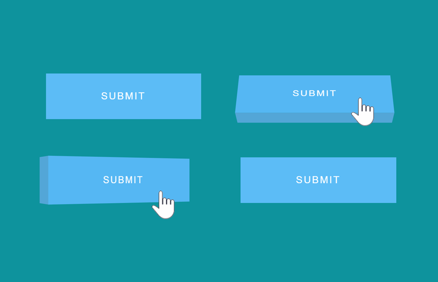
Before getting started with coding, I’ll suggest you browse the demo page to check the 3D hover effect. OK! as you have seen four different 3D effects on button mouseover, do you know how we built them? Well! it’s really simple using CSS perspective property to give 3D-position on hover.
In this hover effect tutorial, we’ll create four 3D effects that reveal on mouseover using CSS :hover pseudo-selector. You can choose your favorite one to implement in your web project. So, let’s get started with the button HTML.
Button HTML to Create 3D Hover Effect
In HTML we just need a button element with three class names “btn btn-3d” and third class to define the 3D effect. So, in the following HTML, we defined four buttons that wrapped into a section. You can create one of them according to your needs.
    <section class="3d-buttons">
      <p class="btn_perspective">
        <button class="btn btn-3d btn-3da">Submit</button>
      </p>
      <p class="btn_perspective">
        <button class="btn btn-3d btn-3db">Submit</button>
      </p>
      <br />
      <p class="btn_perspective">
        <button class="btn btn-3d btn-3dc">Submit</button>
      </p>
      <p class="btn_perspective">
        <button class="btn btn-3d btn-3dd">Submit</button>
      </p>
    </section>
The p tag <p class="btn_perspective"> is necessary, wrap your button into it.
The CSS Styles
In CSS, first of all, we’ll define basic styles for buttons. If you want to customize it, you can change its size by updating the padding and font-size values. Similarly, you can change the background color and other related properties.
.btn {
  border: none;
  position: relative;
  background: none;
  cursor: pointer;
  padding: 28px 90px;
  display: inline-block;
  text-transform: uppercase;
  margin: 15px 30px;
  color: inherit;
  letter-spacing: 2px;
  font-size: 1em;
  outline: none;
  -moz-transition: all 0.4s;
  -webkit-transition: all 0.4s;
  transition: all 0.4s;
}
Now we’ll add CSS transition property for smoothness.
.btn:after {
  content: '';
  position: absolute;
  z-index: -1;
  -webkit-transition: all 0.4s;
  -moz-transition: all 0.4s;
  transition: all 0.4s;
}
Set up the perspective property for the button before defining 3D effect.
.btn_perspective {
  -webkit-perspective: 800px;
  -moz-perspective: 800px;
  perspective: 800px;
  display: inline-block;
}
Now its time to transform the button into a 3D object using CSS after pseudo selector and reveal this effect on hover. The following CSS code snippet specifies the first hover effect (that you have seen on the demo page).
.btn-3d:active {
  background: #55b7f3;
}

.btn-3da:after {
  width: 100%;
  height: 42%;
  left: 0;
  top: -40%;
  background: #53a6d7;
  -webkit-transform-origin: 0% 100%;
  -webkit-transform: rotateX(90deg);
  -moz-transform-origin: 0% 100%;
  -moz-transform: rotateX(90deg);
  transform-origin: 0% 100%;
  transform: rotateX(90deg);
}

.btn-3da:hover {
  -webkit-transform: rotateX(-360deg);
  -moz-transform: rotateX(-360deg);
  -ms-transform: rotateX(-360deg);
  transform: rotateX(-360eg);
}
Likewise, we’ll change a few transformation values to create a second 3D hover effect.
.btn-3db:after {
  width: 100%;
  height: 40%;
  left: 0;
  top: 100%;
  background: #53a6d7;
  -webkit-transform-origin: 0% 0%;
  -webkit-transform: rotateX(-90deg);
  -moz-transform-origin: 0% 0%;
  -moz-transform: rotateX(-90deg);
  -ms-transform-origin: 0% 0%;
  -ms-transform: rotateX(-90deg);
  transform-origin: 0% 0%;
  transform: rotateX(-90deg);
}

.btn-3db:hover {
  -webkit-transform: rotateX(35deg);
  -moz-transform: rotateX(35deg);
  -ms-transform: rotateX(35deg);
  transform: rotateX(35deg);
}
Similarly, the following CSS code snippet specifies the third hover effect.
.btn-3dc:after {
  width: 20%;
  height: 100%;
  left: -20%;
  top: 0;
  background: #53a6d7;
  -webkit-transform-origin: 100% 0%;
  -webkit-transform: rotateY(-90deg);
  -moz-transform-origin: 100% 0%;
  -moz-transform: rotateY(-90deg);
  -ms-transform-origin: 100% 0%;
  -ms-transform: rotateY(-90deg);
  transform-origin: 100% 0%;
  transform: rotateY(-90deg);
}

.btn-3dc:hover {
  -webkit-transform: rotateY(25deg);
  -moz-transform: rotateY(25deg);
  -ms-transform: rotateY(25deg);
  transform: rotateY(25deg);
}
The following is the CSS snippet for the fourth hover effect.
.btn-3dd:after {
  width: 20%;
  height: 100%;
  left: 100%;
  top: 0;
  background: #53a6d7;
  -webkit-transform-origin: 0% 0%;
  -webkit-transform: rotateY(90deg);
  -moz-transform-origin: 0% 0%;
  -moz-transform: rotateY(90deg);
  -ms-transform-origin: 0% 0%;
  -ms-transform: rotateY(90deg);
  transform-origin: 0% 0%;
  transform: rotateY(90deg);
}

.btn-3dd:hover {
  -webkit-transform: rotateY(-15deg);
  -moz-transform: rotateY(-15deg);
  -ms-transform: rotateY(-15deg);
  transform: rotateY(-15deg);
}
By default all buttons are responsive. If you want to add separate styles for mobile you can use the CSS media queries to define the different style for small screen size.
@media screen and (max-width:480px) {
   /* Your  button styles goes here */
}
That’s all! I hope you like these 3D button hover effects. If you have any questions related to these buttons hover styles, drop your comment below.