In this article, we’re going to creating a beautiful and stylish pure CSS accordion menu that has animated elements which user click.
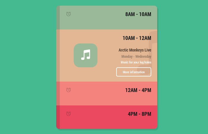
It is the colorful HTML/CSS accordion menu and each one has a unique color. When the user clicks on any menu items, the elements (such as icons, text, button, etc) comes with a nice animation.
Furthermore, the design looks really awesome and if you are going to show some important information such as store or shop timing then this would be the best design you want to implement.
In addition, it allows the user to toggle hidden panels by clicking the title bar. The accordion design is excellent and uses a flat color scheme. It will make your website design more appeal.
A different color background has been used for each title to make it unique and look great. It is responsive and works on all media devices.
You don’t need to write all of the code to build a CSS accordion to from start. Just pick the HTML and CSS code and implement it on your website to make it ready.
This accordion menu is lightweight because it is written in CSS only and you don’t need to use the javascript.
How to Create CSS Animated Accordion Menu
Let’s have a look at how to build this accordion and first see the HTML. The HTML is designed to understand quickly.
You can see we use the radio button and label elements. These will help us to develop the toggle function through CSS.
As for content, we created two divs left and right to arrange the icon and content. As for icons, we are using the ionicons so make sure to include in the head.
<div class='right'>
  <div class='app'>
    <div class='app_inner'>
      <input checked='' id='tab-1' name='buttons' type='radio'>
      <label for='tab-1'>
        <div class='app_inner__tab'>
          <h2>
            <i class='icon ion-android-alarm-clock'></i>
            8am - 10am
          </h2>
          <div class='tab_left'>
            <i class='big icon ion-android-color-palette'></i>
            <div class='tab_left__image'>
              <i class='icon ion-android-color-palette'></i>
            </div>
          </div>
          <div class='tab_right'>
            <h3>Jamie talks design</h3>
            <h4>Monday - Thursday</h4>
            <p>I talk a bunch of rubbish</p>
            <button>More information</button>
          </div>
        </div>
      </label>
      <input false='' id='tab-2' name='buttons' type='radio'>
      <label for='tab-2'>
        <div class='app_inner__tab'>
          <h2>
            <i class='icon ion-android-alarm-clock'></i>
            10am - 12am
          </h2>
          <div class='tab_left'>
            <i class='big icon ion-music-note'></i>
            <div class='tab_left__image'>
              <i class='icon ion-music-note'></i>
            </div>
          </div>
          <div class='tab_right'>
            <h3>Arctic Monkeys Live</h3>
            <h4>Monday - Wednesday</h4>
            <p>Music for your lug holes</p>
            <button>More information</button>
          </div>
        </div>
      </label>
      <input false='' id='tab-3' name='buttons' type='radio'>
      <label for='tab-3'>
        <div class='app_inner__tab'>
          <h2>
            <i class='icon ion-android-alarm-clock'></i>
            12am - 4pm
          </h2>
          <div class='tab_left'>
            <i class='big icon ion-android-microphone'></i>
            <div class='tab_left__image'>
              <i class='icon ion-android-microphone'></i>
            </div>
          </div>
          <div class='tab_right'>
            <h3>Steven Fry podcast</h3>
            <h4>Staurday - Sunday</h4>
            <p>Steven Fry says words</p>
            <button>More information</button>
          </div>
        </div>
      </label>
      <input false='' id='tab-4' name='buttons' type='radio'>
      <label for='tab-4'>
        <div class='app_inner__tab'>
          <h2>
            <i class='icon ion-android-alarm-clock'></i>
            4pm - 8pm
          </h2>
          <div class='tab_left'>
            <i class='big icon ion-android-bar'></i>
            <div class='tab_left__image'>
              <i class='icon ion-android-bar'></i>
            </div>
          </div>
          <div class='tab_right'>
            <h3>Massive event</h3>
            <h4>Monday - Friday</h4>
            <p>Some kind of music festival</p>
            <button>More information</button>
          </div>
        </div>
      </label>
    </div>
  </div>
</div>
The Style
The CSS is a little long to handle the accordion design and its functionality.
@import url(https://fonts.googleapis.com/css?family=Roboto+Condensed:400,700,300);
* {
  box-sizing: border-box;
}

body {
  background: #45b98f;
  overflow: hidden;
  font-family: 'Roboto Condensed', sans-serif;
	line-height: normal;
}
body .left {
  float: left;
  width: 50%;
  height: 100vh;
  position: Relative;
}
body .left_inner {
  width: 340px;
  margin: 0 auto;
  -webkit-transform: translateY(-50%);
          transform: translateY(-50%);
  height: 414px;
  position: absolute;
  right: 20px;
  top: 40%;
}
body .left_inner h1 {
  color: white;
  font-size: 28px;
  margin: 120px 0px 0px 0px;
}
body .left_inner h2 {
  color: #abe8d2;
  font-size: 22px;
  font-weight: 200;
  margin: 0px 0px 0px 0px;
}
body .right {
  float: right;
  position: relative;
  width: 50%;
  height: 100vh;
}

.app {
  border-radius: 10px;
  width: 340px;
  margin: 0 auto;
  height: 414px;
  position: absolute;
  left: 0;
  top: 40%;
  box-shadow: 4px 5px 0px rgba(0, 0, 0, 0.11);
  -webkit-animation: intro 0.34s 0.4s cubic-bezier(1, 1.4, 0.41, 1.01) forwards;
          animation: intro 0.34s 0.4s cubic-bezier(1, 1.4, 0.41, 1.01) forwards;
  -webkit-transform: translateY(-50%) scale(0) rotateX(10deg) rotateY(10deg) rotateZ(10deg);
          transform: translateY(-50%) scale(0) rotateX(10deg) rotateY(10deg) rotateZ(10deg);
  margin: auto;
  overflow: hidden;
  font-family: 'Roboto Condensed', sans-serif;
}
.app_inner {
  position: relative;
}
.app_inner input[type="radio"] {
  display: none;
}
.app_inner input[type="radio"]:checked + label .app_inner__tab {
  height: 175px;
}
.app_inner input[type="radio"]:checked + label .app_inner__tab .tab_right {
  top: 39px;
  transition: all 0.3s 0.2s cubic-bezier(0.455, 0.03, 0.515, 0.955);
}
.app_inner input[type="radio"]:not(checked) + label .app_inner__tab {
  height: 80px;
  border-left: 12px solid rgba(0, 0, 0, 0.12);
}
.app_inner input[type="radio"]:not(checked) + label .app_inner__tab .tab_right {
  top: 200px;
  transition: all 0.3s 0.3s cubic-bezier(0.455, 0.03, 0.515, 0.955);
}
.app_inner input[type="radio"]:checked + label .app_inner__tab .tab_left .tab_left__image {
  -webkit-animation: move_in 0.55s 0.05s cubic-bezier(0.455, 0.03, 0.515, 0.955) forwards;
          animation: move_in 0.55s 0.05s cubic-bezier(0.455, 0.03, 0.515, 0.955) forwards;
  transition: all 0.3s 0.36s cubic-bezier(0.455, 0.03, 0.515, 0.955);
}
.app_inner input[type="radio"]:not(checked) + label .app_inner__tab .tab_left .tab_left__image {
  -webkit-animation: move_out 0.75s 0s cubic-bezier(0.455, 0.03, 0.515, 0.955) forwards;
          animation: move_out 0.75s 0s cubic-bezier(0.455, 0.03, 0.515, 0.955) forwards;
  transition: all 0.3s 0.3s cubic-bezier(0.455, 0.03, 0.515, 0.955);
}
.app_inner input[type="radio"]:checked + label .app_inner__tab .tab_left .big {
  left: 260px;
}
.app_inner input[type="radio"]:not(checked) + label .app_inner__tab .tab_left .big {
  left: 400px;
}
.app_inner input[type="radio"]:checked + label .app_inner__tab h2 i {
  opacity: 0;
}
.app_inner input[type="radio"]:not(checked) + label .app_inner__tab h2 i {
  opacity: .3;
}
.app_inner label {
  display: block;
  width: 100%;
}
.app_inner label:nth-of-type(1) .app_inner__tab {
  background: #99b998;
  height: 200px;
}
.app_inner label:nth-of-type(1) .app_inner__tab:hover {
  transition: all .2s;
  background: #8db18c;
}
.app_inner label:nth-of-type(1) .app_inner__tab .tab_left__image {
  background: #EA495F;
}
.app_inner label:nth-of-type(2) .app_inner__tab {
  background: #E4B794;
}
.app_inner label:nth-of-type(2) .app_inner__tab:hover {
  transition: all .2s;
  background: #e0ac84;
}
.app_inner label:nth-of-type(2) .app_inner__tab .tab_left__image {
  background: #99B998;
}
.app_inner label:nth-of-type(3) .app_inner__tab {
  background: #f4837d;
}
.app_inner label:nth-of-type(3) .app_inner__tab:hover {
  transition: all .2s;
  background: #f2716a;
}
.app_inner label:nth-of-type(3) .app_inner__tab .tab_left__image {
  background: #E4B794;
}
.app_inner label:nth-of-type(4) .app_inner__tab {
  background: #ea495f;
}
.app_inner label:nth-of-type(4) .app_inner__tab:hover {
  transition: all .2s;
  background: #e8374f;
}
.app_inner label:nth-of-type(4) .app_inner__tab .tab_left__image {
  background: #F4837D;
}
.app_inner__tab {
  width: 100%;
  height: 80px;
  background: red;
  cursor: pointer;
  overflow: hidden;
  position: relative;
  transition: all 0.65s cubic-bezier(1, 0, 0.41, 1.01);
}
.app_inner__tab h2 {
  position: absolute;
  right: 20px;
  top: 16px;
  color: #1a1c1d;
  font-size: 18px;
}
.app_inner__tab h2 i {
  position: absolute;
  right: 271px;
  opacity: 0.3;
  transition: all .3s;
}
.app_inner__tab .tab_right {
  width: 60%;
  float: right;
  position: relative;
  top: 200px;
  text-align: right;
  padding: 20px;
	line-height: normal;

}
.app_inner__tab .tab_right h3, .app_inner__tab .tab_right h4, .app_inner__tab .tab_right p {
  margin: 0;
}
.app_inner__tab .tab_right h3 {
  font-size: 14px;
  color: rgba(0, 0, 0, 0.65);
}
.app_inner__tab .tab_right h4 {
  font-size: 12px;
  margin: 4px 0px;
  color: rgba(0, 0, 0, 0.33);
}
.app_inner__tab .tab_right p {
  font-size: 11px;
  color: white;
}
.app_inner__tab .tab_right button {
  margin-top: 10px;
  border: 2px solid white;
  background: none;
  border-radius: 5px;
  padding: 6px 20px;
  cursor: pointer;
  font-family: 'Roboto Condensed', sans-serif;
  outline: none;
  font-size: 11px;
  color: white;
  transition: all .3s;
}
.app_inner__tab .tab_right button:hover {
  background: white;
  color: black;
}
.app_inner__tab .tab_left {
  width: 30%;
  float: left;
  position: relative;
}
.app_inner__tab .tab_left .big {
  position: absolute;
  top: -17px;
  transition: all .3s .3s;
  left: 390px;
  font-size: 180px;
  opacity: 0.08;
}
.app_inner__tab .tab_left__image {
  position: relative;
  top: -100px;
  text-align: center;
  background: white;
  left: 47px;
  border-radius: 20px;
  width: 80px;
  height: 80px;
}
.app_inner__tab .tab_left__image i {
  color: white;
  font-size: 40px;
  top: 18px;
  position: relative;
}

@-webkit-keyframes move_out {
  0% {
    top: 47px;
  }
  100% {
    top: 200px;
  }
}

@keyframes move_out {
  0% {
    top: 47px;
  }
  100% {
    top: 200px;
  }
}
@-webkit-keyframes move_in {
  0% {
    top: -200px;
  }
  100% {
    top: 47px;
  }
}
@keyframes move_in {
  0% {
    top: -200px;
  }
  100% {
    top: 47px;
  }
}
@-webkit-keyframes bump {
  0% {
    top: 16px;
  }
  25% {
    top: 13px;
  }
  50% {
    top: 16px;
  }
  75% {
    top: 13px;
  }
  100% {
    top: 16px;
  }
}
@keyframes bump {
  0% {
    top: 16px;
  }
  25% {
    top: 13px;
  }
  50% {
    top: 16px;
  }
  75% {
    top: 13px;
  }
  100% {
    top: 16px;
  }
}
@-webkit-keyframes intro {
  0% {
    -webkit-transform: translateY(-50%) scale(0) rotateX(10deg) rotateY(10deg) rotateZ(40deg);
            transform: translateY(-50%) scale(0) rotateX(10deg) rotateY(10deg) rotateZ(40deg);
  }
  100% {
    -webkit-transform: translateY(-50%) scale(1) rotateX(0deg) rotateY(0deg) rotateZ(0deg);
            transform: translateY(-50%) scale(1) rotateX(0deg) rotateY(0deg) rotateZ(0deg);
  }
}
@keyframes intro {
  0% {
    -webkit-transform: translateY(-50%) scale(0) rotateX(10deg) rotateY(10deg) rotateZ(40deg);
            transform: translateY(-50%) scale(0) rotateX(10deg) rotateY(10deg) rotateZ(40deg);
  }
  100% {
    -webkit-transform: translateY(-50%) scale(1) rotateX(0deg) rotateY(0deg) rotateZ(0deg);
            transform: translateY(-50%) scale(1) rotateX(0deg) rotateY(0deg) rotateZ(0deg);
  }
}
Hello there,
this tutorial was very helpfull….keep goin 🙂