In recent years a design trend called Neumorphism has gained popularity, particularly in the world of user interface and web design. Neumorphism is characterized by buttons and elements that appear to be slightly pressed into the background, giving them a soft and tactile appearance. In this tutorial, we’ll show you how to create Neumorphism-style social media buttons using HTML and CSS. It’s a simple effective way to enhance the look of your website’s social sharing options.
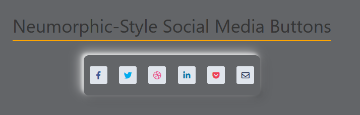
This HTML code snippet builds a web page featuring Neumorphic-style social media buttons using Font icons. Each button is represented by a Font Awesome icon, and their colors are customized. The <head> section includes a link to the Font Awesome CSS file, ensuring the proper rendering of icons. The buttons are enclosed within a <div> element with a class of frame.
<head>
<link href="https://use.fontawesome.com/releases/v5.6.1/css/all.css" rel="stylesheet">
</head>

<body>
<h1>Neumorphic-Style Social Media Buttons</h1>
<div class ="frame">
<a href="#" class="btn">
<i class="fab fa-facebook-f" style="color: #3b5998;"></i>
</a>
<a href="#" class="btn">
<i class="fab fa-twitter" style="color: #00acee;"></i>
</a>
<a href="#" class="btn">
<i class="fab fa-dribbble" style="color: #ea4c89;"></i>
</a>
<a href="#" class="btn">
<i class="fab fa-linkedin-in" style="color:#0e76a8;"></i>
</a>
<a href="#" class="btn">
<i class="fab fa-get-pocket" style="color:#ee4056;"></i>
</a>
<a href="#" class="btn">
<i class="far fa-envelope"></i>
</a>
</div>
</body>
Step 2: Hover Effects in CSS
This CSS code styles a webpage with Neumorphic design elements, including a centered heading, a set of social media buttons within a container with shadow and hover effects, and a custom underline effect for the heading.
body {
display: flex;
flex-direction: column;
justify-content: center;
align-items: center;
height: 100vh;
width: 100vw;
margin: -8px;
background: #636568;
}

h1 {
position: relative;
text-align: center;
color: #353535;
bottom: 30px;
}
h1:before{
position: absolute;
content: "";
bottom: -10px;
width: 100%;
height: 2px;
background-color: orange;
}

.frame{
display: flex;
flex-direction: row;
justify-content: space-around;
align-items: center;
height: 80px;
width: 350px;
position: relative;
box-shadow:
-7px -7px 20px 0px #fff9,
-4px -4px 5px 0px #fff9,
7px 7px 20px 0px #0002,
4px 4px 5px 0px #0001,
inset 0px 0px 0px 0px #fff9,
inset 0px 0px 0px 0px #0001,
inset 0px 0px 0px 0px #fff9, inset 0px 0px 0px 0px #0001;
transition:box-shadow 0.6s cubic-bezier(.79,.21,.06,.81);
border-radius: 10px;
}

.btn{
height: 35px;
width: 35px;
border-radius: 3px;
background: #e0e5ec;
display: flex;
flex-direction: column;
justify-content: center;
align-items: center;
-webkit-tap-highlight-color: rgba(0,0,0,0);
-webkit-tap-highlight-color: transparent;
transition:box-shadow 0.6s cubic-bezier(.79,.21,.06,.81);
font-size: 16px;
color: rgba(42, 52, 84, 1);
text-decoration: none;
}
.btn:active{
box-shadow: 4px 4px 6px 0 rgba(255,255,255,.5),
-4px -4px 6px 0 rgba(116, 125, 136, .2),
inset -4px -4px 6px 0 rgba(255,255,255,.5),
inset 4px 4px 6px 0 rgba(116, 125, 136, .3);
}
Neumorphism Social Media Button Demo
And there you have created Neumorphism-style social media buttons using HTML and CSS. These buttons will not only look modern and stylish but also add an engaging element to your website’s user interface.