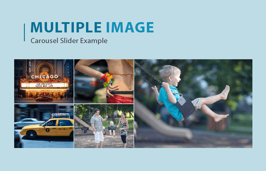
Looking for a way to showcase multiple photos at once in the carousel? With the help of Multiple Image Slider jQuery Example, you can easily highlight a group of images or showcase different products or services. Such a Carousel includes navigation buttons or indicators that allow the user to easily switch between the different images.
jQuery is a popular JavaScript library that makes it easy to create interactive elements for websites, and using it to create a multiple-image responsive image carousel slider can be a straightforward process. The resulting slideshow can be highly customizable, with options for adjusting the speed, transition effect, and more.
In this tutorial, we will build a jQuery multiple-image slider that will also have lightbox functionality to see the images in large resolution. Additionally, we will use the OWL slider for adding the responsive, Touch, and Drag features.
Build Multiple Image Slider jQuery Example
To create or implement this slider you need to load the main jQuery library into your webpage footer area.
<!-- jQuery form CDN -->
<!--<script src="https://code.jquery.com/jquery.min.js"></script> -->
<script src="js/jquery-1.10.2.min.js"></script>
As we are using the owl carousel to build our multiple showcase image Carousel so we will load both of its jQuery files into the footer or header area.
<script src="inc/owl-carousel/owl.carousel.min.js"></script>
<script src="inc/owl-carousel/carousel.js"></script>
Optional: If you want to add lightbox functionality on images then you can include the lightbox Javascript library.
<!-- Image light box-->
<script src="js/lightbox.min.js"></script>
After loading the jQuery file, include the OWL carousel plugin assets from the download directory into your website. The plugin comes with three files for styles and make sure you added all of them.
<!-- Responsive CSS -->
<link rel="stylesheet" href="inc/owl-carousel/assets/owl.carousel.min.css">
<link rel="stylesheet" href="inc/owl-carousel/assets/owl.theme.default.min.css">
<link rel="stylesheet" href="inc/owl-carousel/assets/main.css">
Optional: If you are using the lightbox functionally on the slider then make sure to add lightbox.css as well.
For the slider navigation arrow, we used the font awesome but if you don’t to add another CSS for just the arrow only then you can customize the main CSS file to add your own image basics.
<!-- Font awesome css -->
<!-- <link rel="stylesheet" href="http://maxcdn.bootstrapcdn.com/font-awesome/4.3.0/css/font-awesome.min.css"> -->
<link rel="stylesheet" href="css/font-awesome.min.css">
In case your site layout isn’t responsive then you can use bootstrap. You don’t need to include it if you are already using a responsive layout.
<link rel="stylesheet" href="css/bootstrap.css"><!-- Bootstrap css form cdn -->
<!-- <link rel="stylesheet" href="http://maxcdn.bootstrapcdn.com/bootstrap/3.2.0/css/bootstrap.min.css"> -->
HTML Structure for Multiple Image Slider
In the HTML, we will create the section that will hold the main carousel div element. In the owl-carousel div, we will use the different data items to customize the slider. You can set the number of items to show, slider speed, autoplay enable/disable, auto play speed, and many many more options.
You don’t need to handle such amazing features through Javascript and all you can turn on or offer by using the data tags within the main div of the carousel.
According to the demo, there are five images you can show at the time. So you can define the smaller images by defining the .gallery-small-item within the item content class. Similarly, you need to add .gallery-large a class within the .carousel-item class.
Following the complete HTML code according to the demo.
<section id="services" class="services padding-ok light-grey">
   <div class="container">
      <div class="row">
         <div class="owl-carousel init-carousel-owl slider-gallery-owl "data-items="2" data-items_lg="2" data-items_md="2" data-items_sm="1" data-items_xs="1" data-loop="1" data-speed="300" data-auto_play="1" data-auto_play_speed="1000" data-auto_play_timeout="3000" data-auto_play_hover="1" data-navigation="1" data-rewind_nav="1" data-pagination="0" data-mouse_drag="1" data-touch_drag="1">
             <!-- FOR SMALL PICTURE -->
              <!-- SMALL PICTURE WRAPPED AREA-->
            <div class="galery-small-wrap">
            	 <!-- FOR SMALL PICTURE CONTENTS 1 -->
               <div class="gallery-small carousel-item">
                  <div class="item content gallery-small-item">
                     <a href="img/1.jpg" data-lightbox="gallery">
                     <img src="img/1.jpg" alt=""/>
                     </a>
                  </div>
                  <div class="item content gallery-small-item">
                     <a href="img/2.jpg" data-lightbox="gallery">
                     <img src="img/2.jpg" alt=""/>
                     </a>
                  </div>
               </div>
               <!-- FOR SMALL PICTURE CONTENTS 1 -->
               <div class="gallery-small carousel-item">
                  <div class="item content gallery-small-item">
                     <a href="img/3.jpg" data-lightbox="gallery">
                     <img src="img/3.jpg" alt=""/>
                     </a>
                  </div>
                  <div class="item content gallery-small-item">
                     <a href="img/4.jpg" data-lightbox="gallery">
                     <img src="img/4.jpg" alt=""/>
                     </a>
                  </div>
               </div>
            </div>
            <!-- SMALL PICTURE WRAPPED AREA end...-->

            <!-- FOR LARGE PICTURE -->
            <!-- FOR LARGE PICTURE CONTENTS 1 -->
            <div class="gallery-large carousel-item">
               <div class="item content">
                  <a href="img/5.jpg" data-lightbox="gallery">
                  <img src="img/5.jpg" alt=""/>
                  </a>
               </div>
            </div>
            <!-- FOR LARGE PICTURE CONTENTS 2 -->
            <div class="gallery-large carousel-item">
               <div class="item content">
                  <a href="img/6.jpg" data-lightbox="gallery">
                  <img src="img/6.jpg" alt=""/>
                  </a>
               </div>
            </div>
            <!-- FOR LARGE PICTURE end... -->
         </div>
      </div>
   </div>
</section>
Conclusion
In conclusion, the Multiple Image Slider jQuery example demonstrated how to create a simple image slider that allows the user to browse through a set of images. This can be a useful feature for a website that showcases products or services, or for a portfolio or gallery page.
By using jQuery and a few lines of code, it is easy to create a slider that is responsive and works on a variety of devices. Overall, the slider shows how jQuery can be used to add interactive and visually appealing elements to a website.