Buttons are a fundamental part of web design, and they come in various styles and shapes. In this tutorial, we will explore how to create a visually appealing liquid button using HTML and CSS. A liquid button is a button with a unique animation that makes it look like it’s made of liquid or water, adding an eye-catching element to your website.
So, let’s dive in and learn how to make one step by step!
Step 1: HTML Structure for a Liquid Button
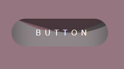
This HTML code represents a button with a text label (“Button”) and a div element with the class “liquid” inside an anchor tag, potentially used for creating a liquid animation effect when hovered.
<a href="#">
<span>Button</span>
<div class="liquid"></div>
</a>
Step 2: Liquid Button with Hover Animation in CSS
This CSS code defines the styles for a liquid button with a captivating hover animation effect. It includes properties for button appearance, liquid animation, and the transformation on hover.
* {
margin: 0;
padding: 0;
box-sizing: border-box;
}

body {
display: flex;
align-items: center;
justify-content: center;
min-height: 100vh;
background: #754b59c4;
}

a {
position: relative;
padding: 20px 50px;
display: block;
text-decoration: none;
text-transform: uppercase;
width: 200px;
overflow: hidden;
border-radius: 40px;
}

a span {
position: relative;
color: #fff;
fot-size: 20px;
font-family: Arial;
letter-spacing: 8px;
z-index: 1;
}

a .liquid {
position: absolute;
top: -80px;
left: 0;
width: 200px;
height: 200px;
background: #81a49a5e;
box-shadow: inset 0 0 50px rgba(0, 0, 0, .5);
transition: .5s;
}

a .liquid::after,
a .liquid::before {
content: '';
width: 200%;
height: 200%;
position: absolute;
top: 0;
left: 50%;
transform: translate(-50%, -75%);
background: #754b59c4;
}

a .liquid::before {

border-radius: 45%;
background: #754b59c4;
animation: animate 5s linear infinite;
}

a .liquid::after {

border-radius: 40%;
background: rgba(20, 20, 20, .5);
animation: animate 10s linear infinite;
}

a:hover .liquid{
top: -120px;
}

@keyframes animate {
0% {
transform: translate(-50%, -75%) rotate(0deg);
}
100% {
transform: translate(-50%, -75%) rotate(360deg);
}
}
Liquid Button with CSS Hover Animation Demo
In this tutorial, we’ve created a stylish liquid button using HTML and CSS. You can further customize the button by adjusting the colors, sizes, and animation parameters to match your website’s design. Liquid buttons can add a modern and eye-catching element to your web projects, making user interactions more engaging