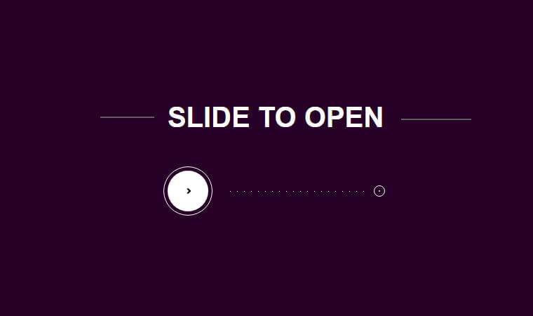
Today, we’ll build a slide to unlock function using jQuery and CSS animation. It works just like any smartphone swap function.
Do you have a smartphone? Everyone has nowadays, and you surely unlock your phone using slides left to right. Even this function also working while attending the calls.
Am I right?
How about to build a similar fashion to the web? Let’s today try out this small snippet and make it work with the website.
The slide to unlock feature most used in the iPhone and many other smartphones but what you think to make such a Transition sliding effect using CSS and bit of Jquery into the site?
Yep, that’s entirely possible to do with CSS and a bit of jquery.
We do use the CSS animation and JavaScript to get this operation done. The function will work similarly to any smartphone function.
When a user slides from left to right, it will open a new page in the same window. It is useful and unique to implement such thing on the site where you want the user do swap the button before entering the website.
Ok, let have a look at the HTML and see how we can achieve that.
How to Build a jQuery Slide to Unlock CSS Animation
We have an ID slideToOpen which works as our main container, and then we have placed a div for showing the dot’s path to the end of the destination.
The div with ID cache is our end destination and to close the screen we will need a button that is defined as an anchor link.
<div id="slideToOpen">
	<div id="dot"></div>
  <div id="cache"></div>
	<a href="#" id="close"></a>
</div>
The HTML without CSS is nothing, so we have to build CSS and used some advance property to make this swap function work.
CSS Style
#slideToOpen {
  position: absolute;
  top: 75%;
  height: 10px;
  left: 40%;
  right: 40%;
}
#slideToOpen > .ui-slider-handle {
  display: block;
  width: 70px;
  height: 70px;
  border: 1px solid white;
  position: absolute;
  top: 0;
  margin-top: -35px;
  margin-left: -35px;
  left: 0;
  border-radius: 100%;
}
#slideToOpen > .ui-slider-handle:before {
  content: '';
  position: absolute;
  display: block;
  top: 50%;
  left: 50%;
  width: 4px;
  height: 4px;
  margin-top: -3px;
  margin-left: -3px;
  transform: rotate(45deg);
  border-top: 2px solid black;
  border-right: 2px solid black;
  z-index: 2;
  opacity: 1;
}
#slideToOpen > .ui-slider-handle:after {
  content: '';
  position: absolute;
  display: block;
  top: 5px;
  left: 5px;
  right: 5px;
  bottom: 5px;
  background: white;
  border-radius: 100%;
  transition: .25s;
}
We haven’t listed complete CSS here, but you can find it in the demo.
See the Pen Slide to Open by Julien Lejeune (@jlnljn) on CodePen.
Here we have Javascript in function. To make work the swap function, we can only use the slider Javascript function. More, we need to add or remove the classes according to the situation.
The JavaScript
$( function() {
	$( "#slideToOpen" ).slider();
});

$(document).ready(function() {

  $('#cache').css('left', parseInt($('#slideToOpen').css('width')) + parseInt($('#slideToOpen').css('left')) + 'px');

  $(window).mousemove(function(){


		if (parseInt($('#slideToOpen > span').css('left')) >= parseInt($('#slideToOpen').css('width'))-20 ) {
    	$('#slideToOpen').addClass('open');
    } else {
    	$('#dot').css('left',parseInt($('#slideToOpen > span').css('left'))+35);
    }

	});

  $(window).resize(function(){

  	var wi = parseInt($('#slideToOpen').css('width'));
    var le = parseInt($('#slideToOpen').css('left'));

    $('#cache').css('left', wi + le + 'px');

	});

  $('#close').click(function(){

  	$('#slideToOpen > span').css('left','0');
    $('#slideToOpen').removeClass('open');

	});

});
I hope, now you are able to build your own slide to unlock animation with the help of jQuery and CSS. If you have any questions or suggestions, let me by comment below.