Are you looking for a unique idea to create a smooth jQuery animated sticky header which shows on scroll? In this simple tutorial, you will learn all about it.
With the help of CSS3 transition, we will handle its animation part and jQuery do the rest of job about handling the show/hidden part.
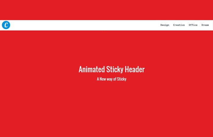
The basic idea to create a big hero header which has a logo on the left side and the navigation element ( Design Creative, Office, Dream ) will stay at the right side.
Furthermore, The center part of the header will have heading and text to stand out it. Making such kind of header force the users to stay on the site as they land on the site.
It is a good idea to create such a header if you want to show some very important message to your site users as they land on the site.
At that time the on-scroll animated sticky header part is something which will stay hidden. This part has the same navigation links which we did add in the big header part and a logo on the left side.
When the user scrolls the page down and as they reach the certain level, A nice and clean with white background slim navigation bar will come up from the top of the page.
It will stay stick at the top of the page while you scroll the page down unless you scroll back to the top of the page.
You may find such kind of example around the web on different websites. But you may can’t find the CSS Tutorial about building it.
HTML Structure for Sticky Header
We will build two different sets of navigation. The first one will stay with the header, and it looks like the header and navigation is one.
You can say, the header will have navigation, but it will still seem like the entire header with menus.
<nav class="top">
<a href="#" class="logo">Codeconvey</a>
<ul>
  <li><a href="#">Design</a></li>
  <li><a href="#">Creative</a></li>
  <li><a href="#">Office</a></li>
  <li><a href="#">Dream</a></li>
</ul>
</nav>
When the user scrolls the page, the header navigation will stay, and sticky navigation will replace it.
<nav class="top fixed">
<a href="#" class="logo">C</a>
<ul>
  <ul>
   <li><a href="#">Design</a></li>
  <li><a href="#">Creative</a></li>
  <li><a href="#">Office</a></li>
  <li><a href="#">Dream</a></li>
  </ul>
</ul>
</nav>
CSS Styles for Header
First of all, we will do some basic things for our logos. We have two different logos for standard and sticky header.
nav .logo {
    color: #fff;
    float: left;
    font-family: "Lobster",cursive;
    font-size: 25px;
    height: 42px;
    margin: 20px 0 0 20px;
    width: 141px;
}
.top.fixed > .logo {
    background: #0091de none repeat scroll 0 0;
    border-radius: 50%;
    color: #fff;
    float: left;
    font-family: "Lobster",cursive;
    font-size: 40px;
    height: 52px;
    margin: 10px 0 0 20px;
    padding: 0;
    text-align: center;
    width: 52px;
}
i) General Styling
We have some general styles for navigation like the styling of ul, li, and anchor link. There isn’t anything special here, just design the navigation look good.
/* general style */
nav.top ul {
  list-style-type: none;
  margin: 0 20px 0 0;
  padding: 0;
  float: right;
  line-height: 4.375rem;
}
nav.top ul li {
  display: inline-block;
}
nav.top ul li a {
  color: #fff;
  text-decoration: none;
  display: inline-block;
  font-size: .9375rem;
  font-weight: 700;
  margin-left: 9px;
  position: relative;
  cursor: pointer;
  line-height: 1em;
  padding: 8px 7px 9px;
  border-radius: 5px;
}
nav.top ul li a:hover {
  opacity: 1;
  background: rgba(0, 0, 0, 0.1);
  box-shadow: inset 0 1px 2px rgba(0, 0, 0, 0.05);
}
ii) Standard Hero Header
Here are styles of standard navbar that isn’t sticky but you should remember that you should make its position fixed with z-index: 99
Because we used the class.top for both navbars. We are not going to hide any header. We will just keep it behind each other.
/* normal navbar */
nav.top {
  position: fixed;
  top: 0;
  width: 100%;
  height: 70px;
  z-index: 99;
  -webkit-transform: translate3d(0, 0, 0);
  transform: translate3d(0, 0, 0);
  -webkit-transition: -webkit-transform 420ms cubic-bezier(0.165, 0.84, 0.44, 1);
  transition: -webkit-transform 420ms cubic-bezier(0.165, 0.84, 0.44, 1);
  transition: transform 420ms cubic-bezier(0.165, 0.84, 0.44, 1);
  transition: transform 420ms cubic-bezier(0.165, 0.84, 0.44, 1), -webkit-transform 420ms cubic-bezier(0.165, 0.84, 0.44, 1);
}
.scrolled nav.top {
  -webkit-transform: translate3d(0, -70px, 0);
  transform: translate3d(0, -70px, 0);
}
iii) Sticky Navigation Bar
For a fixed header, we will use the transform CSS property for animation. Also, we change the background color. You can also do more modification if you want.
/* fixed navbar*/
.top.fixed > ul {
  margin: 0 0px 0 0;
}
nav.top.fixed {
  -webkit-transform: translate3d(0, -80px, 0);
  transform: translate3d(0, -80px, 0);
  background: #fff;
  box-shadow: rgba(0, 0, 0, 0.09804) 0px 2px 4px;
}
.scrolled nav.top.fixed {
  -webkit-transform: translate3d(0, 0, 0);
  transform: translate3d(0, 0, 0);
}
nav.top.fixed ul a {
  color: #404B55;
}
The JavaScript
The JavaScript isn’t long, and we used the scroll function to get this done. Before apply this code, make sure to add jQuery library to your page for working for sticky header on scroll event.
$( document ).ready(function() {
var $body = $(document.body);
var _SCROLL_FIXED_CUTOFF = _SCROLL_FIXED_CUTOFF || ($(window).height() >= 825 ? 300 : 75),
  _HEADER_HEIGHT = _HEADER_HEIGHT || 825;

$(window).scroll(function(e) {
  if ($('nav.top[data-no-scroll]').length)
    return;
  if (this.pageYOffset >= _SCROLL_FIXED_CUTOFF && !$body.hasClass('scrolled')) {
    $body.addClass('scrolled');
  } else if (this.pageYOffset < _SCROLL_FIXED_CUTOFF && $body.hasClass('scrolled')) { $body.removeClass('scrolled'); } if (this.pageYOffset >= _HEADER_HEIGHT) {
    _header_carousel_active = false;
  } else {
    _header_carousel_active = true;
  }
});
});
Hope you find it great tutorial for building a different type of animated header.