Ticks are useful marks along with the numeric values in the HTML range slider. These marks not only create range steps but also helps to identify the current value of the slider. Such a range slider can be used for different purposes on a webpage.
Basically, a range slider with ticks can be created using HTML only and can be further styled with CSS. On the other hand, you can easily get min, max value, and execute a custom callback functions on each step. Anyhow, in this tutorial, you’ll come to know how to create a range slider with ticks and numeric values.
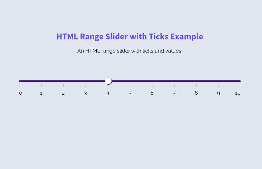
HTML Structure for Range Slider with Ticks
The HTML for ticks range slider consists of four main elements, the main container, input range, and SVG elements for ticks and values. The main container is a fieldset element of HTML that contain all other elements of the range slider.
First, you need to create the input element with a class name "range" and define its type attribute as "range". Likewise, create an SVG element just after the input and specify the SVG rect elements (with the following mentioned attributes) according to the number of ticks inside it.
Similarly, define the second SVG tag and present the number of values. Wrap all these elements into the fieldset tag and define its class name "range__field".
<fieldset class="range__field">
   <input class="range" type="range" min="0" max="10">
   <svg role="presentation" width="100%" height="10" xmlns="http://www.w3.org/2000/svg">
      <rect class="range__tick" x="0%" y="3" width="1" height="10"></rect>
      <rect class="range__tick" x="10%" y="3" width="1" height="10"></rect>
      <rect class="range__tick" x="20%" y="3" width="1" height="10"></rect>
      <rect class="range__tick" x="30%" y="3" width="1" height="10"></rect>
      <rect class="range__tick" x="40%" y="3" width="1" height="10"></rect>
      <rect class="range__tick" x="50%" y="3" width="1" height="10"></rect>
      <rect class="range__tick" x="60%" y="3" width="1" height="10"></rect>
      <rect class="range__tick" x="70%" y="3" width="1" height="10"></rect>
      <rect class="range__tick" x="80%" y="3" width="1" height="10"></rect>
      <rect class="range__tick" x="90%" y="3" width="1" height="10"></rect>
      <rect class="range__tick" x="100%" y="3" width="1" height="10"></rect>
   </svg>
   <svg role="presentation" width="100%" height="14" xmlns="http://www.w3.org/2000/svg">
      <text class="range__point" x="0%" y="14" text-anchor="start">0</text>
      <text class="range__point" x="10%" y="14" text-anchor="middle">1</text>
      <text class="range__point" x="20%" y="14" text-anchor="middle">2</text>
      <text class="range__point" x="30%" y="14" text-anchor="middle">3</text>
      <text class="range__point" x="40%" y="14" text-anchor="middle">4</text>
      <text class="range__point" x="50%" y="14" text-anchor="middle">5</text>
      <text class="range__point" x="60%" y="14" text-anchor="middle">6</text>
      <text class="range__point" x="70%" y="14" text-anchor="middle">7</text>
      <text class="range__point" x="80%" y="14" text-anchor="middle">8</text>
      <text class="range__point" x="90%" y="14" text-anchor="middle">9</text>
      <text class="range__point" x="100%" y="14" text-anchor="end">10</text>
   </svg>
</fieldset>
The CSS Styles
Firstly, disable the default style of range input by defining the “none” value for -webkit-appearance. Set its position as relative and leave some space from the bottom (by defining minus value) where we’ll place ticks. Similarly, define transparent value for background in order to remove the default background-color of the range slider.
input.range {
  -webkit-appearance: none;
  bottom: -10px;
  position: relative;
  width: 100%;
  margin: 0;
  padding: 0;
  border: 0;
  background: transparent;
}
Likewise, remove the outline (by defining 0 value) when range input focused using CSS focus pseudo-selector.
input.range:focus {
  outline: 0;
}
input.range::-moz-focus-outer {
  border: 0;
}
After removing all default styles, now its time to create custom CSS styles for the range slider. Well! target the -webkit-slider-thumb pseudo-element in order to styles the thumb icon of the slider. Specify values for height, width, background color, and box-shadow, etc. Define the border-radius as 50% to make the circular thumb.
If you want to customize the size of the range’s thumb, increase/decrease height, and width values that are both 20px. Similarly, define the same block of code with -Moz, -Ms vendor-prefixed for cross-browser support.
input.range::-webkit-slider-thumb {
  box-shadow: 1px 1px 1px black, 0px 0px 1px black;
  border: 0;
  height: 20px;
  width: 20px;
  border-radius: 50%;
  background: white;
  cursor: pointer;
  -webkit-appearance: none;
  margin-top: -7.5px;
}

input.range::-moz-range-thumb {
  box-shadow: 1px 1px 1px black, 0px 0px 1px black;
  border: 0;
  height: 20px;
  width: 20px;
  border-radius: 50%;
  background: white;
  cursor: pointer;
}
input.range::-ms-thumb {
  box-shadow: 1px 1px 1px black, 0px 0px 1px black;
  border: 0;
  height: 20px;
  width: 20px;
  border-radius: 50%;
  background: white;
  cursor: pointer;
  height: 5px;
}
Now, define the styles for the range slider track. Keep its width value 100% to make it responsive and specify height value. You can customize the track thickness by defining the own value for height (that is 5px). In the same way, set the box-shadow, background color, and remove the default border by defining 0 value.
input.range::-webkit-slider-runnable-track {
  width: 100%;
  height: 5px;
  cursor: pointer;
  box-shadow: 1px 1px 1px rgba(0, 0, 0, 0), 0px 0px 1px rgba(13, 13, 13, 0);
  background: indigo;
  border-radius: 20px;
  border: 0;
}

input.range::-moz-range-track {
  width: 100%;
  height: 5px;
  cursor: pointer;
  box-shadow: 1px 1px 1px rgba(0, 0, 0, 0), 0px 0px 1px rgba(13, 13, 13, 0);
  background: indigo;
  border-radius: 20px;
  border: 0;
}

input.range::-ms-track {
  width: 100%;
  height: 5px;
  cursor: pointer;
  background: transparent;
  border-color: transparent;
  color: transparent;
}
Define the range slider lower and upper filler style. Keep the same background color as you defined above and double the value for border-radius.
input.range::-ms-fill-lower,
input.range::-ms-fill-upper {
  background: indigo;
  border: 0;
  border-radius: 40px;
  box-shadow: 1px 1px 1px rgba(0, 0, 0, 0), 0px 0px 1px rgba(13, 13, 13, 0);
}
Now, set the HTML color value for the range ticks "fill" property. You can define any valid color in order to customize the range ticks.
.range__tick {
  fill: #a0a0a0;
}
Adjust first and last tick using CSS transform property. Use the vendor-prefixed with transform property for cross-browser ticks adjustment.
.range__tick:first-child {
  -webkit-transform: translateX(2px);
  -moz-transform: translateX(2px);
  -ms-transform: translateX(2px);
  -o-transform: translateX(2px);
  transform: translateX(2px);
}
.range__tick:last-child {
  -webkit-transform: translateX(-3px);
  -moz-transform: translateX(-3px);
  -ms-transform: translateX(-3px);
  -o-transform: translateX(-3px);
  transform: translateX(-3px);
}
Finally, remove the fieldset border by defining 0 value for CSS border property and done.
.range__field {
  border: 0;
}
That’s all! let me know by comment below if you have successfully created an HTML range slider with ticks and values.
You rock, it really helped me a lot!
Hi Ramon Ramirez!
Thanks for your feedback, keep visiting us for more free HTML & CSS code snippets.
Thanks so much, I’ve been looking a way to make a nice slider for hours!
You’re welcome! keep visiting us for more solutions.