Creating tabs in a webpage can greatly enhance navigation and improve the user experience by organizing content in a visually appealing and accessible way. One of the simplest methods to implement tabs is by using the HTML <details> and <summary> tags, combined with some clever CSS styling. In this post, I’ll guide you through the process of creating tabs using these HTML elements, step by step.
Step1: Tabs Structure With HTML
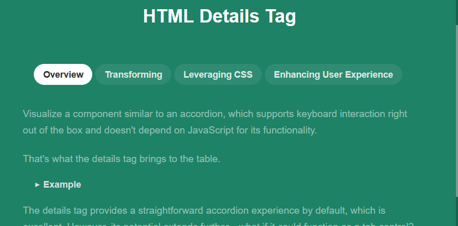
This HTML code demonstrates how to transform the <details> tag into a tabbed interface, leveraging CSS for seamless visual integration and JavaScript to enforce tab-like behavior where only one tab remains active at a time, enhancing the user experience with controlled interactivity.
<h1>HTML Details Tag</h1>
<div class="details-tabs">
<details class="details-item" open> <!-- default first "tab" to open -->
<summary class="details-tab">Overview</summary>
<div class="details-content">
<p>Visualize a component similar to an accordion, which supports keyboard interaction right out of the box and doesn't depend on JavaScript for its functionality.</p>
<p>That's what the details tag brings to the table.</p>
<details>
<summary>Example</summary>
<p>This is what the inside of a details tag looks like.</p>
</details>
<p>The details tag provides a straightforward accordion experience by default, which is excellent. However, its potential extends further—what if it could function as a tab control?</p>
</div>
</details>
<details class="details-item">
<summary class="details-tab">Transforming</summary>
<div class="details-content">
<p>While tabs and accordions share similar underlying mechanics, tabs usually require distinct parent and child containers for the tabs and their respective contents.</p>
<p>Another key difference is their interactivity; accordions can be manipulated individually, but tab interfaces maintain one active tab at all times.</p>
<p>Initially, it might seem challenging to adapt the details tag for tab functionality due to structural, layout, and functional discrepancies, but these challenges can be addressed with a closer examination.</p>
</div>
</details>
<details class="details-item">
<summary class="details-tab">Leveraging CSS</summary>
<div class="details-content">
<p>By utilizing the CSS property <strong>display: contents;</strong>, it's possible to visually eliminate the boundaries of the details tags, allowing their contents to blend seamlessly within the document flow.</p>
<p>Imagine having several small containers each filled with a mix of distinct items. These containers can only interact at a surface level, not allowing deeper interaction among the contained items. With <strong>display: contents;</strong>, it's as though these barriers are removed, mixing everything into one coherent group.</p>
<p>Now, all elements within the details tags can be reorganized flexibly using CSS's <strong>display: flex;</strong> and <strong>order</strong> properties, creating a clean separation of tabs and their content while maintaining a fluid layout.</p>
</div>
</details>
<details class="details-item">
<summary class="details-tab">Enhancing User Experience</summary>
<div class="details-content">
<p>Although the goal was to minimize JavaScript usage, achieving a true tab-like behavior requires minimal scripting. This involves monitoring attribute changes and preventing toggling actions from keyboard and mouse that conflict with expected tab functionality.</p>
<p>The essential behavior to implement is keeping one tab active at all times, which involves toggling sibling details tags appropriately when a new tab is activated.</p>
</div>
</details>
</div>